


Get Started

Sales Suite
Field Ops
Marketing
Service CRM
Integrations & Apps
FloStack
SIERA Dashboard Builder

1. Feature Overview
The Analytics Dashboard Builder tool will allow admins to create their own dashboards, and share them with users. This is an evolving tool and presently helps users in creating widgets using the existing Analytics reports.
2. Prerequisites
- To learn how to create an Analytics report, refer to this article: Analytics Report Builder.
- To enable Analytics for your account, contact your account manager or support@leadsquared.com.
3. Create a Dashboard
Follow these steps to create a dashboard:
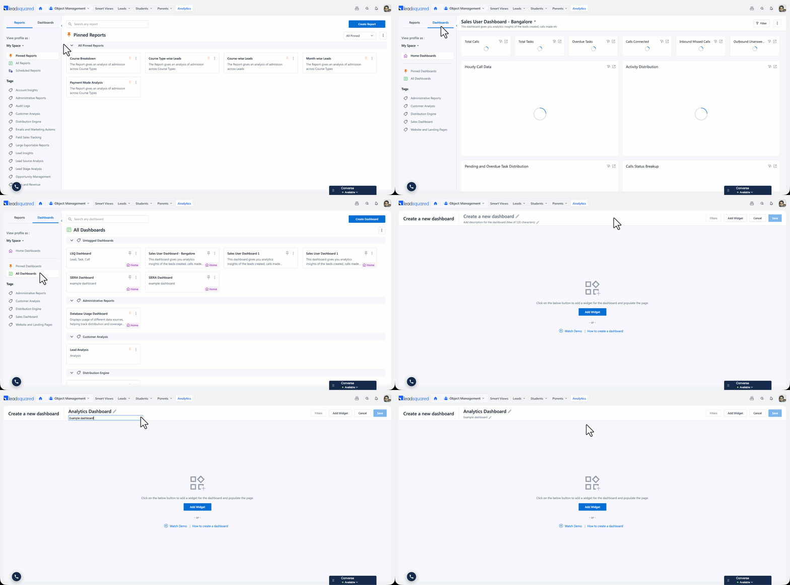
- Navigate to Analytics>Dashboards>All Dashboards.
- Click Create Dashboard.
- Enter a name and description for the dashboard.
Note:
- You must add widgets before you can save the dashboard (refer to the next section in this article).
- Dashboard Name should have a minimum of 3 characters and a maximum of 60 characters.
- Dashboard Description should have a minimum of 3 characters and a maximum of 120 characters.
- Special characters
` ; ' " . \are not allowed in Dashboard Name and Dashboard Description.
4. Create a Widget from a Report
You can add a widget from an existing Analytics report, or from an external source. When you add a widget from a report, you also configure how the widget presents that report’s data, so the same report can appear as a table on one dashboard and as a KPI on another.
Note:
- A dashboard can hold up to 25 widgets. The Add Widget panel shows the limit along with the number of widgets already added.
- Configuring a widget does not change the underlying report. The report continues to open with its own settings in the Report Builder.
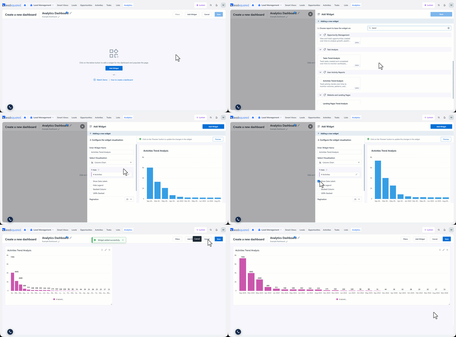
- In the Dashboard Builder, click Add Widget.
- Select Create Widget from Report, and select the report you want to use.
- Under Enter Widget Name, enter a name for the widget. This name applies to the widget only, so it can differ from the report name.
- Under Select Visualization, select how the widget presents the data. The list holds the same chart types as the Visualise section of the Report Builder, along with KPI and Table (No Chart). The visualisation the report is saved with is selected by default.
- Configure the visualisation. The options that appear depend on your selection, and are described below.
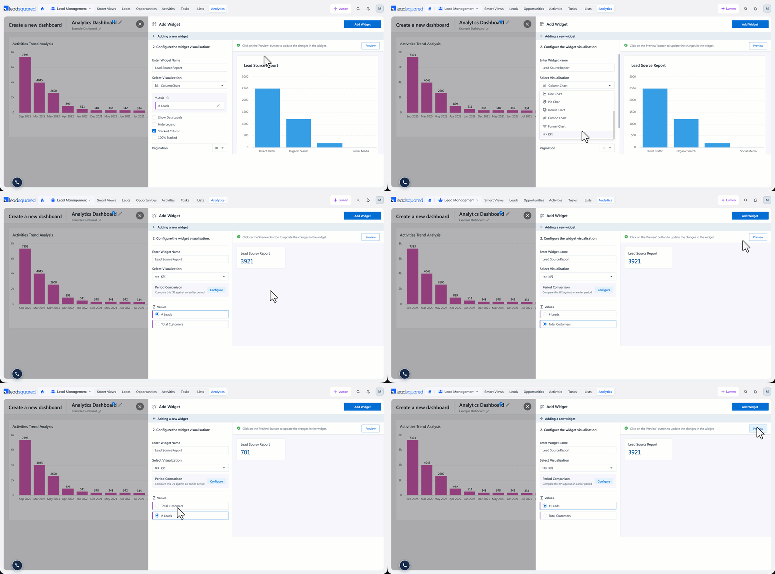
- Select the Values or Columns to display in the widget.
- Click Preview to update the widget preview, and then click Add Widget.
- If required, resize the widget and reposition it on the dashboard, and then click Save.
Chart Colours
For chart widgets, you can set the chart colours from the widget itself, using the same options as the Visualise section of the Report Builder:
- For Pie, Donut, and Funnel widgets, apply a colour palette under Chart Colours, using Edit Colours. The available palettes are Default, Warm, Orchard, Ocean, and Sunset.
- For Bar, Column, Line, and Area widgets, click the Edit icon next to a measure and select a colour against that measure.
Colours set on a widget apply to that widget only, and do not change the report the widget was created from.
4.1 KPI Widgets
A KPI widget displays a single value as a large figure, which makes it useful for headline metrics such as total leads. Select KPI under Select Visualization, and then select the value to display under Values. A KPI widget shows the total for that value.
KPI Widget Period Comparison
Period Comparison compares the value on a KPI widget against the same value in an earlier period, and displays the change. For example, a KPI showing the leads created in the last 30 days can also show how that figure moved against the previous 30 days.
Note:
- Period Comparison is available on dashboards only, and only on KPI widgets. It is not available in the Report Builder or on any other widget type.
- Period Comparison applies only to numeric values. KPI widgets can also display a string value, and for those the option is not actionable and displays a tooltip stating that period comparison applies only to numeric data types.
To configure Period Comparison:
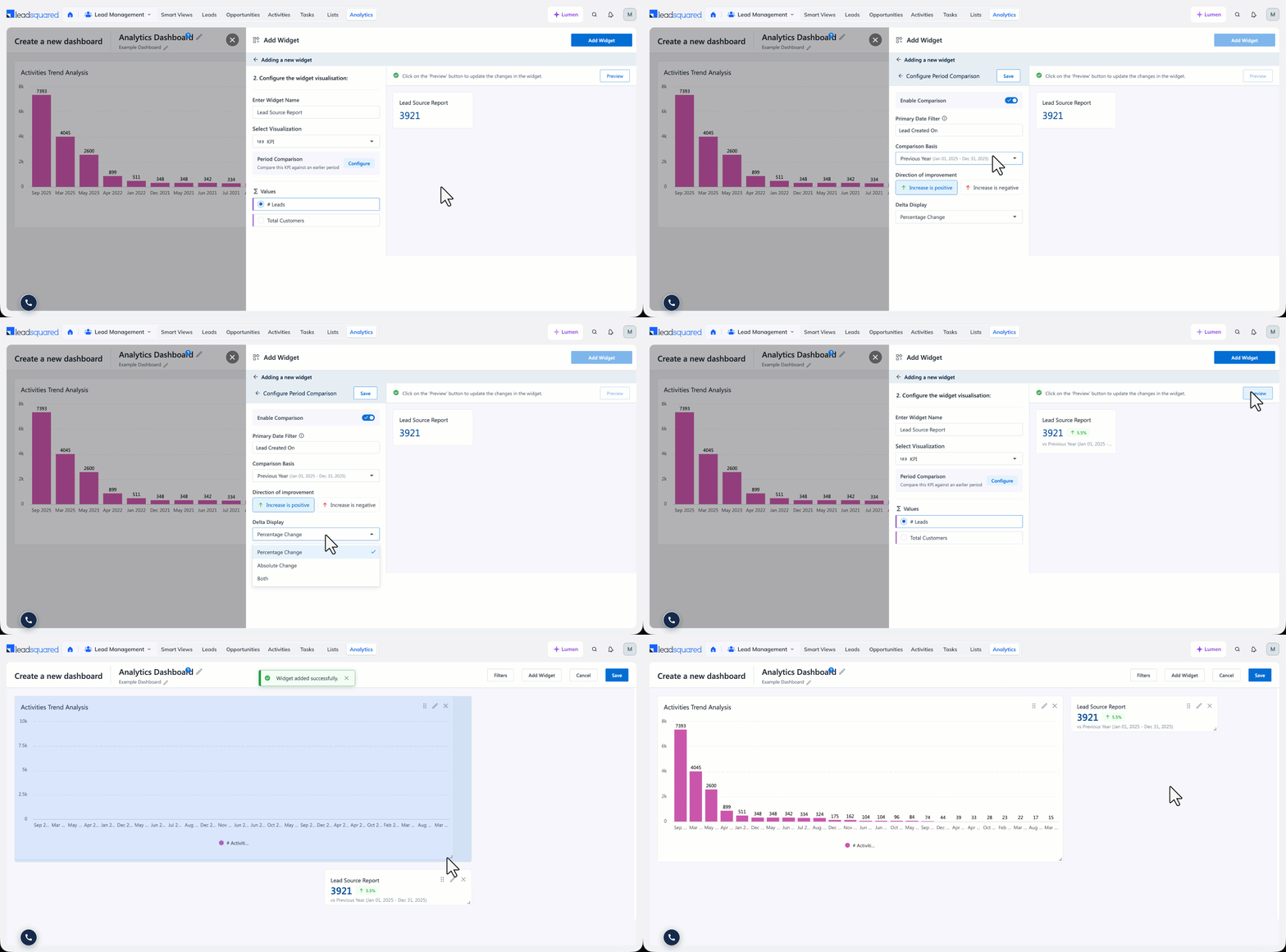
- On the KPI widget, click the Edit
- Under Period Comparison, click Configure.
- Enable the Enable Comparison
- Check the Primary Date Filter. This is the date field the KPI is filtered on, such as Lead Created On or Activity Created On. The current value on the widget covers the range selected for this filter.
- Under Comparison Basis, select the period to compare against. Each option displays the date range it resolves to.
- Here, the Previous Period option refers to the period of the same length immediately before the current range.
- Under Direction of improvement, select Increase is positive or Increase is negative. This controls whether an increase is presented as an improvement or as a decline. For example, an increase in leads created is an improvement, while an increase in calling time may not be.
- Under Delta Display, select Percentage Change, Absolute Change, or Both. Absolute Change displays the difference as a number, so a move from 10 to 12 appears as +2.
- Click Save, and then click Save Changes.
How the change is displayed
Analytics runs a separate query for each of the two periods and compares the results. The change is colour-coded based on the Direction of improvement you set:
- Green when the change is an improvement.
- Red when the change is a decline.
- A neutral colour when the two values are equal, so there is no change either way.
If there is no data for one of the periods, the widget displays a dash instead of a change.
5. Add a Widget from an External Source
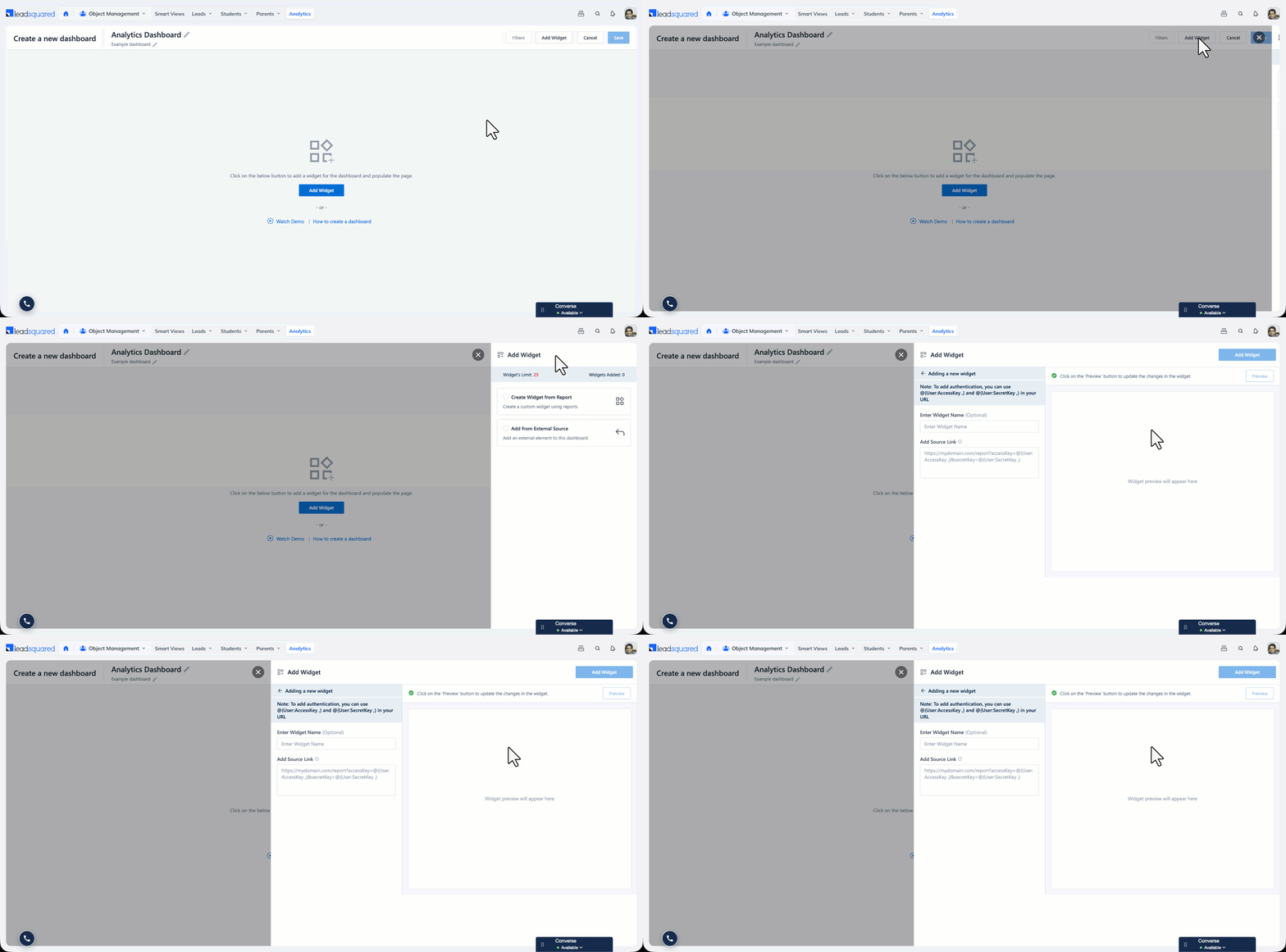
You can add an external element to a dashboard by pointing the widget at a URL.
- Click Add Widget, and select Add from External Source.
- Under Enter Widget Name, enter a name for the widget. This is optional.
- Under Add Source Link, enter the URL of the element you want to display.
- Click Preview, and then click Add Widget.
To authenticate the request with the credentials of the user viewing the dashboard, use the @{User:AccessKey} and @{User:SecretKey} placeholders in the URL, as shown below:
https://mydomain.com/report?accessKey=@{User:AccessKey}&secretKey=@{User:SecretKey}
6. Edit a Widget
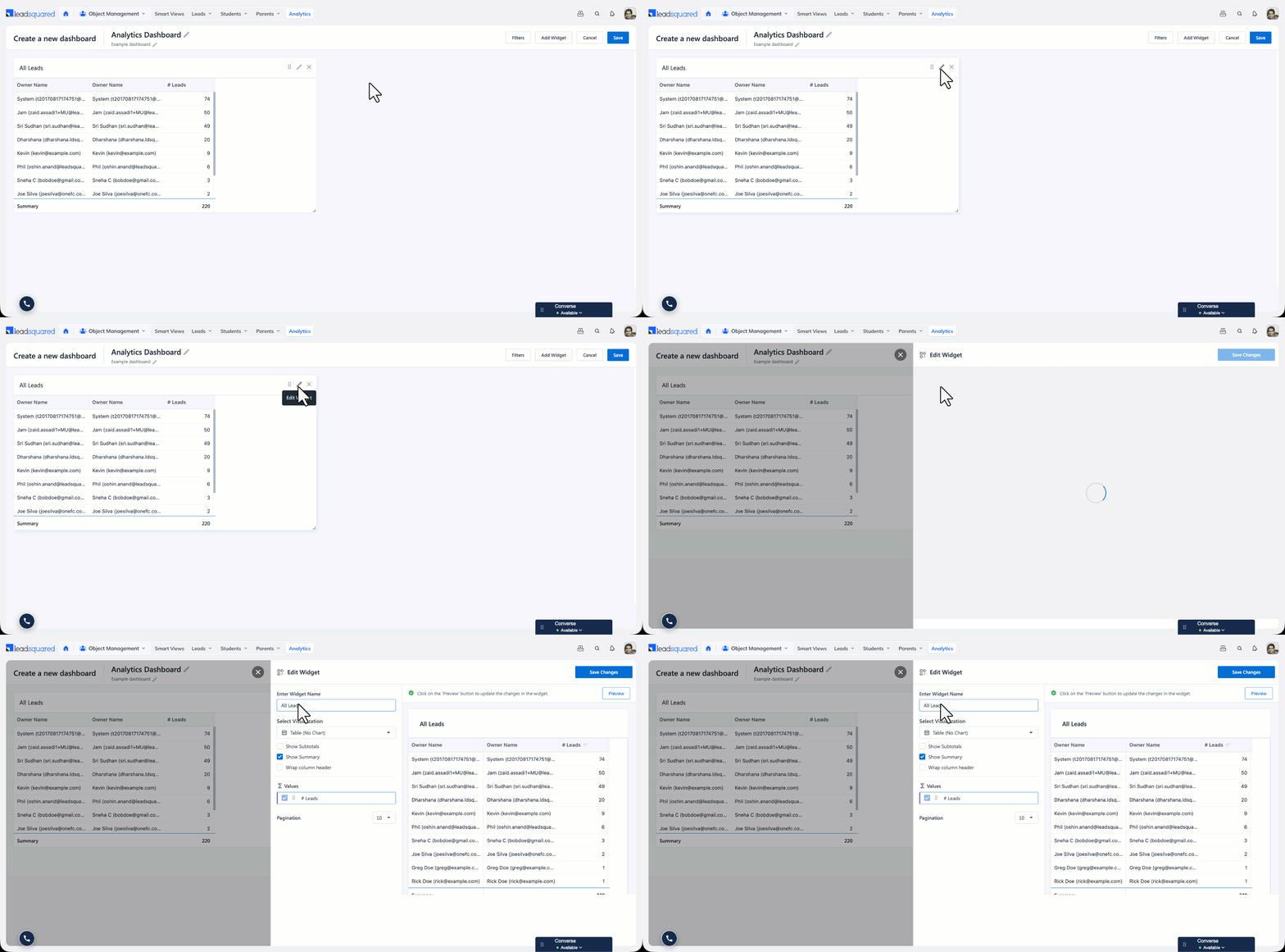
To change a widget that is already on the dashboard, click the Edit icon on the widget. The Edit Widget panel opens with the same options used when the widget was added. Click Preview to check the change, and then click Save Changes.
You can also resize a widget and reposition it on the dashboard.
7. Dashboard Filters
Admins can add filters to a Dashboard and link them to multiple Widgets. All widgets linked to a filter will then display data for the specified ranges or values.
7.1 Adding a filter for a single widget
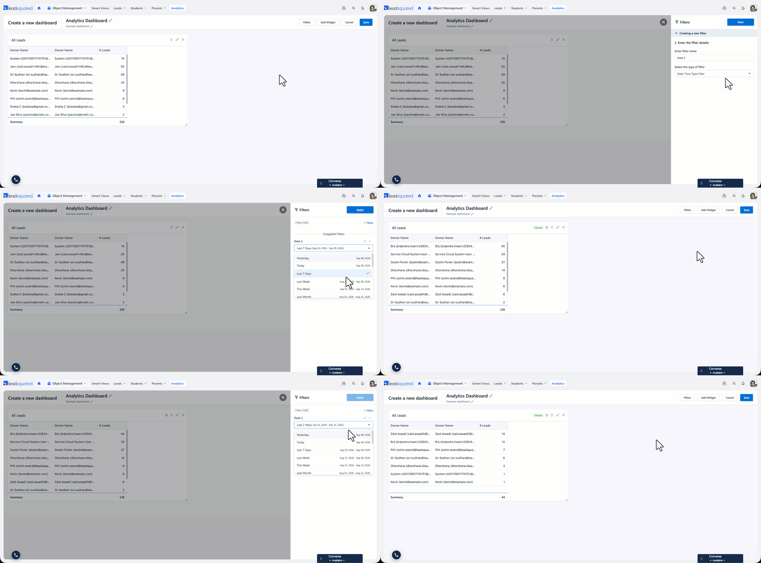
- Once you add a Widget to your dashboard, click on the Filters
- To add a new filter click on the
- Enter the Filter Name.
- You can select from the following Filter types:
- Date Filters
- String Filters
- Dropdown Filters
- User Filters
- Sales Group Filters
- Number Filters
- Click Next.
- Select the Widgets and the filters in the Widget that you want to link. For example, we will be linking the Date Filter with the Lead Created On filter from the Widget.
- Click Add Filter.
- Once a Filter is added, users can change the Filter’s default value.
- Once done, click on Save & Apply Filters.
Note:
- A funnel icon with a count on the widget header indicates that a filter is applied to that widget
- If a new Widget is added to a Dashboard, you will need to manually link any existing filters.
7.2 Linking Dashboard Filters to Multiple Widgets
You can link a filter to multiple widgets. The available filters are Date Filters, Dropdown Filters, String Filters, User Filters, Sales Group Filters, and Numbers Filters
When you are linking a specific type of filter to multiple widgets, the available fields of that data type will appear for selection. For example, if you select the Date Range filter, all the date-time type fields (for example, lead created on, renewal date) in the widget or report will appear, and you can select the field you want to link to.
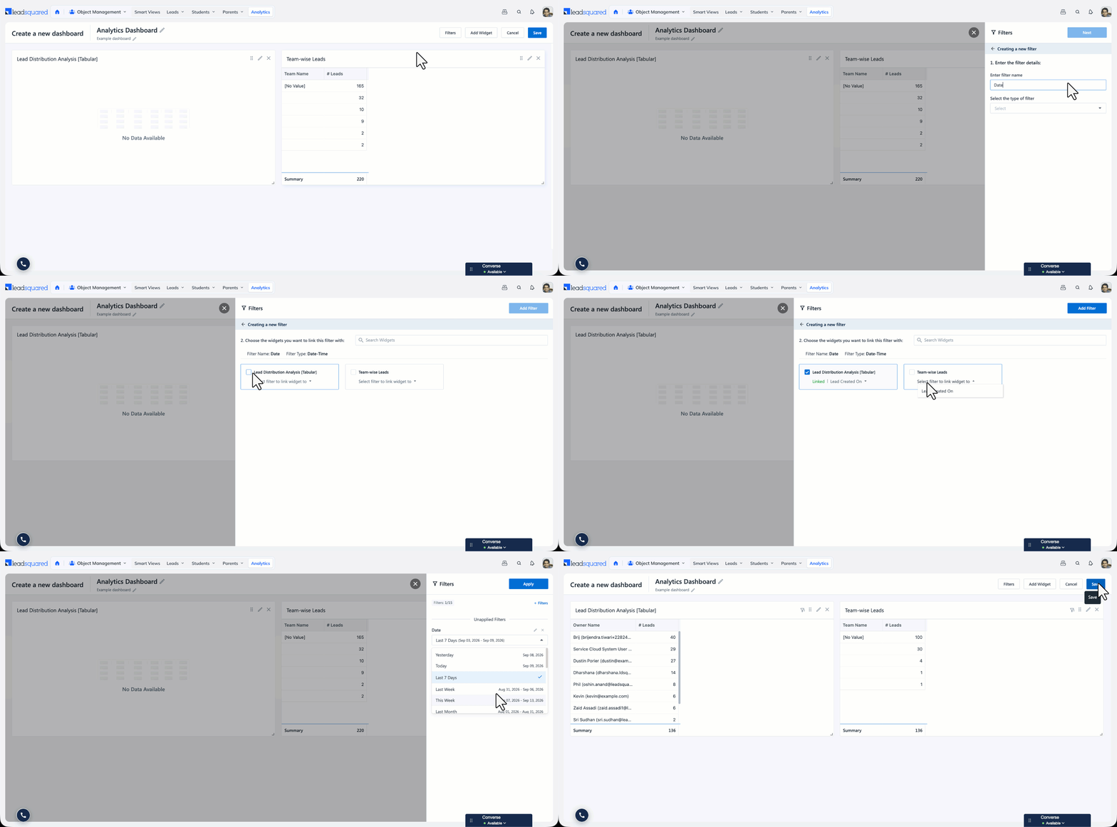
Example 1 – Linking a date range filter to multiple widgets
For example, we can link the Date-Time type filter to both the Lead Distribution Analysis widget and the Team-wise Leads Widget, since both the Widgets have a Lead Created On date-time field.
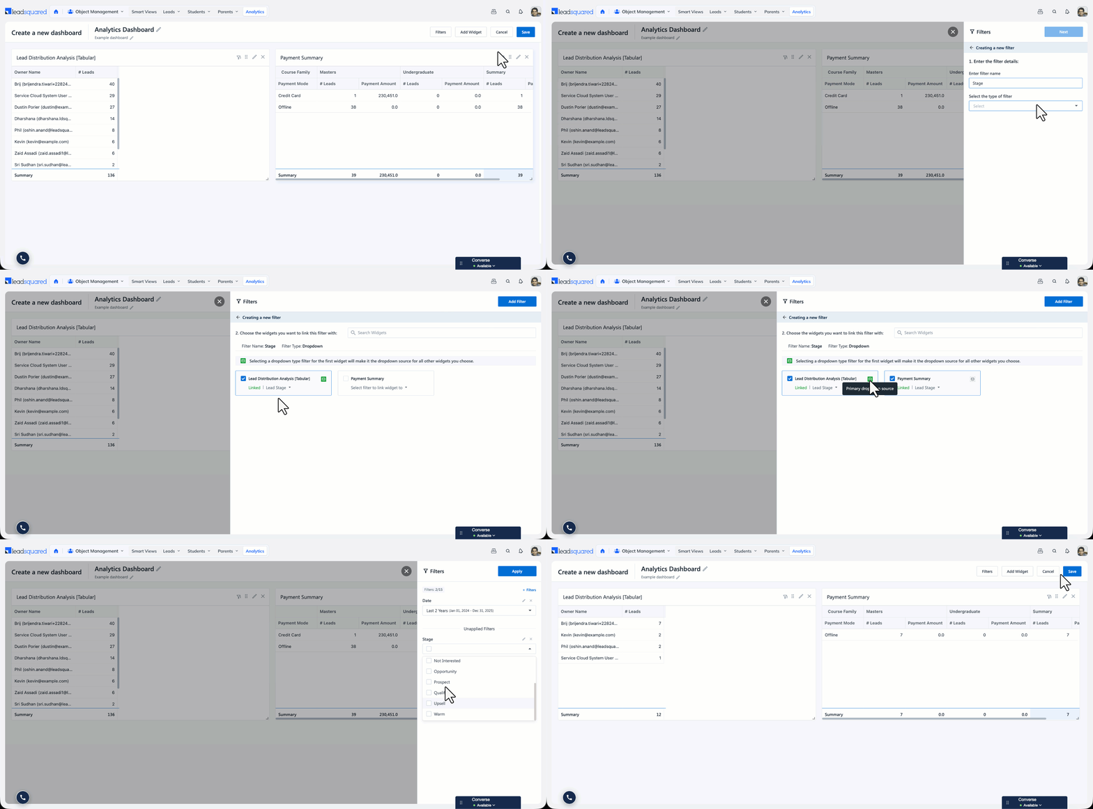
Example 2 – Linking a drop-down filter to multiple widgets
For example, let’s say the Lead Distribution Analysis Widget has a Lead Stage Filter of type Dropdown in the corresponding Report. And, the Payment Summary Widget also has a Lead Stage filter of type Dropdown in the corresponding report. Instead of adding 2 separate filters to control each Widget, you can link the dropdown type filter to both the Lead Stage of Lead Distribution Analysis and the Lead Stage of Payment Summary.
Now, when you select a lead stage from the drop-down type filter, both widgets will be filtered with the selected values.
8. Add the Dashboard to Your Home Page
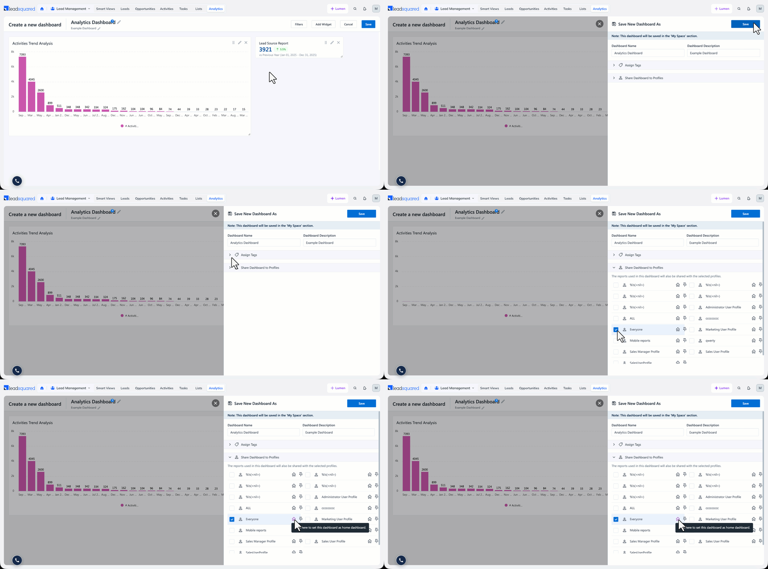
When you click Save, a panel appears where you can edit the dashboard name and description, assign tags to it and share it with specific profiles under Share Dashboard to Profiles.
You can pin the dashboard, and click the icon on a dashboard to set it as a Home dashboard. These dashboards appear in the Home Dashboards tab in Analytics, and are also available as options in the home page selector when you log in to LeadSquared. You can set multiple dashboards as Home and they will show up on Home Dashboards.
Any Questions?
Did you find this article helpful? Please let us know any feedback you may have in the comments section below. We’d love to hear from you and help you out!