


Get Started
Sales Suite
Field Ops
Marketing
Service CRM
Integrations & Apps
FloStack
SIERA Feature Guide
1. Feature Overview
Sales Intelligence and Efficiency through Reports and Analytics (SIERA) is LeadSquared’s new-gen self-service reporting tool. Through SIERA, you can track leads, opportunities, organization revenue, user performance, and more. Additionally, SIERA helps you –
- Customize reports and apply relevant filters to display crucial data
- Make informed decisions using real-time analytics and actionable insights
- Design reports that trickle down your organization hierarchy to track user-level progress
- Configure appropriate reports for your users
- Improve business performance by analyzing large data volumes
- Sort and filter vast data volumes
- Create pivot tables
- Create custom expressions that can be used to retrieve and manipulate data on any report easily.
2. Getting Started
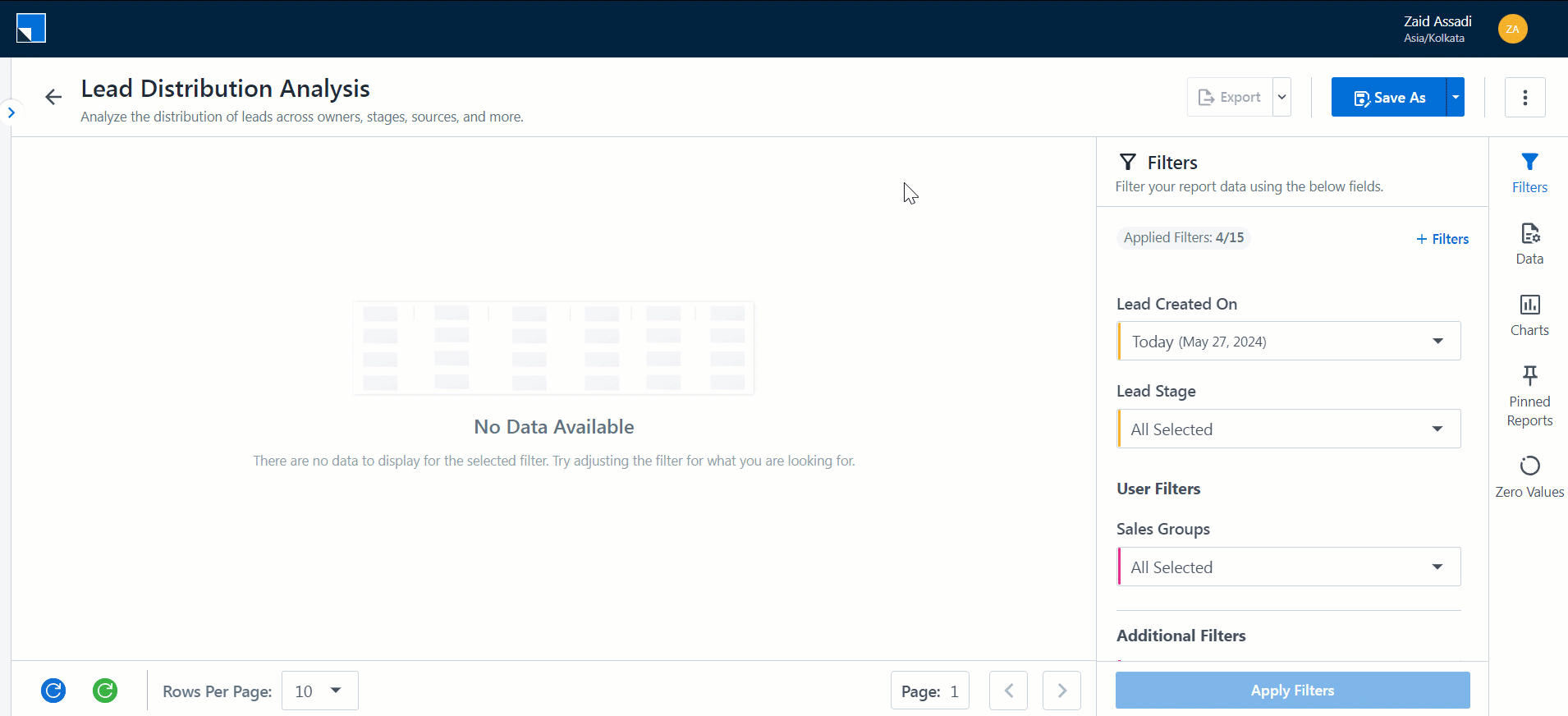
2.1 View SIERA Reports
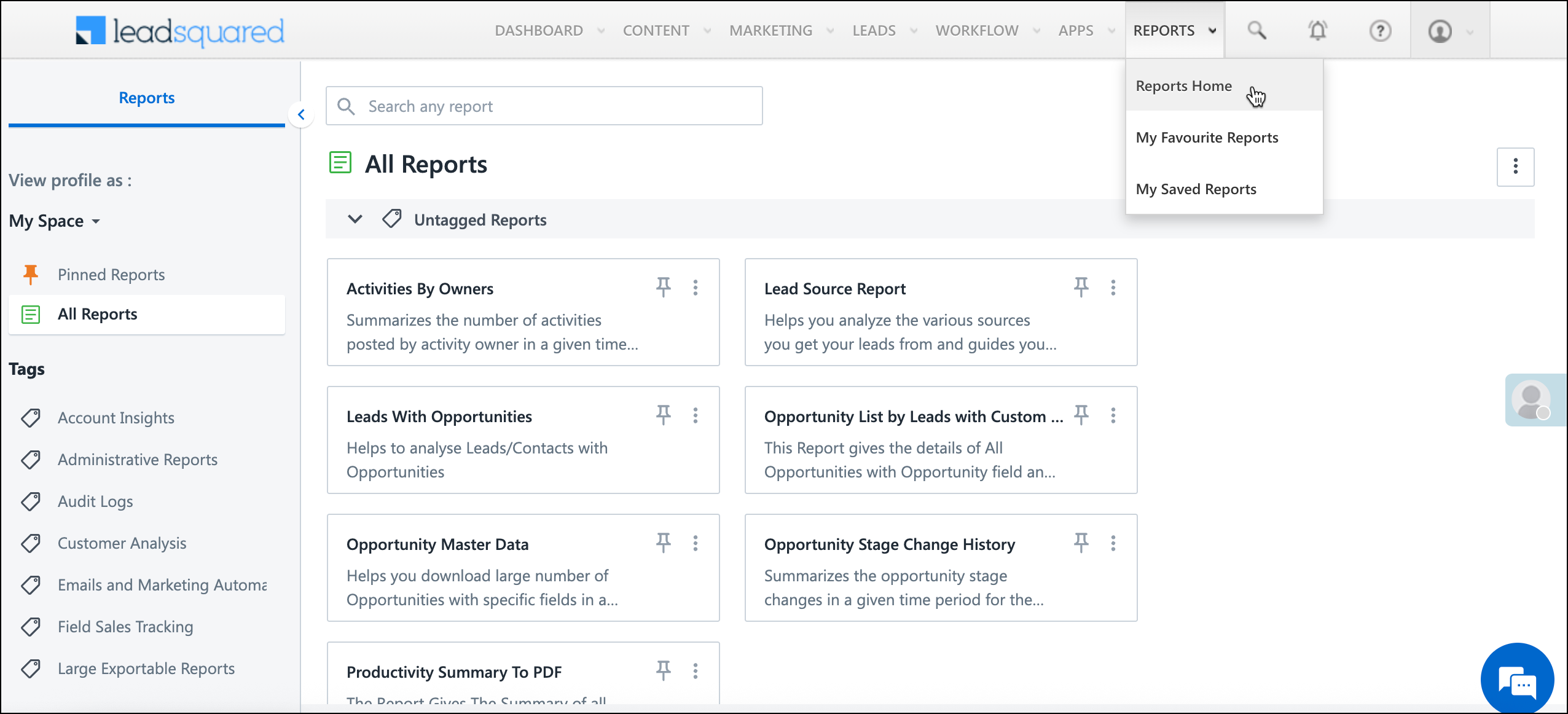
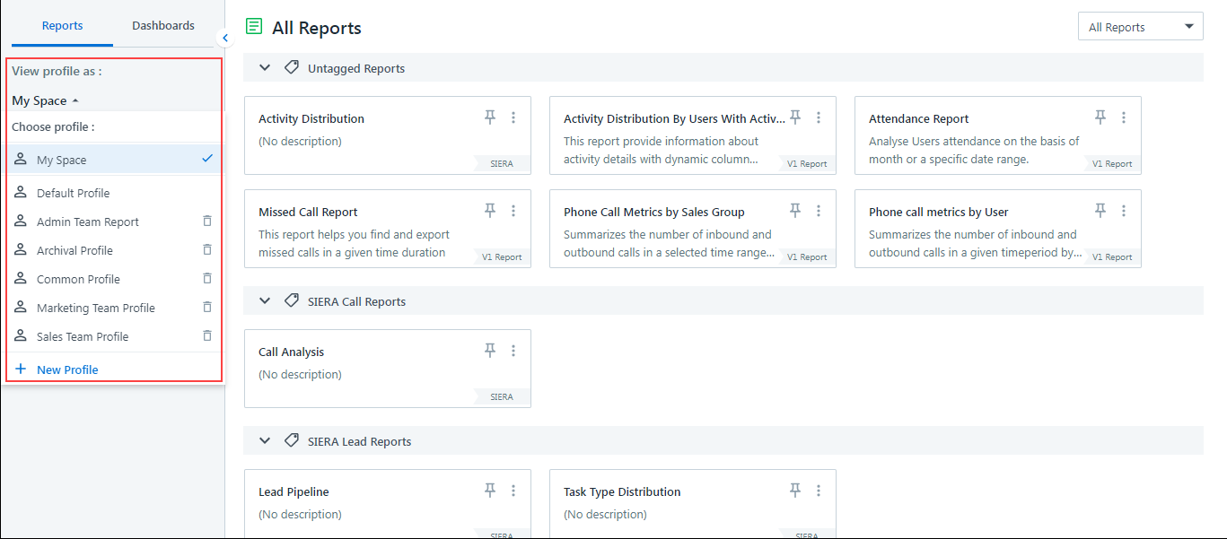
To view the default SIERA reports screen, navigate to Reports>Reports Home.
Note:
- On legacy systems, you can still access SIERA through Reports>SIERA. On newer tenants, navigate to Reports>Reports Home instead.
- Legacy reports (non-SIERA) will be marked as V1 Report. Whereas the SIERA reports will be denoted with SIERA.
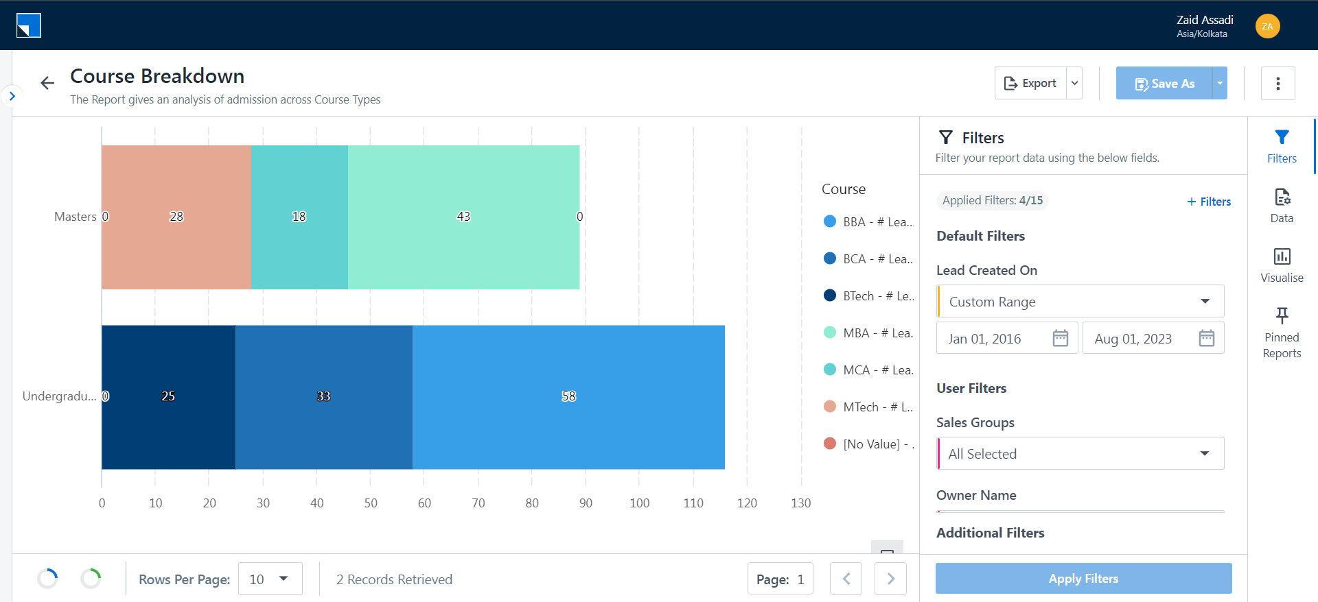
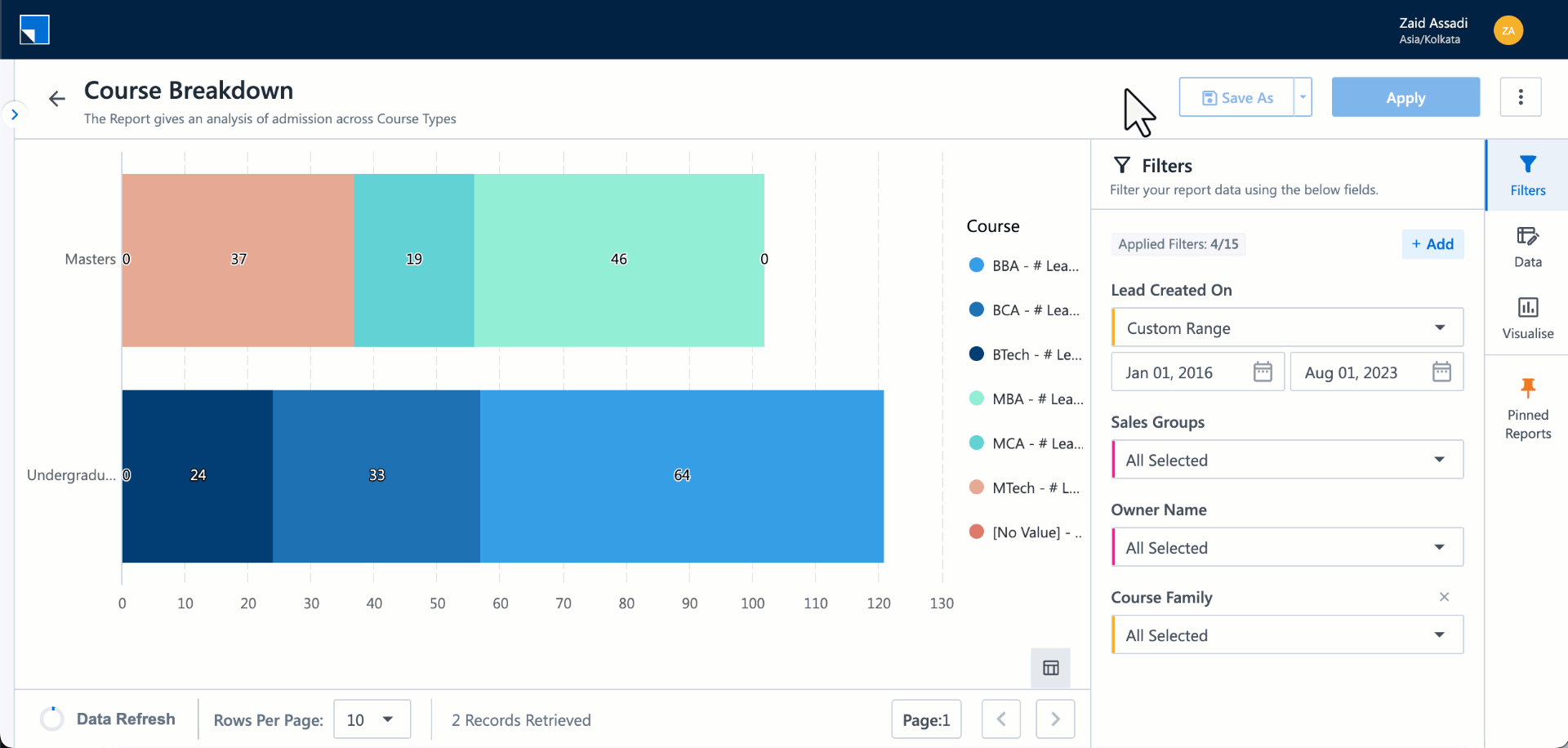
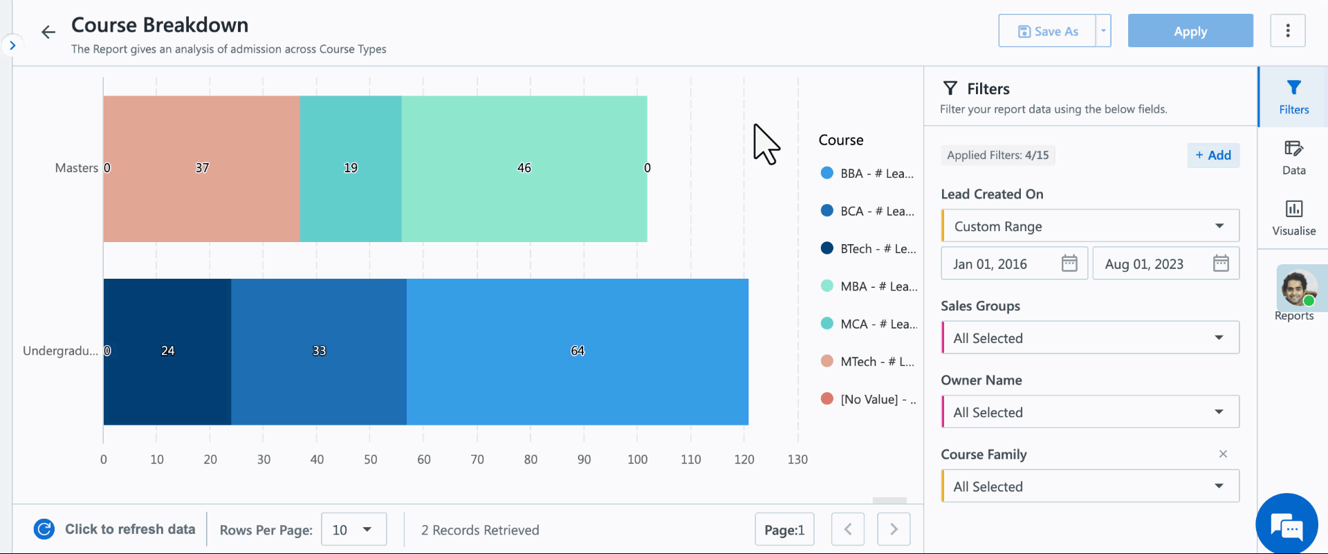
2.2 Quick Edit
With SIERA’s Quick Edit feature, you can change the basic parameters of an existing report, such as –
- Add filters to the report
- Add groupings and values to a report
- Visualize the data through different charts
Once you modify a report, you can save it as a new copy or overwrite the existing report.
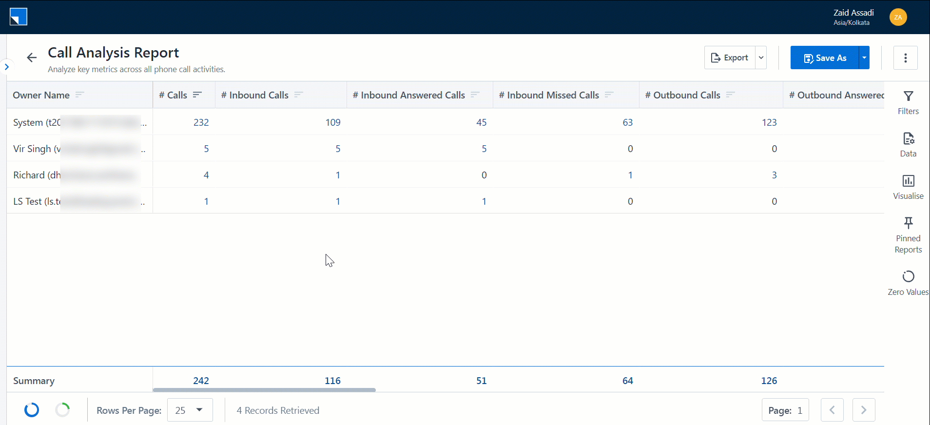
2.3 SIERA Report Actions
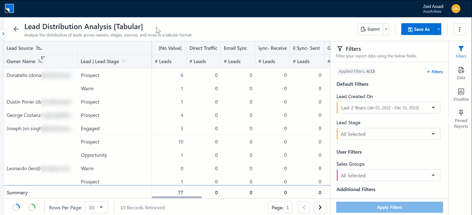
2.3.1 Sort Data
The visual below displays how to re-order and sort data on a table.
2.3.2 Drill Down
Open any SIERA report, and click on any entry within the report. This will securely drill down to the lead, opportunity, activity, or task level. The data you see in the drill-down will be dependent on the permissions provided to you.
2.3.3 Quick Export
To enhance your experience while using SIERA, you can perform the Quick Export action to export all the data that’s present on the current report page you’re on. Click on the three-dotted menu. You can export this page as a CSV file, and Excel file, or a PDF. This export happens instantaneously, without any reliance on the Export History tab. You can Quick Export the summary as well as the drill-down reports.
2.3.4 Export
To enhance your experience while using SIERA, you can perform the Export action to export all the rows across the entire report. You can export this page as a CSV file or PDF. Once you’ve performed the Export action, the report is queued as a link on the Export History tab. Once the file is rendered, you can download the report.
Note:
- You can only Export up to 1,000 rows through this action.
- You can restrict certain users from exporting the report by creating and applying Permission Templates.
2.3.5 Click Actions
On the SIERA report, use the right-click action on your mouse to perform the following actions –
- Copy – Copies the selected content, along with the column headers (#Leads in the example below) and group headers (“Customer”, “Disqualified”, etc. in the example below) of the selected content.
- CSV Export – Exports the selected content as a CSV file. The export file includes the column and group headers.
- Excel Export – Exports the selected content as an Excel file. The export file includes the column and group headers.
3. Report Management
LeadSquared’s Report Management is aimed at helping admins configure appropriate reports for their users. Through Report Profiles, you can manage report and dashboard access for your users and be able to design the report listing page for all your users.
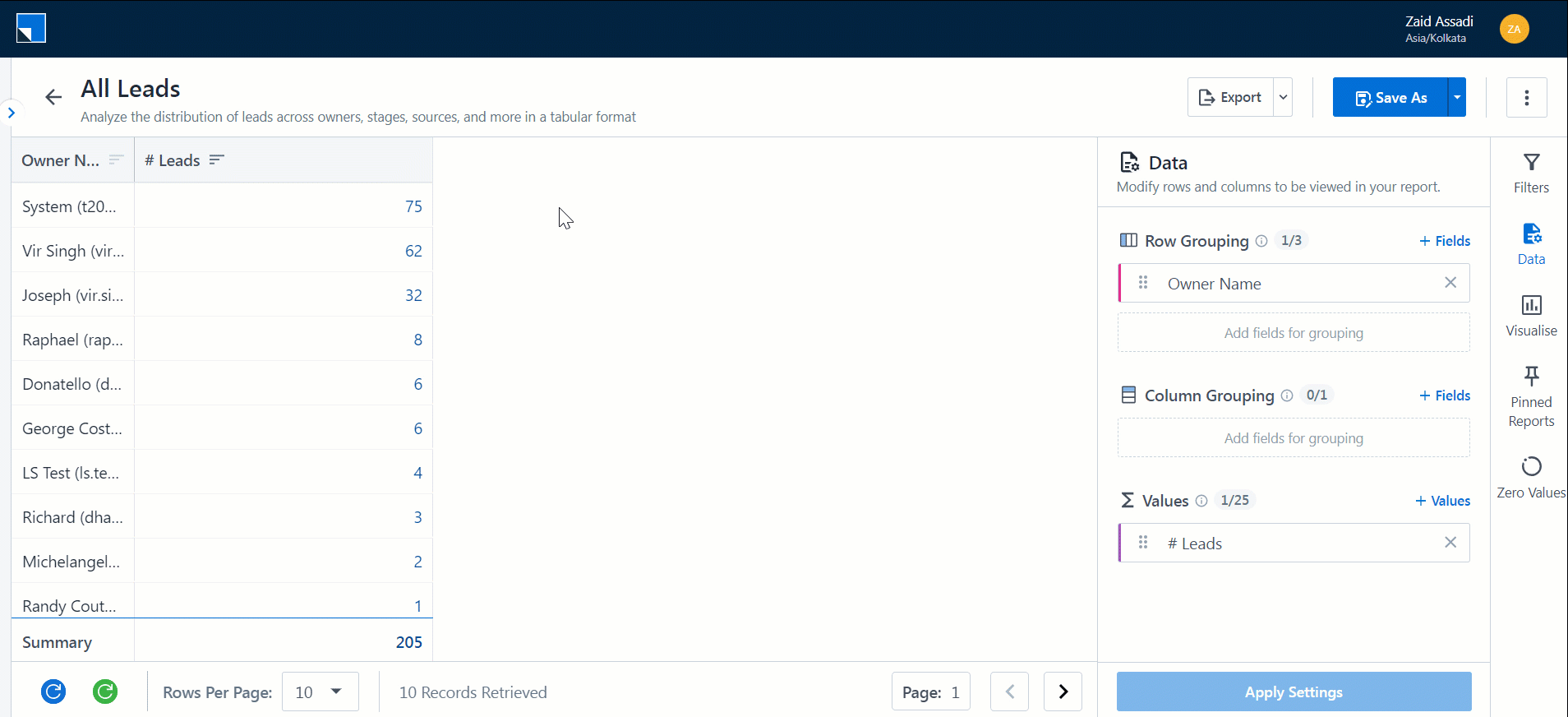
4. SIERA Report Builder
The Report Builder helps you go beyond system reports by creating custom reports tailored to your business needs. It works on predefined templates that bring together data from multiple LeadSquared entities such as leads, activities, opportunities, tasks, and calls.
When building a report, you can choose the right data source, apply filters, and group or sort data. You can also create custom columns and expressions to add calculations or transformations. Reports can be designed in two ways:
- Summary reports for aggregated insights with charts and drill-downs.
- List reports for detailed row-level data.
Together, these options let you track anything from high-level trends to granular details.

4.1 SIERA Expression Builder
SIERA’s Expression Builder tool lets Admins create their own expressions that can be used to easily retrieve and manipulate data on any report.
To learn how you can write your own expressions, you can go through the following articles:
4.2 Join Data Sources
The SIERA Report Builder enables you to combine data from multiple sources to create unified and more meaningful reports. Depending on your reporting requirement, you can use:
- Joins and Sub-Query Joins to relate datasets using common fields and analyze connected data.
- Unions to stack similar datasets together and view them as a single consolidated source.
For detailed configuration steps, see Join Data Sources on SIERA Report Builder and Using Union in SIERA Report Builder.
4.3 Import External Data from Mavis
You can import external data stored in Mavis into SIERA and use it in your SIERA reports and dashboards. This enhancement allows you to combine third-party campaign data (e.g., from Facebook Ads, Google Ads) with your LeadSquared data for deeper performance insights.
To learn how you can import Mavis data onto SIERA, you can go through the following article: Import External Data from Mavis into SIERA.
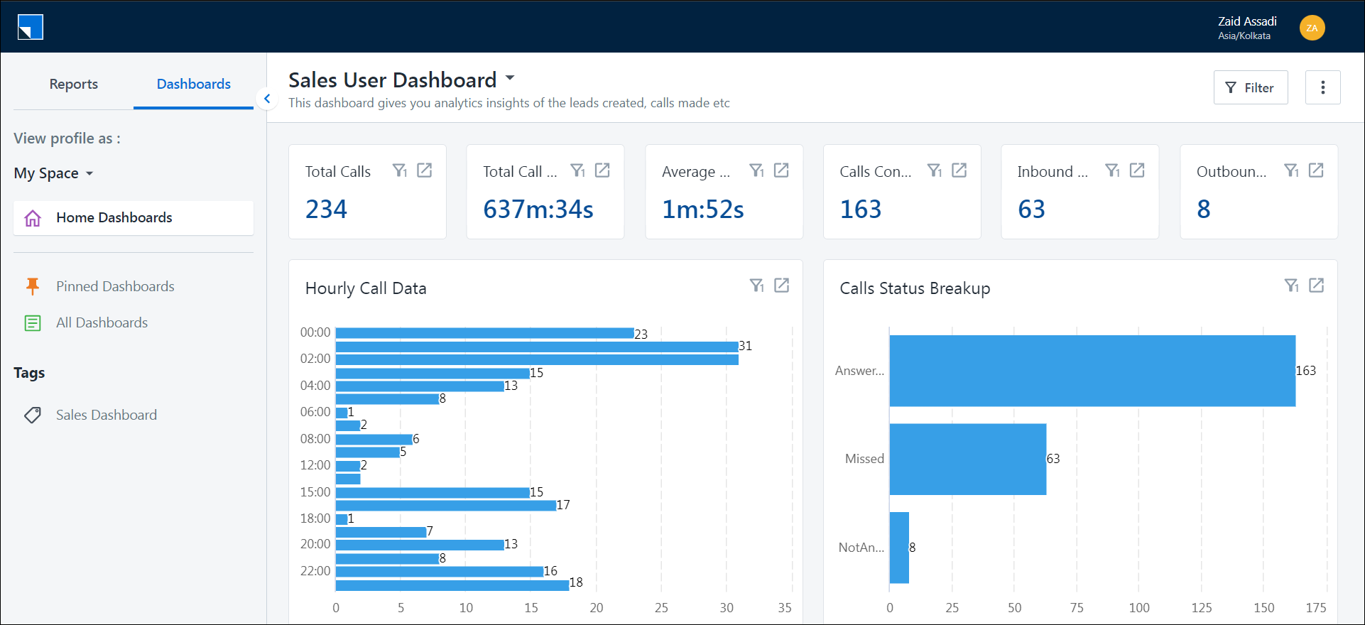
5. SIERA Dashboard Builder
The SIERA Dashboard Builder enables admins to create custom dashboards. Once a dashboard is created, any SIERA report can be added as a widget. You can apply custom filters to individual widgets or use a single filter across multiple widgets.
6. Schedule SIERA Reports
Schedule the delivery of your SIERA report to your LeadSquared email address. Admins can schedule reports for themselves or other users, while non-admin users can schedule reports for themselves.

7. Service CRM Analytics
Service CRM Analytics enables you to analyze and report on support tickets and ticket-related activities using LeadSquared’s Analytics framework.
It helps service teams track ticket volume, monitor SLA performance, evaluate agent efficiency, and understand how tickets move through different stages of the support lifecycle.
For more information, refer to LeadSquared Analytics on Service CRM.
8. Troubleshooting
If SIERA reports are not loading or working as expected, or are loading but are flickering and not stable, it may be due to a time mismatch issue –
If the time on the system accessing the reports is ahead or behind the actual timezone (used in SIERA) by 15 minutes or more, reports may not load correctly. Change the time on your system to the correct timezone (e.g., IST, ET, etc.) and then reload the reports. If this doesn’t fix the issue, reach out to us at support@leadsquared.com.
Any Questions?
Did you find this article helpful? Please let us know in the comments section below. We’d love to hear from you and help you out!