


Get Started

Sales Suite
Field Ops
Marketing
Service CRM
Integrations & Apps
FloStack
SIERA Report Builder

1. Feature Overview
The Analytics report builder allows admins to create customized reports using existing data (such as leads, activities, etc.) in their accounts, and determine which users should have access to them.
2. How it Works
In this article, we will demonstrate how to create Analytics reports using predefined templates. These templates include pre-joined data from various LeadSquared entities such as leads, activities, opportunities, tasks, and phone call activities.
To build your own reports, it is essential to determine which predefined template aligns with your specific use case. For example, if your goal is to track the number of Payment activities posted on all the leads within the past month, you will need to utilize a template that contains the Activity Data Source, where the Data Scope is set to Payment activities (Read this article for more information on Data Sources).
While your account provides nine default templates if Opportunities is enabled (or seven templates if it’s not enabled), if your use case does not fit within these templates’ scope, you can request a custom template to be created by contacting your account manager or emailing support@leadsquared.com.
3. Types of Reports
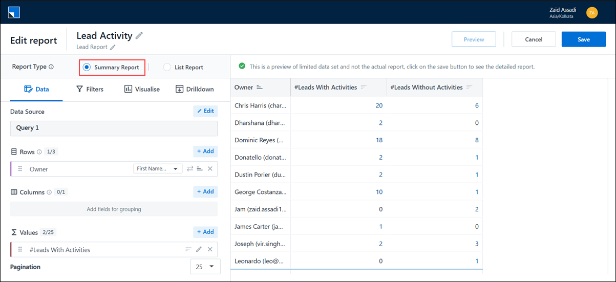
Analytics supports two types of reports—Summary Reports and List Reports—to suit different reporting needs. You can select the report format at the start of report creation. This option is available for both the main report and any sub-query.
3.1 Summary Report
Summary Reports are designed for grouped and aggregated reporting. They allow you to analyze metrics across different dimensions using data from entities like Leads, Activities, Opportunities, and more.
3.1.1 Use case
Use Summary Reports to measure performance, identify trends, and track key metrics—for example, total leads generated by user, count of activities by user, or revenue by opportunity stage.
3.1.2 Key Features
- Group and aggregate data using row and column groupings.
- Apply joins or sub-query joins for multi-entity reporting.
- Create visualizations like bar, pie, or line charts.
- Configure drilldowns for deeper analysis.
- Supports filtering, sorting, pagination, and custom expressions.
3.2 List Report
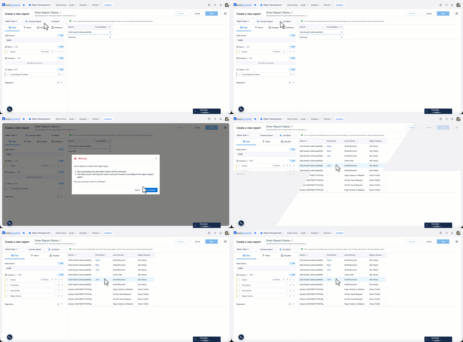
List Reports provide a flat, tabular view of individual records without any grouping or aggregation. Each row represents a single record with selected fields as columns.
3.2.1 Use case
Use List Reports to view detailed, row-level data such as lists of leads, tasks, or activities—e.g., all leads created in the last 30 days along with their contact information and owner.
3.2.2 Key Features
- Displays ungrouped data in a simple list format.
- Supports up to 20 fields (configurable) as columns.
- Apply joins or sub-query joins for multi-entity reporting.
- Filters, sorting, and pagination are supported.
- Can be added to dashboards as a table widget.
4. Using the Report Builder
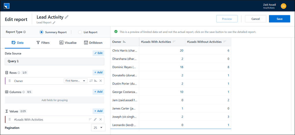
The Report Builder has the following sections –
- Data –This section lets you join data sources, add values, and add fields as rows and columns in your report. You can also choose a pre-defined value or create your own expression here.
- Filters –This section lets you add fields as filters in your report. You can also add default values to the filter. For each data source, there are a set of mandatory filters that need to be added.
- Visualise – This section lets you add charts to your Summary Report. The axes of the charts depend on the Groupings and Values. Charts are not available on a List Report.
- Drilldown (only Available on Summary Report) – This section will be used to configure a custom column for the measures used in a Summary Report.
On the right-hand side of the Report Builder is the Preview section. This lets you view the report up till the first 10 rows.
5. Data
This section helps you join data sources, design the Rows, Columns, Values, Sorting, and Pagination, and add values for the report.
5.1 Data Sources
The Report Builder supports advanced data combination through Joins, Sub-Query Joins, and Unions, enabling you to analyze data across multiple sources within a single report.
Use simple joins (Left, Inner, Right, and Full Outer Joins) to relate data across connected tables such as Leads, Tasks, Activities, and Opportunities using common fields. For more advanced reporting scenarios—such as applying grouping, filtering, or aggregations before combining datasets—use Sub-Query Joins, which allow you to nest refined queries and join them back to the main report.
When you need to merge similar datasets into one unified dataset, use Union or Union All. This is useful when combining records from different sources that share the same structure but are not directly related.
For detailed configuration steps, see Join Data Sources on Analytics Report Builder and Using Union in Analytics Report Builder.

5.2 Custom columns
Create Custom Columns in the Data Source section of Analytics reports. A custom column lets you build new fields by writing expressions that combine existing columns, apply conditions, or transform values.
To learn more, see Create Custom Columns in Analytics.

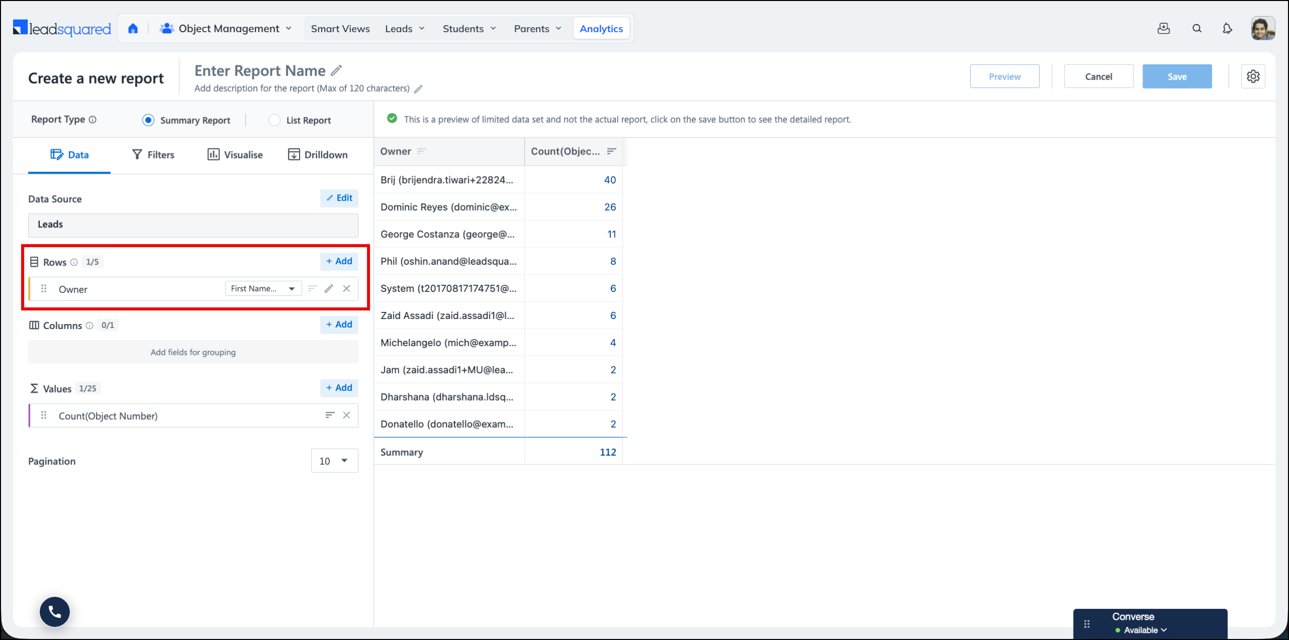
5.2 Row Grouping
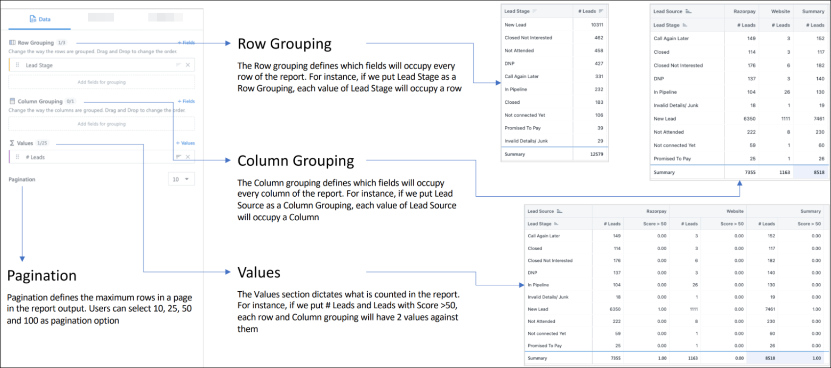
This option will let you select the row grouping of the report. Row grouping defines the fields that will occupy each row of the report. For instance, if we put Lead Stage as a Row Grouping, each value of Lead Stage will occupy a row.
The + Add button opens all fields corresponding to the Data Source (For example, Activity Data Source will contain all Lead Fields and Standard Activity Fields, along with System User Fields.) Click on any field to add it to the row grouping and click on Preview to see the changes.
Note:
- Only Date and String (Dropdown + Text) fields are allowed.
- The minimum permissible number of row groupings is 1.
- The maximum permissible number of row groupings is 3.
- To define sorting on a row grouping, click on the sort icon beside the field.
- To remove a field from the row grouping, click on the cross icon.
- To add a Row grouping, click on the + Add option.
5.3 Column Grouping
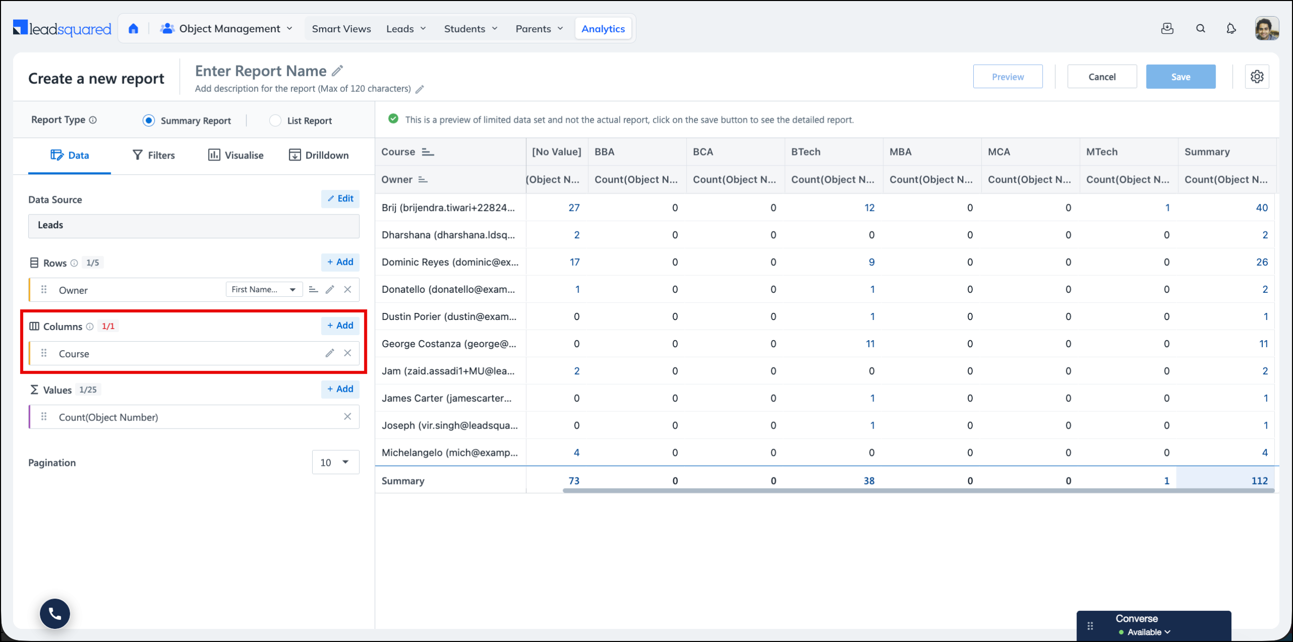
This option will let you select the column grouping of the report. You can make a pivot table with your data.
The + Add button opens all fields corresponding to the Data Source (For example, Activity Data Source will contain all Lead Fields and Standard Activity Fields, along with System User Fields.) Click on any field to add it to the Column grouping and click on Preview to see the changes.
Note:
- Only Date and String (Dropdown + Text) fields are allowed.
- In pivot mode, up to 52 columns will be visible, after which all the other columns will be clubbed under the Others column.
- The minimum permissible number of row groupings is 0.
- The maximum permissible number of row groupings is 1.
- To remove a field from column grouping, click on the cross icon.
- To add a column grouping, click the + Add option.
5.4 Values
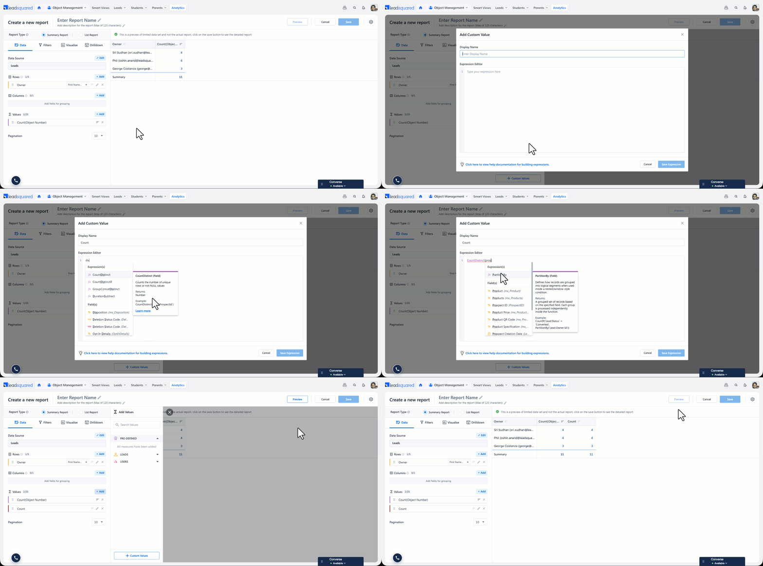
This option lets you select the measures in the report. Row and column groupings define how the report is broken up, while values define what is measured against each grouping.
Click + Add to open all fields corresponding to the Data Source. For example, the Activity Data Source contains all Lead Fields and Standard Activity Fields, along with System User Fields. Click any field to add it to the Values section, and then click Preview to see the changes.
You can also write your own expression using the Expression Builder. For more information, refer to Expression Builder.
Note:
- Only Number fields can be added from the field list.
- The Values section also has a pre-defined set of values to help you create quick reports.
- The minimum permissible number of values is 1.
- The maximum permissible number of values is 25.
- To define sorting on a value, click the sort icon beside it.
- To remove a value, click the cross icon.
5.5 Sorting
You can use the sort icon in the groupings and values to change the sorting order. In case of multiple row grouping or column grouping few fields will have mandatory sorting which can’t be changed.
5.6 Pagination
Pagination can be set for the report, which will load the number of records. Pagination can be selected from 10, 25, 50 and 100.
6. Filters
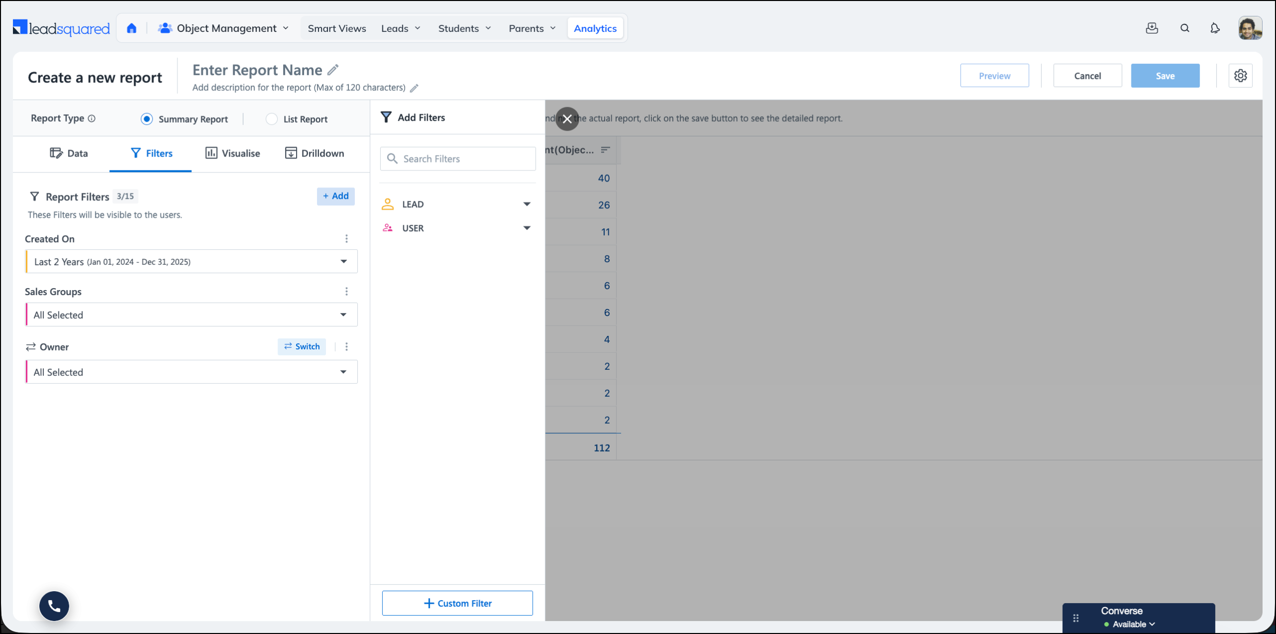
This section lets you add fields as filters in your report. For each data source, there are a set of mandatory filters that must be added.
- The + Add button opens all fields corresponding to the Data Source. For example, the Activity Data Source will contain all Lead Fields and Standard Activity Fields, along with System User Fields.
- Only Date and String (Dropdown + Text) fields are allowed.
- Users can change the name of the filter by clicking on the dot menu.
- The Filter section also has a set of mandatory filters that come with the data source.
- The maximum permissible number of row groupings is 15.
- To remove a field from column grouping, click the cross icon.
- To add a column grouping, click on the + Filter option.
- Users can change the display name of the filter.
6.1 Custom Filters (Filter Linking and Merging)
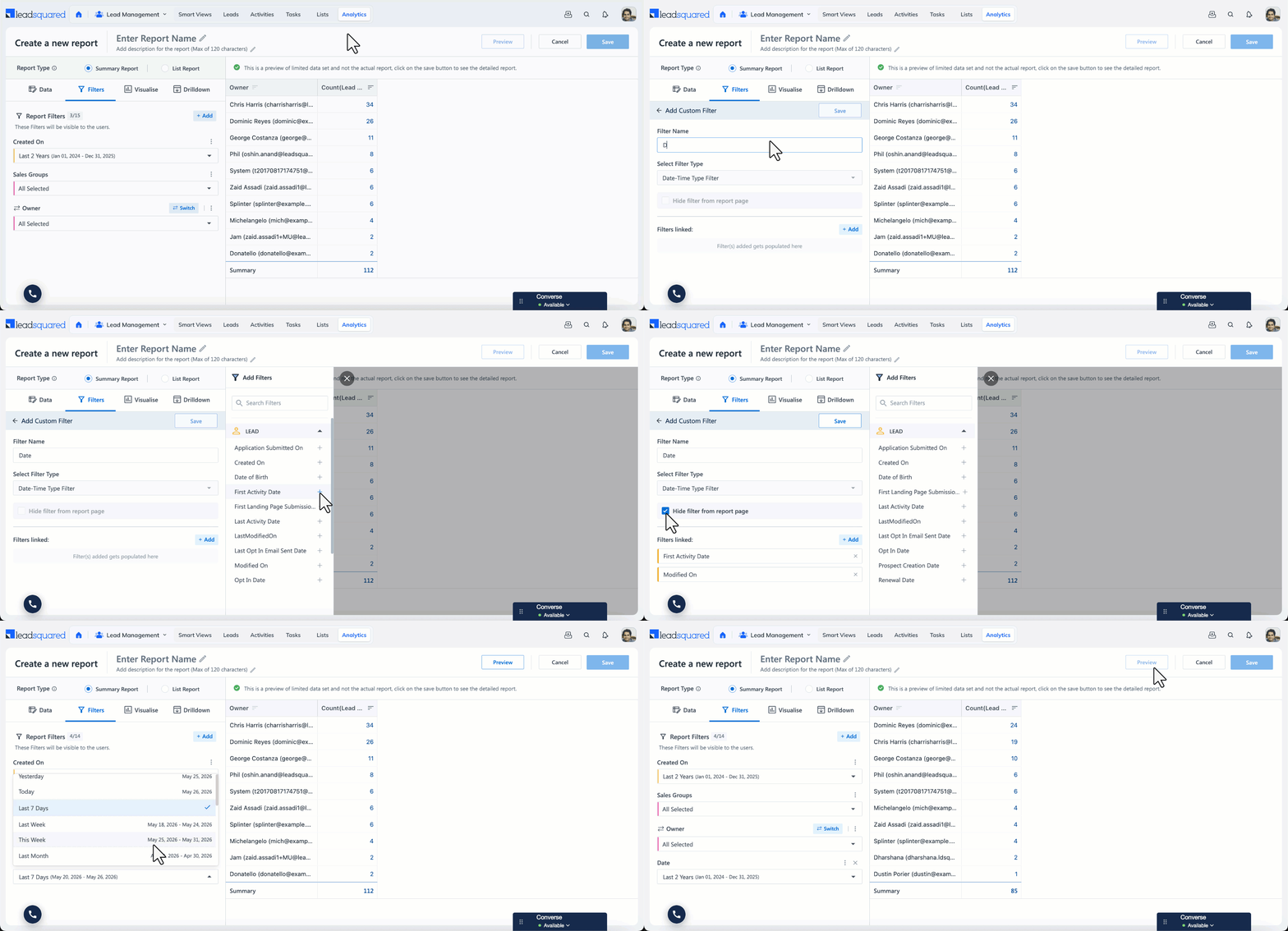
The Add Custom Filter option lets you merge multiple filters of the same data type into a single filter. This is useful when you want users to apply the same value (for example, the same date range) across multiple fields without updating each filter individually.
There are two ways to create a custom filter:
6.1.1 Create a new custom filter
- In the Filters section, click + Add, and select + Custom Filter.
- Enter a name for the filter (for example, Date).
- Under Select Filter Type, choose the data type (currently, only Date-Time Type Filter are enabled).
- Search for and add the fields you want to merge into this filter (for example, First Activity Date and Modified On lead fields).
- When you want a custom filter to apply a fixed value without allowing users to change it, select the Hide filter from report page option. The filter will be hidden from users viewing the report, while the configured value continues to apply
- Click Save.
The selected fields are now combined into one filter. Updating the value on this filter applies it to all the linked fields.
6.1.2 Link fields to an existing filter
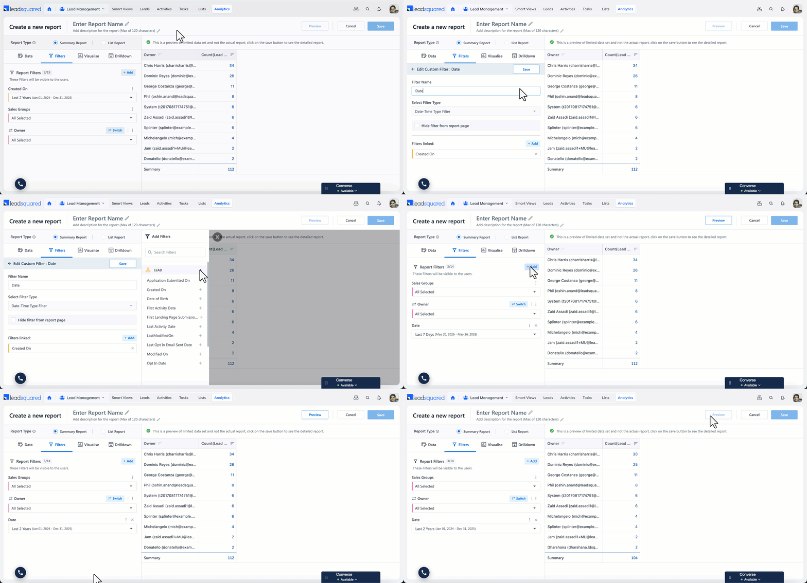
Mandatory filters (such as Created On) cannot be removed from the report. To merge other fields with a mandatory filter:
- Click the Edit icon next to the mandatory filter.
- Search for and add the other date fields you want to link (for example, Modified On).
- Rename the filter if required (for example, Date).
- Click Save.
6.2 Custom Filters and Sub-Query Filters
If a sub-query filter has been popped out to the main report (using the Show this filter in report option inside the sub-query), it cannot be merged with other filters using a custom filter.
To merge a sub-query filter with other filters in the main report, do not pop it out from the sub-query. Instead, leave the Show this filter in report checkbox unchecked inside the sub-query, save the data source, and then add the field through Add Custom Filter in the main report’s Filters section.
7. Visualise
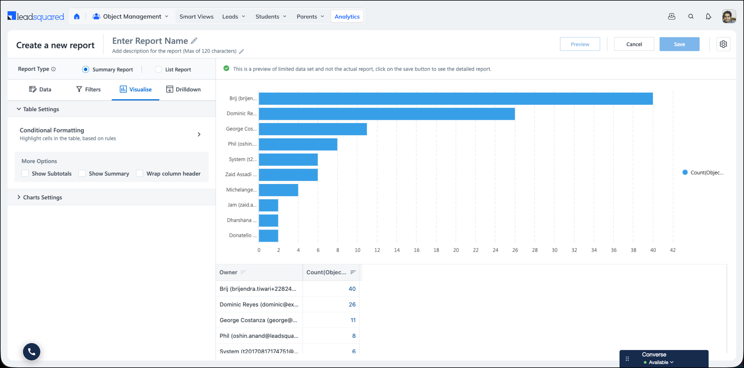
The Visualise section controls how your report output is presented. It has two parts:
- Table Settings – Controls the appearance of the report table, including conditional formatting, subtotals, and summary rows.
- Charts Settings – Lets you add a chart to the report. The axes of the chart depend on the Groupings and Values configured in the Data section.
7.1 Table Settings
7.1.1 Conditional Formatting
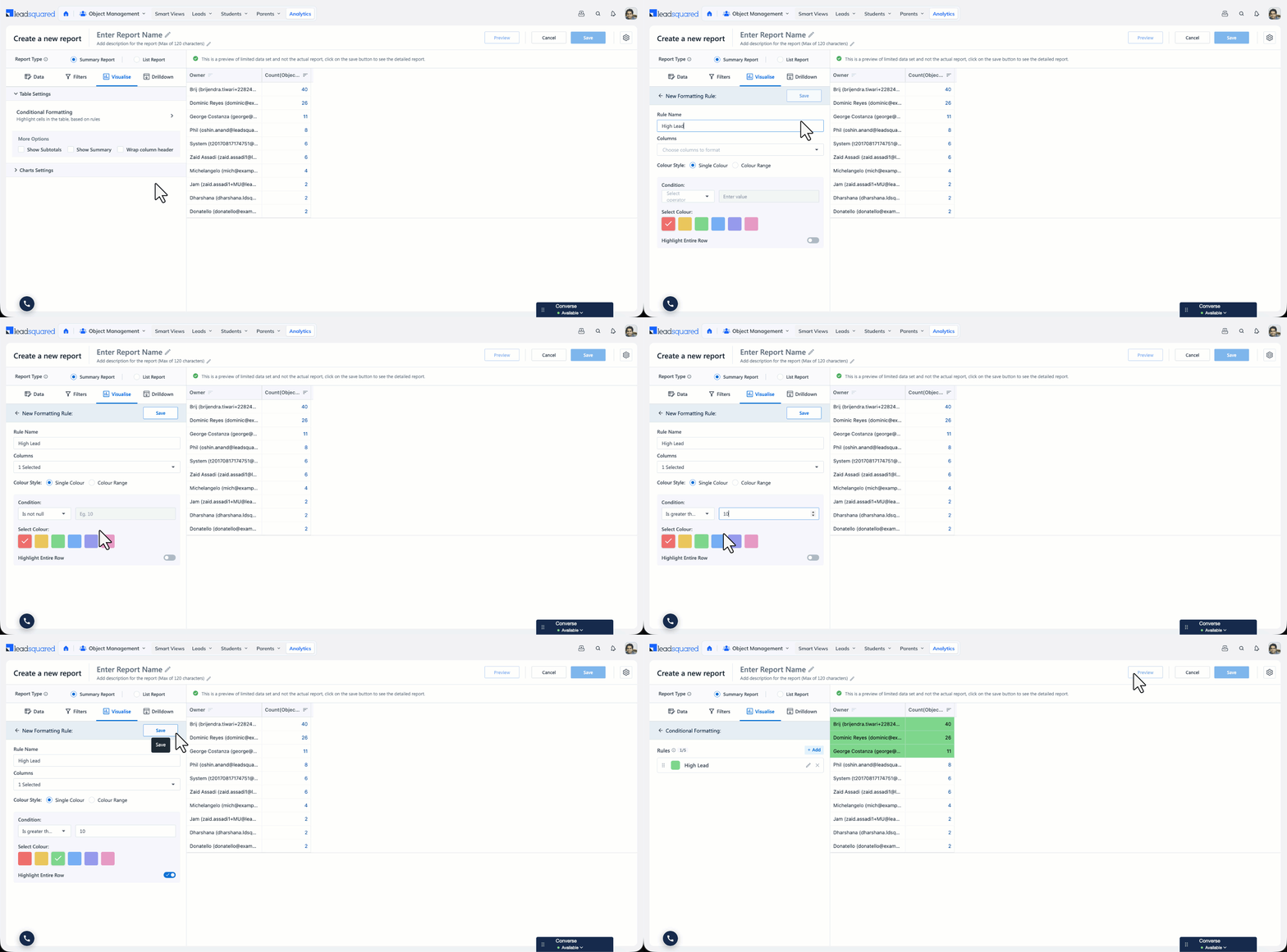
Conditional formatting highlights cells in the report table based on rules you define, so that values needing attention stand out. For example, you can highlight every month where the number of leads created crosses a threshold.
Note:
- Conditional formatting applies only to the table view of a report. It does not apply to charts.
- You can select up to five columns in a rule.
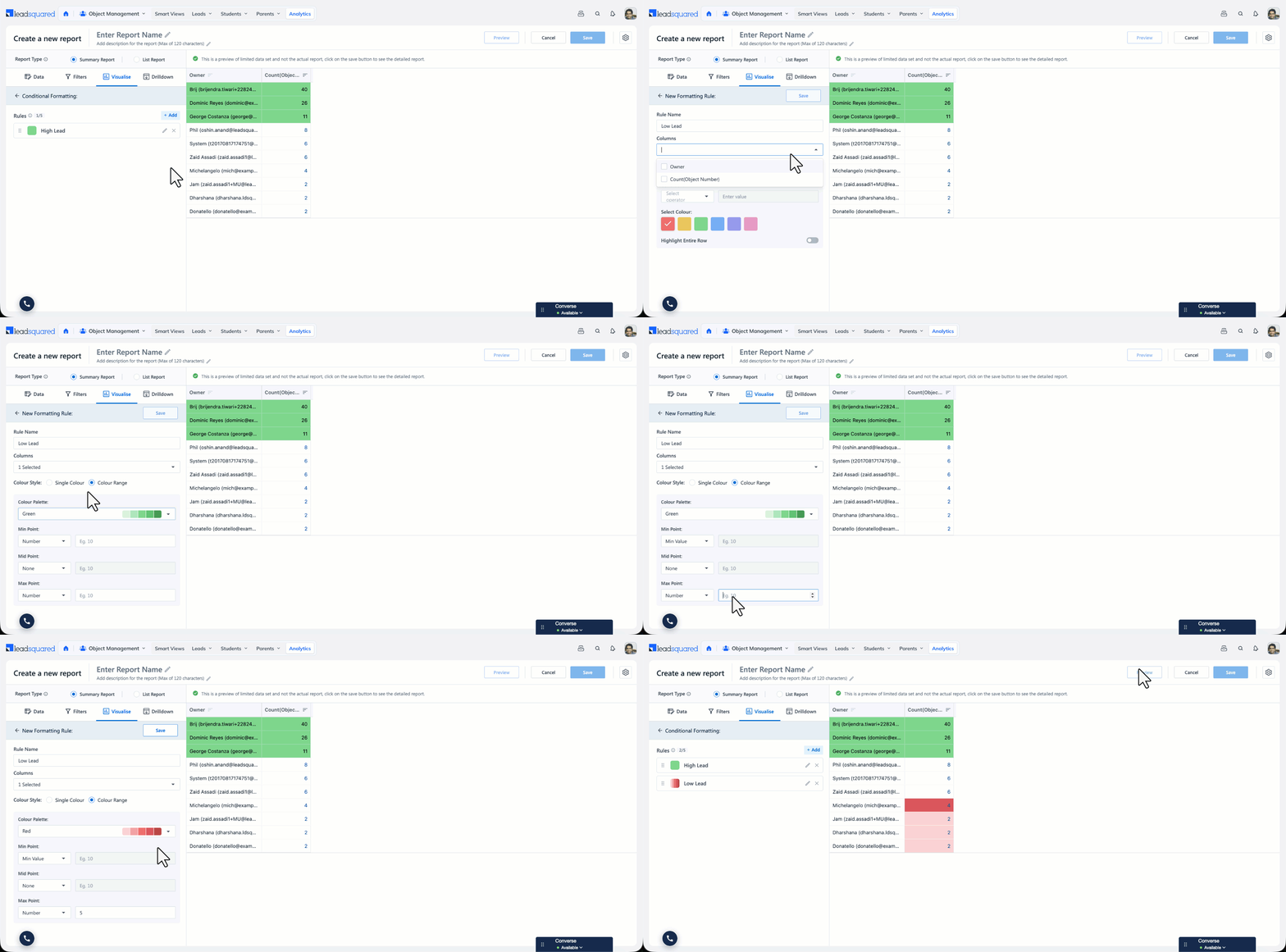
To create a formatting rule:
- In the Report Builder, go to the Visualise
- Expand Table Settings, and click Conditional Formatting.
- Click Add Rule, and enter a name in the Rule Name field (for example, High Lead Volume).
- Under Columns, select the columns you want to format (for example, Count(Prospect Id)).
- Under Colour Style, select Single Colour or Colour Range, and configure it as described below.
- Click Save, and then click Preview to see the formatting applied to the table.
Single Colour
Use Single Colour when you want the same colour applied to every cell that meets one condition.
- Under Condition, select an operator, and enter a value
- Is equal to – Matches the value you enter
- Is not equal to – Does not match the value you enter
- Is greater than – Is higher than the value you enter
- Is less than – Is lower than the value you enter
- Is null – Is empty
- Is not null – Contains any value
- Under Select Colour, choose a colour for the highlight.
- To extend the highlight from the matching cell to the whole record, enable Highlight Entire Row. This applies at row level, so all columns in that row are highlighted even when the rule is set on a single column.
Colour Range
Use Colour Range when you want the intensity of the colour to reflect the size of the value. Darker shades indicate higher values, which makes it easy to spot the periods or records that contribute the most.
- Enter the minimum and maximum values for the range.
- Enter a midpoint value, or leave it blank to let Analytics calculate it from the minimum and maximum.
- Under Select Colour, choose the colour for the range.
Conditional Formatting on Dashboards
When you add a report that has conditional formatting to a dashboard as a table widget, the formatting is carried over to the widget.
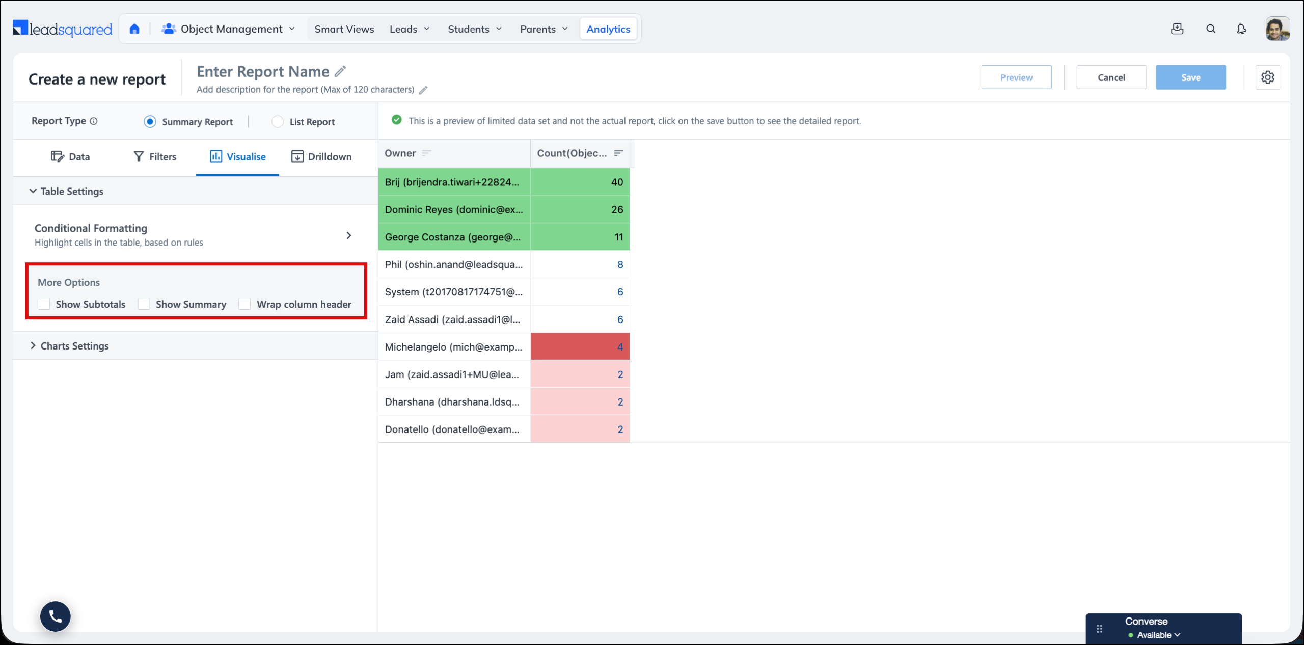
7.1.2 More Options
The following table options are available under Table Settings:
- Show Subtotals – Displays subtotal rows for each row grouping.
- Show Summary – Displays a summary row with the totals for the measures in the report.
- Wrap column header – Wraps long column headers across multiple lines instead of truncating them.
7.2 Charts Settings
Charts Settings lets you add a chart to your Summary Report. The axes of the chart depend on the Groupings and Values configured in the Data section. The default chart selected is No Chart.
The charts supported are:
| Chart | Description |
| Bar Chart | Compares a measure across categories using horizontal bars. Useful when the category names are long. |
| Column Chart | Compares a measure across categories using vertical bars. Useful for comparing values across a small number of periods. |
| Line Chart | Shows how a measure moves across a continuous grouping, usually a date field. Useful for spotting trends. |
| Area Chart | A line chart with the area below the line filled in, which emphasises the volume behind the trend. |
| Pie Chart | Shows each category’s share of the total. Useful when the report has a small number of categories. |
| Donut Chart | Shows each category’s share of the total, with a hollow centre. |
| Funnel Chart | Shows how a measure moves through the stages of a process, and the drop-off between one stage and the next. |
| Combo Chart | Plots two or more measures in a single chart, with a chart type and an axis for each measure. |
Attributes such as Show Data Labels, Show Shared Tooltips, and Hide Legend can be applied from the chart attributes. Attributes such as Stacked and 100% Stacked are available for bar, column, line, and area charts. Attributes such as Show Percentages are available for pie and donut charts.
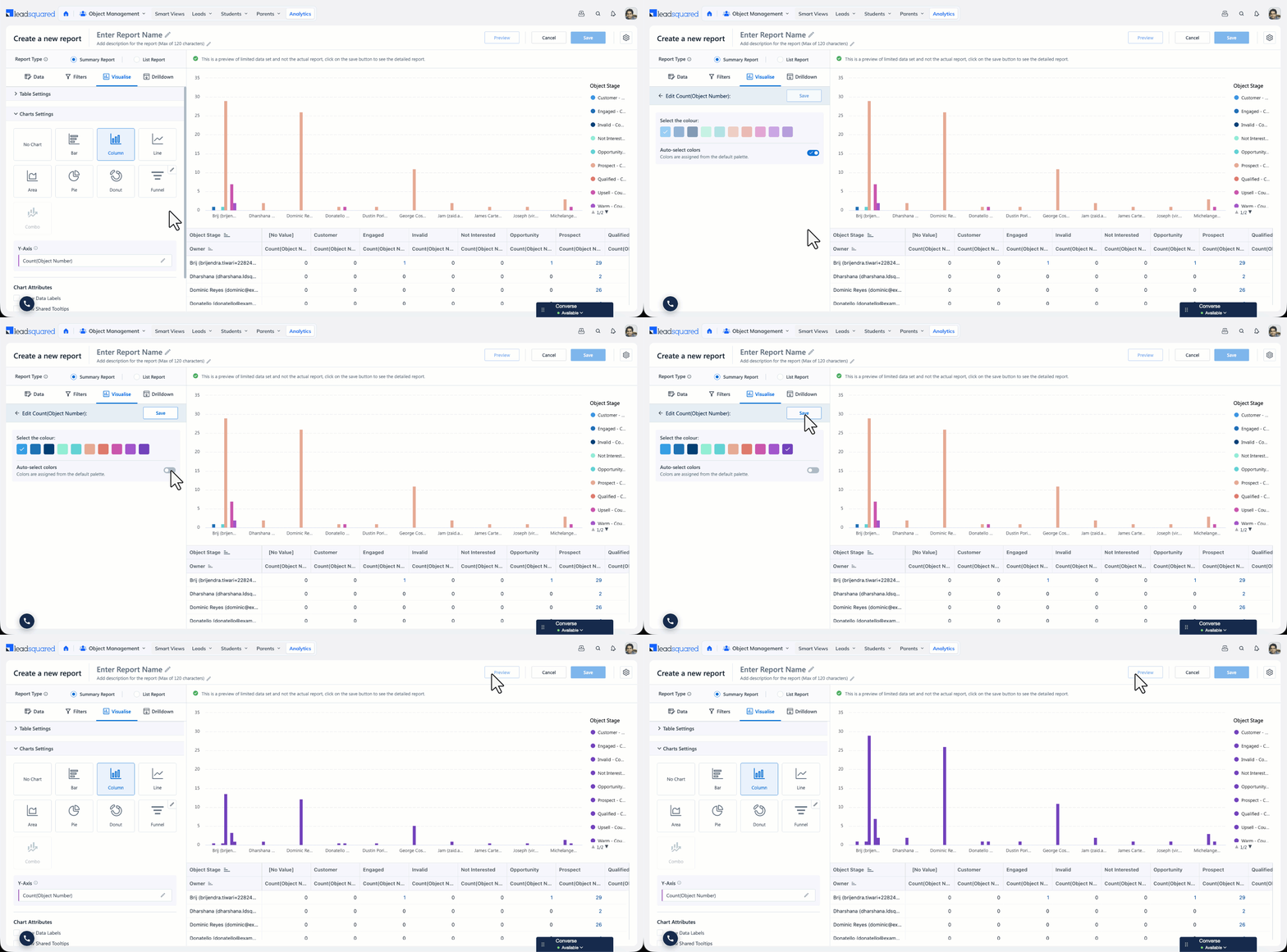
7.2.1 Chart Colours
You can control the colours of a chart. How you do this depends on the chart type, because some charts render one series per measure while others render one segment per value of the grouping field.
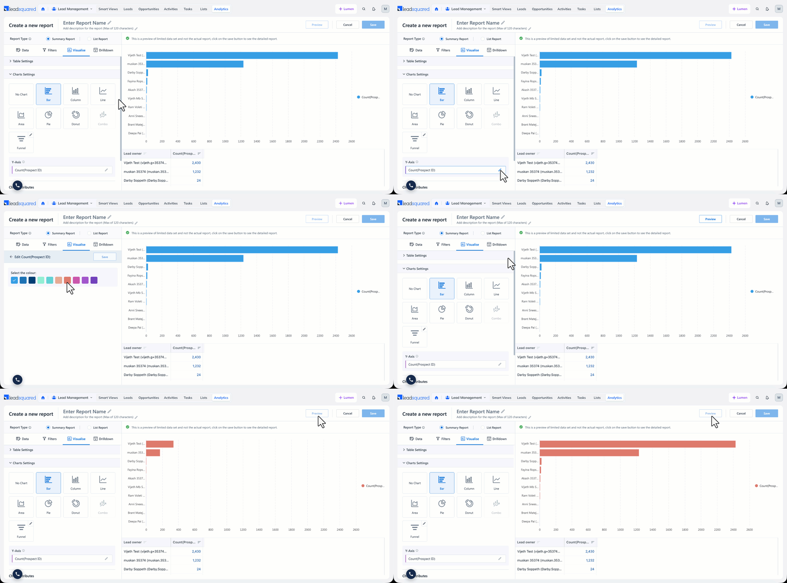
Bar, Column, Line, Area, and Combo charts
These charts render one series per measure, so you set a colour against each measure:
- Under the Y-axis, click the Edit icon next to the measure.
- Under Select the colour, choose a colour.
- Click Save, and then click Preview to see the chart.
When the report has more than one measure, each measure has its own colour option.
Pie, Donut, and Funnel charts
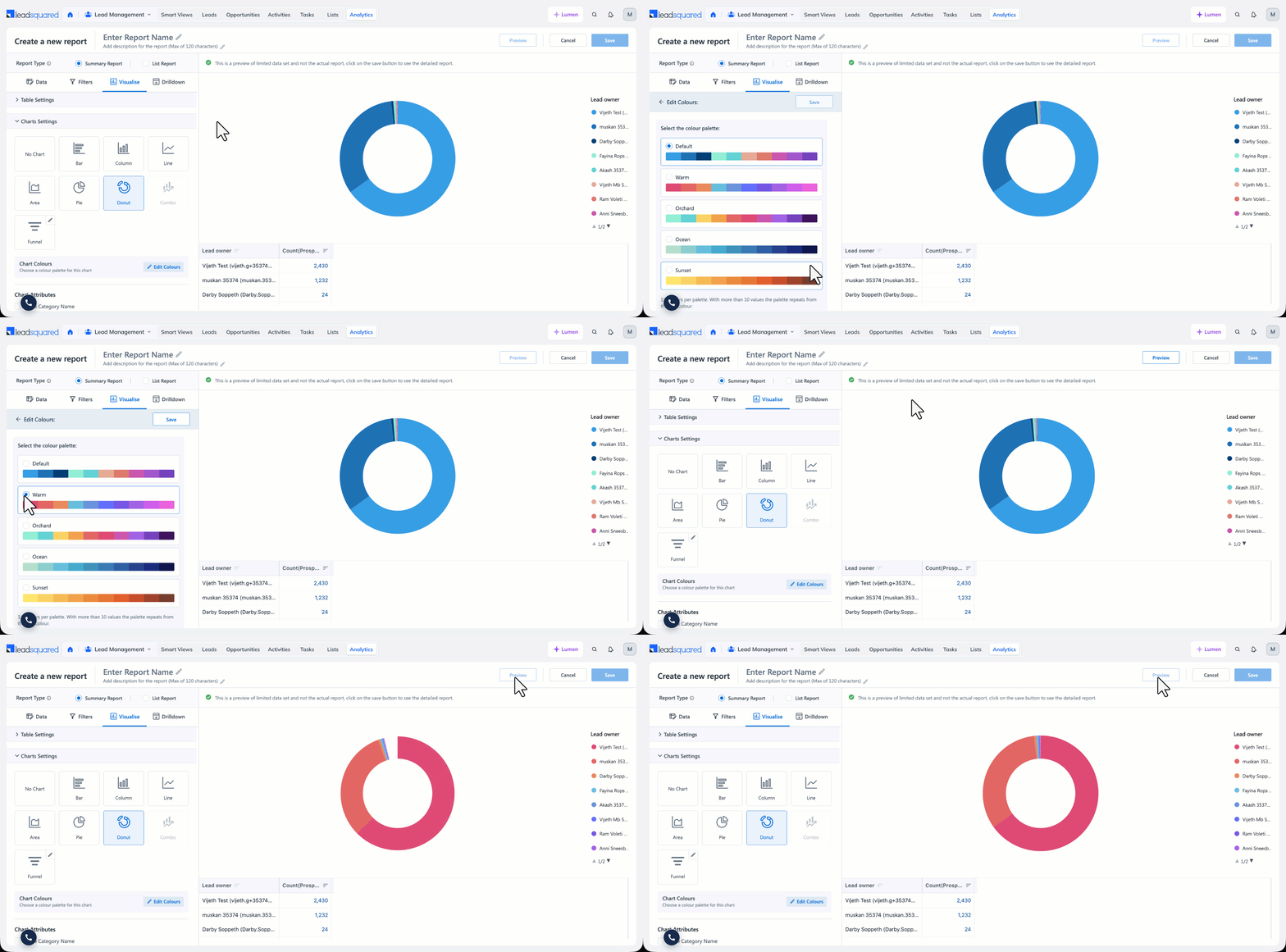
These charts render one segment for each value of the grouping field, such as one segment per lead owner. The number of values differs from one account to another, so analytics cannot resolve a colour against an individual value. Instead, you apply a colour palette to the whole chart.
- In the Visualise section, expand Charts Settings, and select Pie, Donut, or Funnel.
- Under Chart Colours, click Edit Colours.
- Select a palette. The available palettes are Default, Warm, Orchard, Ocean, and Sunset.
- Click Save, and then click Preview to see the chart.
Charts with a column grouping
When a column grouping is applied to the report, each series in the chart represents a value of the column-grouping field, such as each lead stage. Since the number of values differs from one account to another, analytics assigns these colours automatically and Auto Select stays on.
If you select a colour against a measure and save it, Auto Select turns off and the chart uses your measure colours instead. The chart then no longer distinguishes the column-grouping values by colour. Choose the option that suits what the report needs to show:
- To distinguish the column-grouping values, such as each lead stage, leave Auto Select on.
- To distinguish the measures from each other, select a colour against each measure and let Auto Select turn off.
Note: Setting a colour against an individual column-grouping value, such as a fixed colour for one lead stage, is not supported.
7.2.2 Funnel Chart
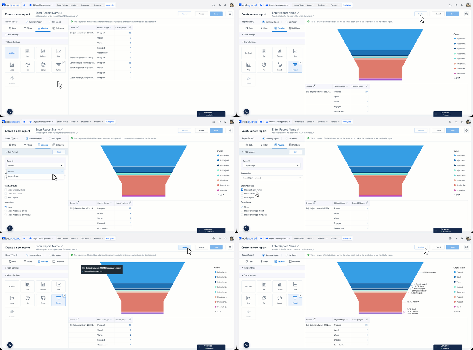
Select Funnel to see the drop-off across the stages of a process. Select the field that holds the stages under Rows (for example, Lead Stage), and the measure to plot under Select value (for example, count of leads).
Under Percentages, select how the percentage against each stage is calculated:
- None – No percentages are displayed.
- Show Percentage of First – Calculates the percentage of each stage against the first stage in the funnel.
- Show Percentage of Previous – Calculates the percentage of each stage against the stage immediately before it.
Note:
- A funnel chart supports one dimension and one measure. Remove any additional groupings from the report before selecting Funnel.
- Stages with no value against them are not shown in the funnel.
- To hide a stage from the funnel, click the stage in the legend. To bring it back, double-click it in the legend.
7.2.3 Combo Chart
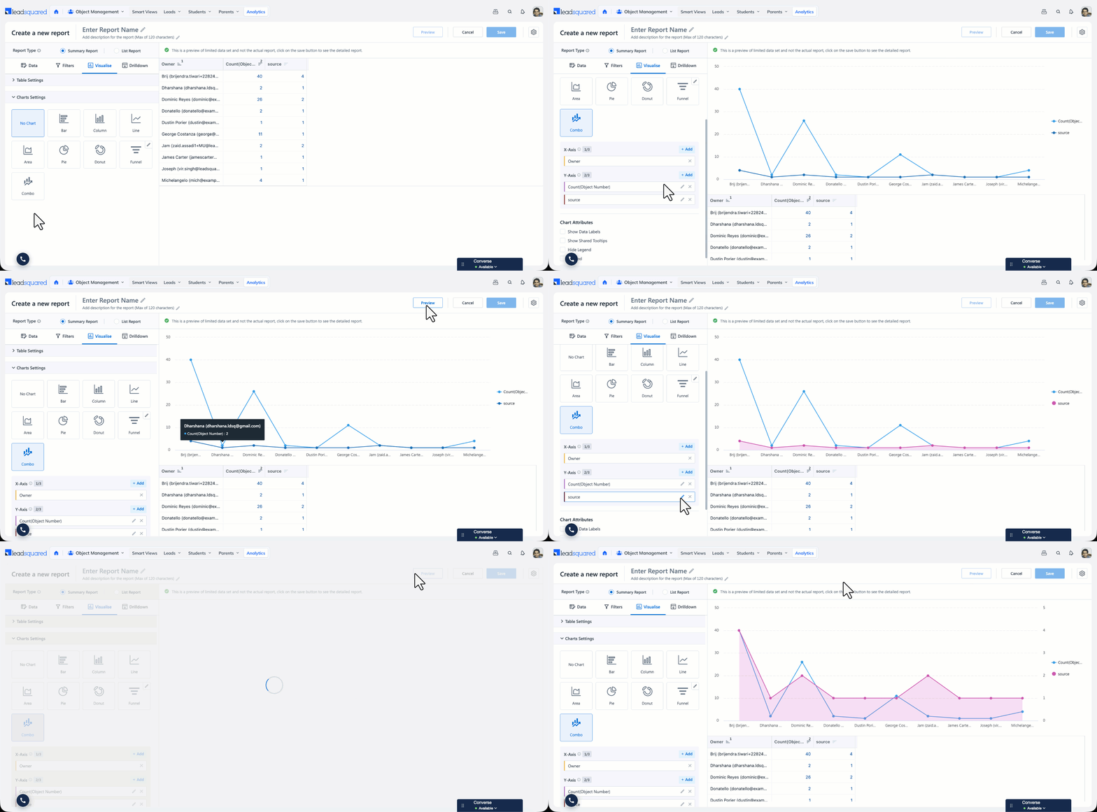
A Combo Chart plots two or more measures in a single chart, and lets you display each measure using a different chart type. For example, in a report grouped by month, you can show the count of leads created as a column chart and the number of sources those leads came from as a line chart in the same visualisation, instead of choosing one chart type for both. Combo charts are useful when the measures in your report are on different scales.
To configure a Combo Chart:
- In the Visualise section, expand Charts Settings, and select Combo.
- Under X-Axis, click + Add, and select the field to plot.
- Under Y-Axis, click + Add, and select the measures to plot.
- Click the Edit icon next to a measure to configure it –
- Select the colour – Sets the colour used for this measure in the chart.
- Display Type – Sets the chart type for this measure. Available types are line, area, and column.
- Y-axis Position – Sets the axis this measure is plotted against. Auto plots all measures on a single shared axis, so the scale is an aggregate of all the measures and is not specific to any one of them. Left and Right plot the measure against a dedicated axis, so each measure can be read on its own scale.
- Click Save and then click Preview to see the chart.
Note:
- You can add up to 3 fields on the X-axis and up to 3 measures on the Y-axis.
- Combo charts require at least two measures in the Values section of the Data tab.
- When two measures share the Auto setting, the axis values do not identify which measure they belong to. Assign one measure to the Left axis and the other to the Right axis for clearer reading.
8. Drilldown
8.1 Configure Drilldown
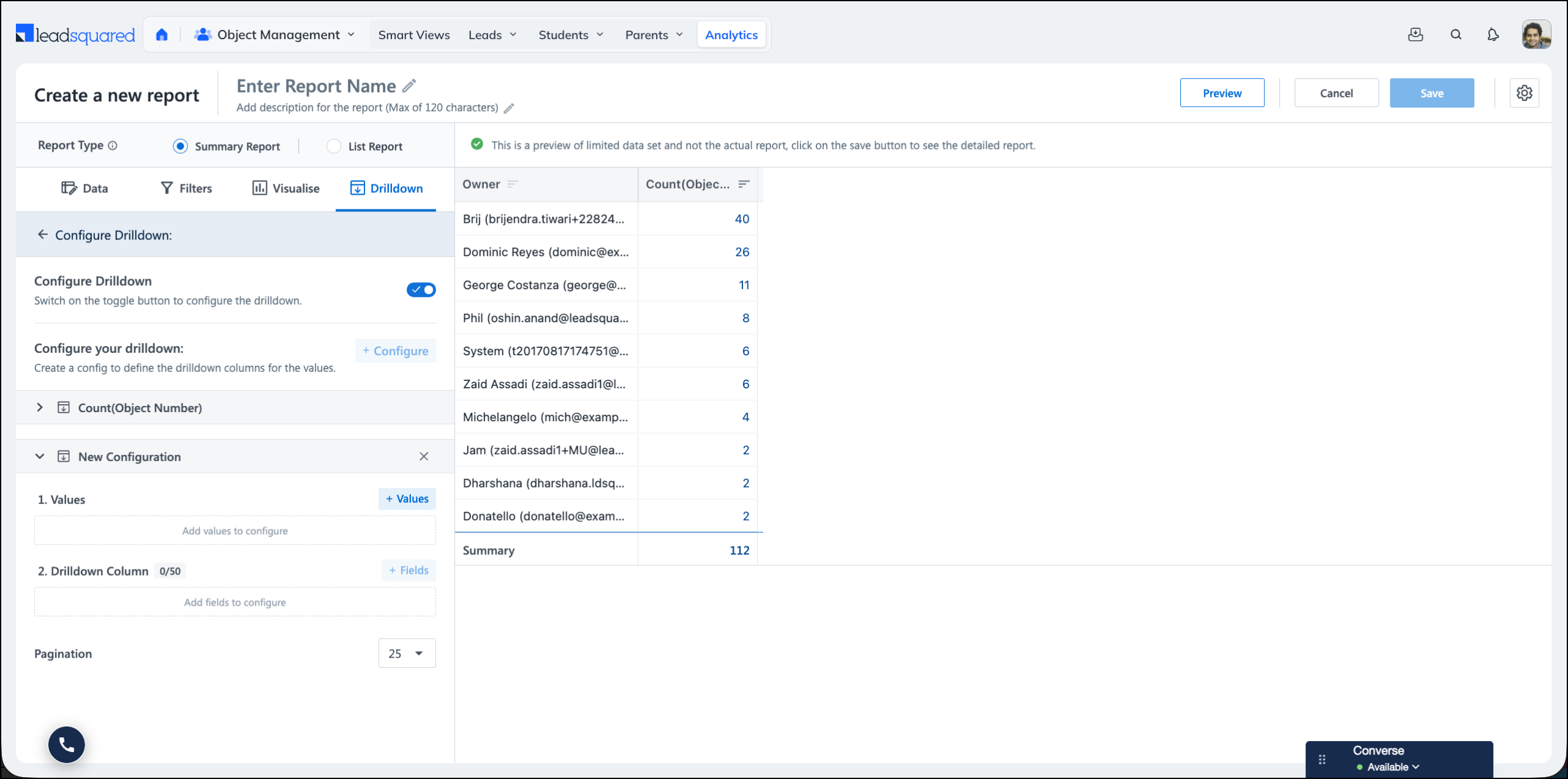
The Drill-down Configurator allows admins to customize columns for measures used in Summary Reports. By default, the Drilldown section is enabled with default mappings. The admin can deselect any measure and add a custom drill-down for it by clicking + Configure.
- Measures are grouped by entity, and selecting a measure disables columns from child entities (for example, for Lead measure, Activity columns cannot be configured).
- If no columns are mapped for a measure, users can’t drill down on it.
- Pagination of drill down can also be set by the admin while creating the report.
- Admins can sort columns, apply custom formatting to number and date-time fields, and change the display name of all the columns.
- For calculated measures (measures that use arithmetic operations), drill-down configuration is not allowed.
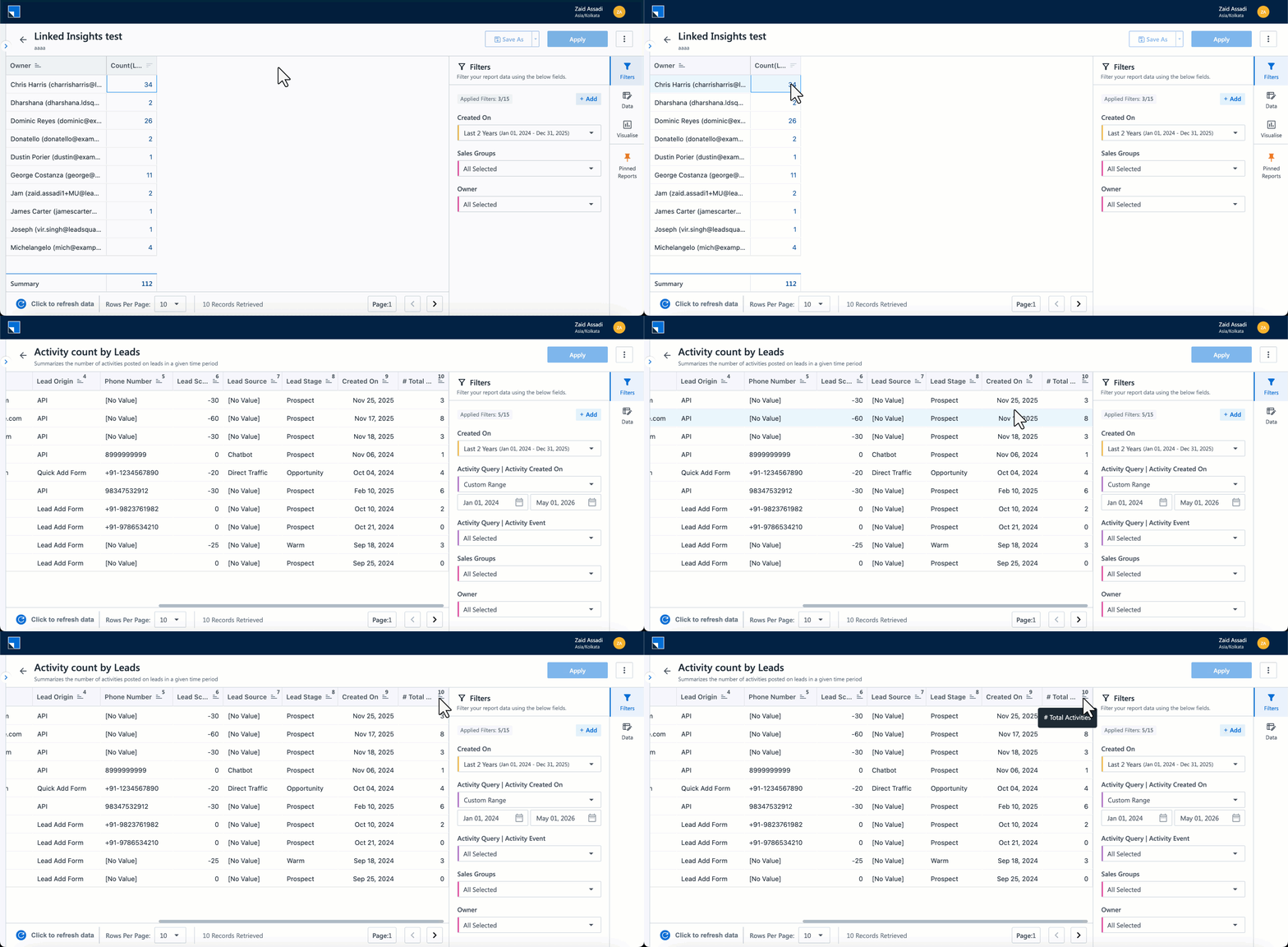
8.2 Configure Linked Insight
Linked Insights lets you connect a source report to a target report. When a user clicks a measure value in the source, the target report opens with matching dimension context and filters applied automatically.
Learn more here: Linked Insights on Analytics Report Builder.
9. Preview
The Preview button will preview the report output. This will be limited to the first 10 results only.
10. Report Settings
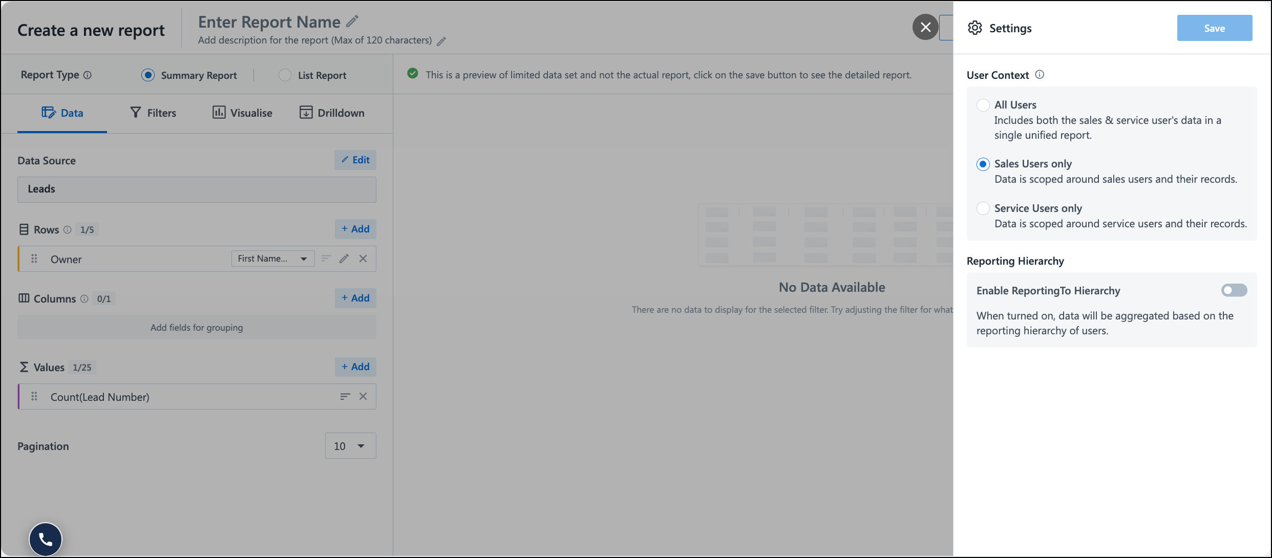
The Report Builder includes a settings panel that lets you configure report-level options. To access it, click the gear icon next to the Save button in the Report Builder.
The following settings are available:
10.1 User Context
User Context controls which users are included in the report when measures and fields are tied to users (such as Lead Owner, Activity Owner, or User ID). Select one of the following options:
- All Users – Includes both sales and service users.
- Sales Users Only – Includes only sales users.
- Service Users Only – Includes only service users.
Note:
- The User Context setting appears only in tenants where both Sales and Service modules are enabled. It is not visible in sales-only or service-only tenants.
- User Context is configured at the report level. Different reports in the same account can have different User Context settings.
When a report includes user-tied data, the User Context setting determines which users from the directory are included in the result set. For example, if a report row shows the owner name against a Prospect ID count, a service user appearing under All Users will show a zero value, since service users own tickets rather than leads.
This makes the choice of User Context dependent on what the report is meant to show:
- If you want to see only users with actual measure values against them, choose the relevant user type (Sales Users Only or Service Users Only).
- If you want to see all users in the tenant, including those with zero values against a specific measure, choose All Users.
Use cases
- Attendance report – An admin wants to track login, check-in, and check-out for all users in the tenant, regardless of whether they are sales or service. Set User Context to All Users.
- Lead activity report – An admin wants to track lead-related measures only for sales users. Set User Context to Sales Users Only to exclude service users (who would otherwise appear with zero values).
- Reports based on data sources where the user type is not clear – Some data sources (such as Converse) include user activity that is not strictly tied to sales or service. User Context lets the admin scope the report to the relevant user set.
10.2 Reporting Hierarchy
The Reporting hierarchy section in a report’s settings controls whether data is shown per individual user or rolled up across a manager’s team.
The behaviour depends on the toggle state:
- When the toggle is off, each user appears in the report with only the records they own. A manager and the people who report to them are shown as separate rows, and a manager’s figures do not include their team’s records.
- When the toggle is on, data is aggregated based on the reporting hierarchy of users. A manager’s row includes their own records along with the records owned by the users who report to them, so the report reflects team-level totals instead of individual-only totals.
This setting relies on the Reporting To relationships configured for your users. If a user has no one reporting to them, turning the toggle on does not change their figures.
Any Questions?
Did you find this article helpful? Please let us know any feedback you may have in the comments section below. We’d love to hear from you and help you out!
I have created a Siera report. How to give the same report access to other users
Hi. If you’re an Admin user, you can use the Profiles feature to assign reports and dashboards to users, groups, teams, or roles.
How to share the created reports to a particular user in LSQ?
Hi. You can share reports to a particular user in LeadSquared by using the Report Management feature. Here, you can set the sharing criteria to “User/Teams/Groups/Roles” and assign that profile (with the report) to the intended user.
For full steps, refer to this article: Report Management.
Is there any dynamic date filter available that we can apply to multiple date fields, for example on a fetch rolling level data, to reference data across multiple columns?
Hi. At present, this isn’t available. But I’ve passed it on as a feature request to the team.
Can we schedule a SIERA report?
Hi, Aman. The feature to schedule reports in SIERA isn’t available yet but is expected to be released soon.
Update: You can now schedule reports on SIERA. Please refer to this article for more details: Scheduling Reports on SIERA.
How to edit a custom report that I created?
Hi, Ananthu. Navigate to SIERA>All Reports and select and open your custom report. You should be able to edit your report from here.
Hi Zaid,
I need to edit the custom expression that I have created, it’s not happening.
Could you please detail your issue in an email to siera.support@leadsquared.com? We’ll get back to you quickly and help you resolve it.