


Get Started
Sales Suite
Field Ops
Marketing
Service CRM
Integrations & Apps
FloStack
Create Portals with Multiple Web Pages
1. Feature Overview
This article shows you how to add multiple web pages (home page, contact us page, application dashboard, etc.) to your LeadSquared Portals, using the Portal Designer. You can also make logins compulsory to view certain pages. This can be used for application and user profile pages.
2. Prerequisites
Portals Designer is part of the Portals feature. To enable Portals on your account, please write to support@leadsquared.com.
3. Getting Started
To create a new page –
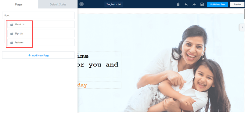
- On the Portal Designer page, on the top-left corner, click the
 icon.
icon. - On the Pages tab, click Add New Page.
- Enter relevant details in the following fields –
| Field | Description |
| Name | The name of the page. This is visible on the Portal Designer. This field is mandatory. |
| Title | The title of the page. This is visible on the published portal, and can be seen by anyone who’s on the website. This field is mandatory. |
| Parent Page | The parent page to which the new page will be linked to. You can select the Parent Page from the list of pages available on the dropdown. |
| URL | The page’s URL slug. This will be visible in the browser, and the URL can be used to access the page directly. For example, the URL of a ‘Contact Us’ page can be written down as ‘contact-us’. This field is mandatory. |
| Requires Login | If you want to enable login on this page, toggle the  slider. If this feature is turned on, then a User Profile icon is added to the top-right corner of this section. slider. If this feature is turned on, then a User Profile icon is added to the top-right corner of this section. |
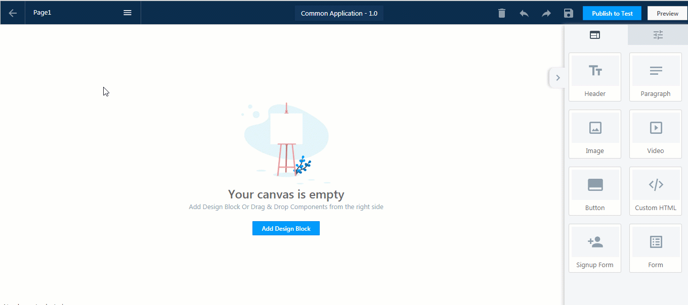
4. Once you’ve entered all the necessary details, click Add. You’ll get a message saying ‘Page Created Successfully’.
You can create a new webpage by cloning an existing portal page. This will retain the structure of the original page, and you can change the content within the page as per your requirement. To clone a portal page –
- On the Portal Designer, click the icon on the top of your screen.
- On the Pages tab, against the page you want to clone, hover your cursor over the
 icon.
icon. - From the dropdown options, click Clone.
- On the Add New Page tab, enter the relevant details, and click Add. You’ll get a message stating, “Page Created Successfully”.
4. Configurations
Here you can customize the font and accent colours for text content across all pages. Changes made here are applied at the global level, eliminating the need for you to customize each section on each page. It helps apply uniform and consistent fonts and colours across the entire portal.
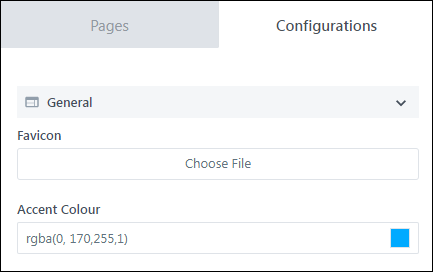
4.1 General
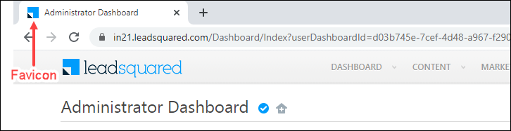
- Favicon – Upload a relevant icon for the portal, which will show up as the favicon on a browser window. To add a favicon, click Choose File.
- Accent Colour – Select the font colour for all the form section headers and buttons on all the pages, from the gradient screen, or enter the hex code for a specific colour.
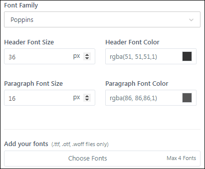
4.2 Text & Fonts
Customize the font type, font colour and font size for header and paragraph text across all the portal pages.
You can also add up to four custom fonts of your choice. Click Choose Fonts to import the font file. Only the following custom fonts file formats are accepted – .ttf, .otf, and .woff.
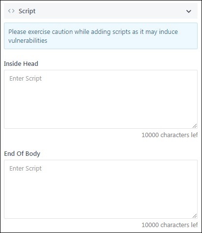
4.3 Script
Here you can add custom JavaScript for any of the following use cases –
- Analytics and Third-party Tracking Scripts – Google Analytics Script, Google Tag Manager, FaceBook Pixel, etc.
- Portal Component Modifications – If default configurations are not present in the designer, you can use custom scripts to modify UI elements on the page (e.g., form length, form fields, etc.).
- Perform Actions on Lead Engagement – Show a popup on lead login, post an analytics event on lead form submission, etc.
5. User Profile
When you turn on the Requires Login setting for a page, the page will be marked with a lock  icon. Pages requiring login will not be accessible to users until they successfully log in to the portal.
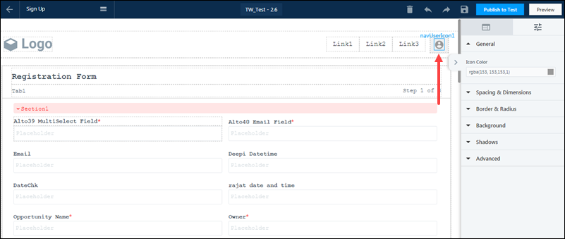
All pages requiring login will automatically display a User Profile  icon. Click on the icon to customize it.
5.1 General
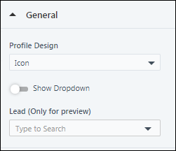
- Profile Design – The appearance and design of the User Profile icon. The following options are available –
- Icon – Only the icon will appear. You can customise the icon colour by clicking the icon, and select the colour from the gradient screen, or enter the hex code for a specific colour.
- Icon&Name – The icon, along with the lead’s name will appear. You can customise the icon colour by clicking the icon, and select the colour from the gradient screen, or enter the hex code for a specific colour. You must configure the mail merge field, for the lead’s name to show up. To configure the name field mail merge value, double tap on the existing value, and make changes.
- Name – Only the lead’s name will show up here, without any icon. You can customise the icon colour by clicking the icon, and select the colour from the gradient screen, or enter the hex code for a specific colour. You must configure the mail merge field, for the lead’s name to show up. To configure the name field mail merge value, double tap on the existing value, and make changes.
- Avatar&Name – To add a lead’s avatar to the User Profile, you must add a mail merge value. This will pull the relevant image and display it alongside the lead’s name. To configure the name field mail merge value, double tap on the existing value, and make changes.
- Avatar – To add a lead’s avatar to the User Profile, you must add a mail merge value. This will pull the relevant image and display it.
- Show Dropdown – If you want the User Profile actions to be visible under the icon, you must enable this setting by toggling the slider.
- Lead (Only for preview) – You can select a lead to preview the user profile icon.
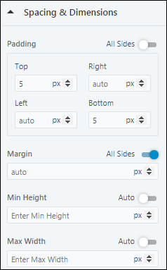
5.2 Spacing & Dimensions
- Padding – Set the padding for the User Profile icon. If you want the padding dimensions to be applicable on all sides of the icon, against All Sides, toggle the slider.
- Margin – Set the margin width for the User Profile icon. If you want the margin to be applicable on all sides of the icon, against All Sides, toggle the slider.
- Min Height – Set a minimum height for the User Profile icon. If you want the height to be set automatically, against Auto, toggle the slider.
- Max Width – Set the maximum width for the User Profile icon. If you want the height to be set automatically, against Auto, toggle the slider.
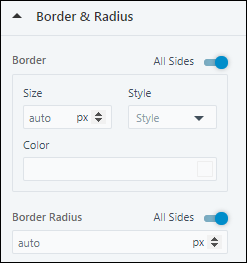
5.3 Border & Radius
- Border – Set the size, style and colour for the border around the User Profile icon. If you want the border to be applicable on all sides of the selected layout, against All Sides, toggle the slider.
- Border Radius – Set the radius for the border around the User Profile icon. If you want the border radius to be applicable on all sides of the layout, against All Sides, toggle the slider.
5.4 Background
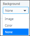
You can either choose to leave the background of the User Profile icon blank, or set an image or a background colour.
- To set the background colour, from the dropdown, select Color. Then, choose a colour from the gradient screen, or enter the hex code for a specific colour.
- To add an image, from the dropdown, select Image. Then, click on Choose Image to choose an image from your Image Library.
- To leave the background blank, from the dropdown, select None.
5.5 Shadows
Set a shadow for the icon.
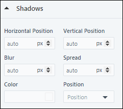
5.6 Advanced
- Opacity – Set the opacity for the User Profile icon.
- Hide on Mobile – To hide the User Profile icon on a mobile device, toggle the slider.
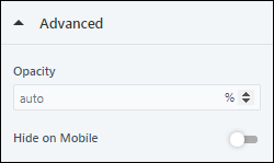
6. Applications
You can add ready to use application blocks to your portal. To know more, see How to Show Activity Status in Portal Dashboard.
Each application can be added as a content block that shows some basic information related to the application (name, type, created on date, etc.) the status (pending, completed, etc.), and available actions (view, continue, etc.). Once an application block is added you must integrate an activity or opportunity. The associated activity/opportunity form will be launched, and the user can fill in the relevant details.
- Hover your cursor on a particular section, then click the
 Add Block button.
 - From the Add Block pop-up, click Application, and then select a relevant layout for your page.
- Select either an activity or an opportunity that you’re looking to integrate. Fields corresponding to the selected activity or opportunity will become for mail merge within the application items.
- After you’ve selected the item to integrate, select the activity or opportunity type.
- Then, configure the Display Rules and Application Properties.
6.1 Display Rules
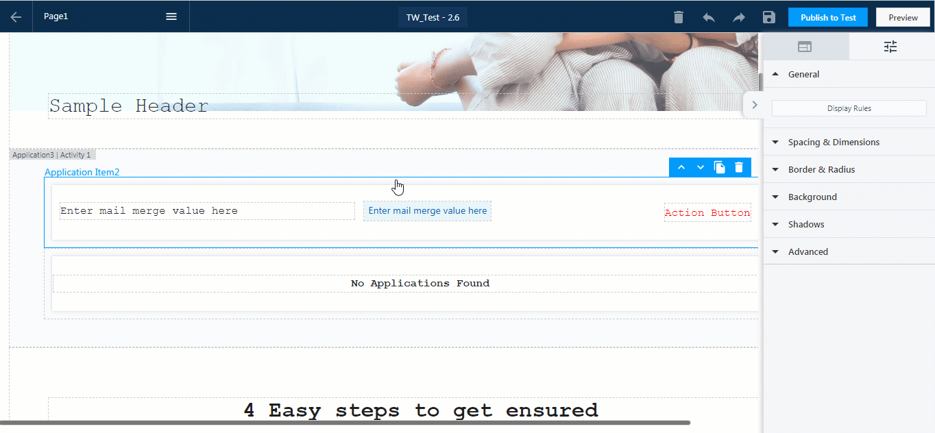
Display rules allow you to configure which application boxes you want to display to your users, based on field values or combination of field values. In this example, we’re configuring two application boxes, one to be displayed when the application status is ‘Inactive’, and the other one to be displayed when the status is ‘Active’.
- Configure the application item.
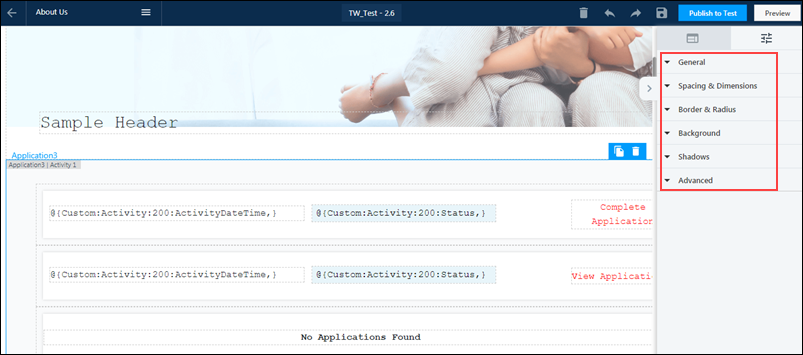
- Set the mail merge values you want to display within the application item. For example, status, created on date, etc. To add mail merge values, you’ll have to begin with ‘@’.
- Next, set the action buttons you want to display. For example, on a pending application, the button can display ‘Finish Application’ or ‘Continue Application’, and direct the user to the application form.
- Once the application items are configured, set the Display Rules.
- Stay on the Application Item box, and from from the right panel, under General, click Display Rules.
- On the Dashboard Item Display Rules pop-up, select the field and the values based on which you want the application items to be displayed. You can add a combination of fields and values, based on which the items can be displayed. You can choose to apply All the rules or Any of the rules.
- Once you’ve set the display rules, you must then configure the application properties.
6.2 Application Properties
- General
- Integrate – From this dropdown, you can integrate the application with an activity or an opportunity.
- Activity/Opportunity Name – From the dropdown, select the relevant activity/opportunity name.
- Accent Color – Select the colour of the call-to-action button and tabs from the gradient screen, or enter the hex code for a specific colour.
- Lead (Only for preview) – You can preview the application for a specific lead. To do so, select the lead’s name from the dropdown.
- Advanced
- Opacity – This allows you to configure how opaque/transparent the card will be.
- Hide on Mobile – This allows you to hide the block on mobile devices.
The other application properties (such as Spacing & Dimensions, Border & Radius, Background, etc.) are the same as elsewhere within the portal designer. To know how to configure them, please refer to LeadSquared Portals Designer.
Any Questions?
Did you find this article helpful? Please let us know any feedback you may have in the comments section below. We’d love to hear from you and help you out!