


Get Started
Sales Suite
Field Ops
Marketing
Service CRM
Integrations & Apps
FloStack
LeadSquared Portal Designer
1. Feature Overview
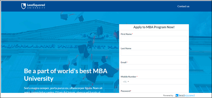
LeadSquared’s Portal feature enables you to build your own customized online portals (for education/insurance/lending/medical applications, course registrations, etc.) to capture leads and opportunities. The Portals Designer lets you build entire portals without writing a single line of code. It offers pre-built templates for common use cases across industries, and also the ability to design a portal from scratch, using the simple drag-and-drop interface.
For other Portal related articles, see –
- How to Save Progress for Multi-Step Forms in LeadSquared
- How to Pre-Populate and Capture Data in Portal Forms
- Using Scripts in Portals for Google Analytics, FB Pixel, Chatbots and Other Custom Behaviour
- How to Show Activity Status in Portal Dashboard
- How to Track Application Status Using Forms & Activities in Portals
- Use Custom Domains for Portals
- Create Portals with Multiple Web Pages
2. Prerequisites
- To use registration/log-in forms and lead, opportunity, activity and task capture forms, you must first create the relevant forms or processes (sequences of forms) using Forms and Processes.
- The Portals Designer is a part of the Portals feature. To enable Portals on your account, please write to support@leadsquared.com.
3. Getting Started
3.1 Select an Existing Template
To select from the list of templates –
- To create a portal-
- From the LeadSquared dashboard, navigate to Workflow>Manage Portals.
- Click the Create Portal button.
- Give a relevant name for the portal, and add a description if required. Once you’re done, click Create.
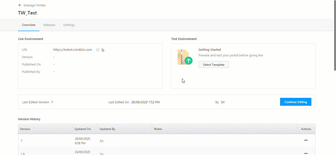
- After you’ve created a portal, on the Manage Portals page, click the portal name.
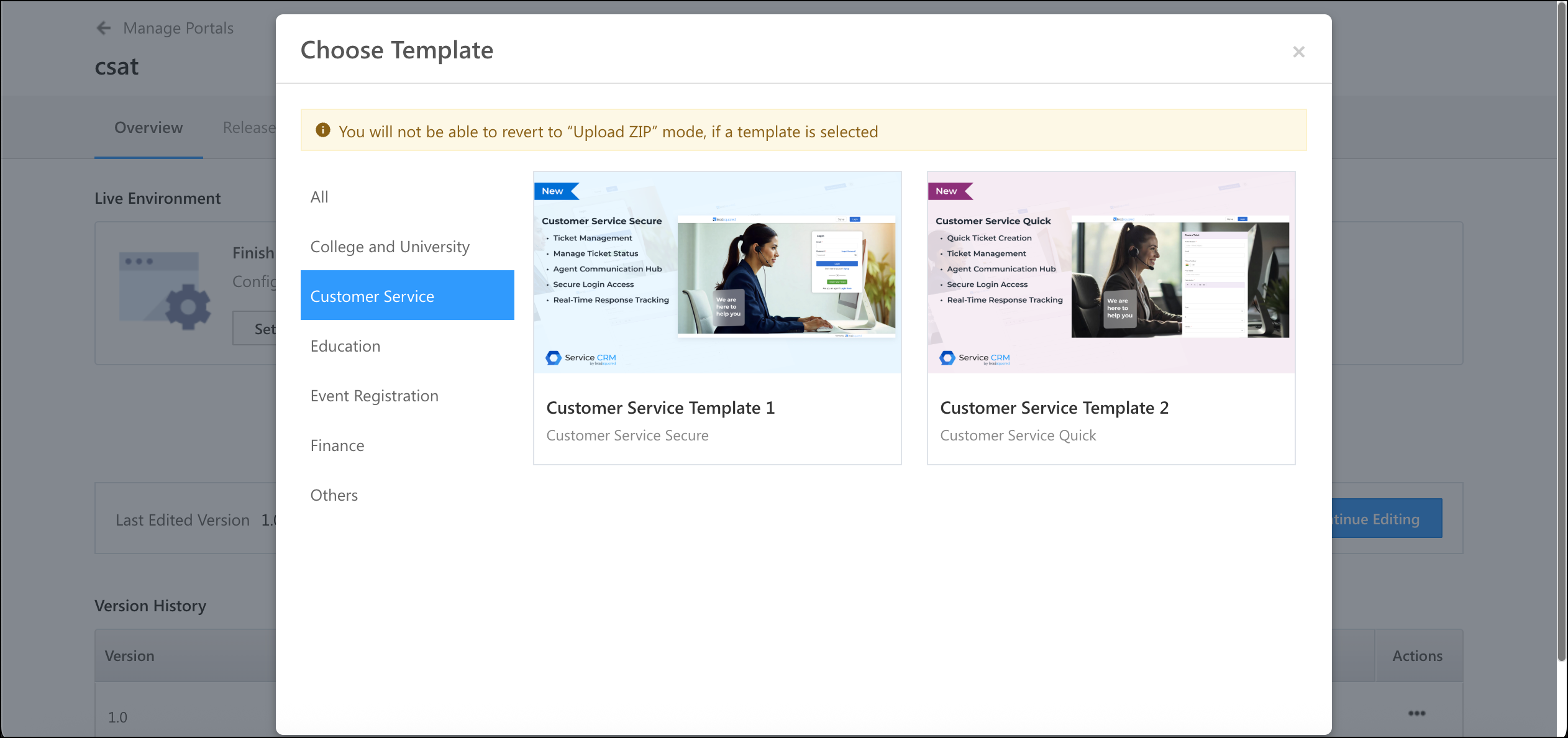
- Under Getting Started, click Select Template.
- On the Choose Template pop-up, to select a relevant template for your business from the list of available options, click Get Started.
- Provide the Version Number of the template you’ve chosen, and then click Proceed to Builder.
- Once the version is created successfully, you’ll get a message stating the same. You will then be automatically directed to the portal designer page.
3.2 Build from Scratch
Alternatively, you can choose to build your own portal page from scratch in minutes.
Click on Others, and click on Get Started. On the designer, you can –
- Click on Add Design Block or the
 icon to add a section.
 - Choose from a wide range of industry-specific templates and pre-designed sections (hero banners, testimonials, forms, sliders, etc.).
- Customize if required.

3.3 Save and Reuse Sections
You can save any section or element you create (e.g., a testimonial block, a call-to-action banner, or a lead capture form) and reuse it across any Portal and Landing Pages Pro.
For example, If you’ve created a custom header with your brand’s logo and navigation, select that element and click on the  icon to Save Section. Now, you can apply it to all future pages from the Saved Sections panel in the designer.

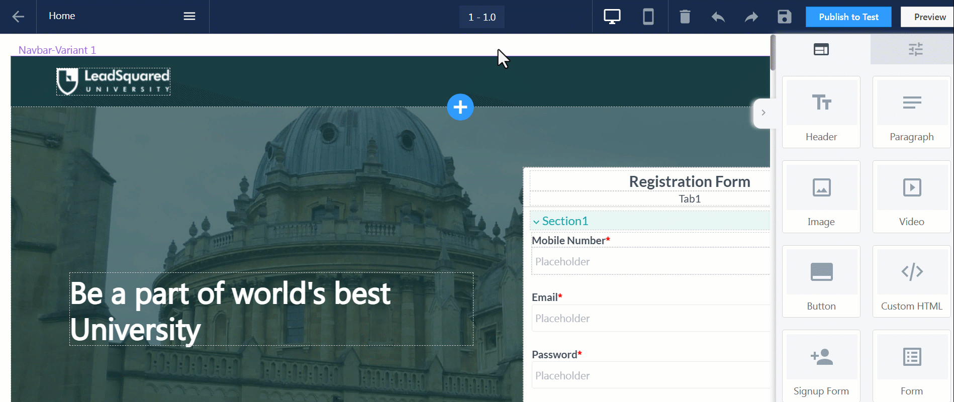
4. Layouts
The page layout is divided into the following –
- Section – This is the base layout of a particular section on the page. This will hold the rows and columns, which will help you manage the structure of your content.
- Rows and Columns – Rows contain columns, which in turn contain various elements. Rows are stacked vertically, while columns are stacked horizontally. Using rows and columns together, you will be able to arrange your content on the portal designer.

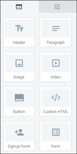
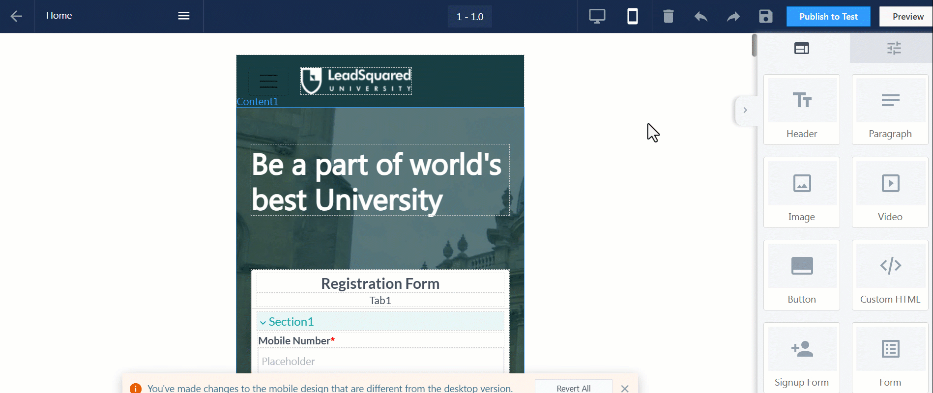
5. Elements
The elements that go inside each layout are –
- Header – The header for the selected layout. This can either be the over-all page header, or an individual section’s header.
- Paragraph – The text content that is present within a layout, for a specific section.
- Image – To add an image within the selected layout, click Choose Image, and upload an image. To make the image interactive, configure an action by clicking Action on Click/Tap.
- Video – To add a video within the selected layout, enter the video’s URL under Video URL. To autoplay the video when a cursor is hovered over it, toggle the
 slider.
 - Button – You can add a button within a layout, and under Action on Click/Tap, you can configure what happens when the button is clicked/tapped.
- Custom HTML – This feature gives you a code editor to add any custom HTML code to your portal. To do this, drag-and-drop a Custom HTML block. On the outer box, click
 , and add your HTML code.
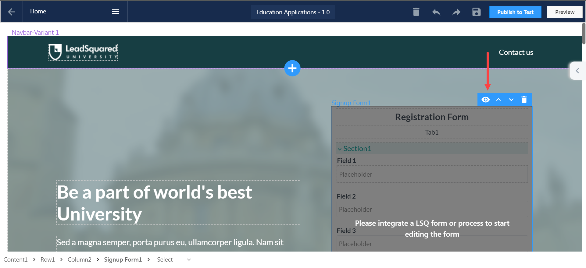
 - Signup Form – The Signup Form feature enables you to build registration and sign-in forms on your portal. To know more, please refer to LeadSquared Portal Designer – Create Sign Up Forms.
- Form – You can choose to add a LeadSquared form and/or process within a section on the webpage.
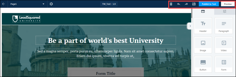
6. Action Tool Bar
You can use the following action on Sections, Rows, and Columns –
- Hide on device – This feature lets you control how layouts display on desktop or mobile. You can hide or show specific sections based on the device to create a cleaner, more tailored user experience. Select an element, choose the device to hide it from, and preview your layout to ensure it looks right on both desktop and mobile.
- Move Up – Shift the selected Section, Row, or Column upward.
- Move Down – Shift the selected Section, Row, or Column downward.
- Move Left– Shift the selected Section, Row, or Column to the left.
- Move Right– Shift the selected Section, Row, or Column to the right.
- Clone – Create a duplicate of the element.
- Delete – Remove the selected Section, Row, or Column.
Note:
- The Hide on Device feature is available for backward compatibility but is no longer recommended. Instead, use the Mobile Editor for a cleaner and more intuitive layout experience
- You can only have one form on a portal page. However, if you hide a form on one device, you can add another form to the page and hide it on the alternate device.
7. Properties
Each layout listed above can be customized by using the following properties –
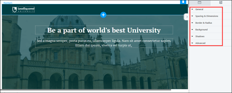
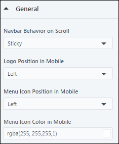
7.1 General
This is only applicable for navbars and forms.
- Navbar Behavior on Scroll – Set the navbar behaviour while scrolling through the page, to either remain sticky on the top, scroll with the rest of the page, or fade out while scrolling through the page.
- Logo Position in Mobile – Choose how you want the logo to be positioned on the mobile device version of the page. It can either be to the left of the screen or centre of the screen.
- Menu Icon Position in Mobile – Choose how you want the main menu to be positioned on the mobile device version of the page. It can either be to the left or right of the mobile device screen.
- Menu Icon Color – Pick a colour for the menu icon from the gradient screen, or enter the hex code for a specific colour.
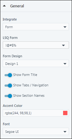
7.1.1 For Forms –
The properties of a form are –
- Integrate – Choose either a form or a process to integrate with your portal page.
- To know how to create a form, please refer to How to Create a Form.
- To know how to create a process, please refer to How to Create a Process.
- LSQ Form – If you chose a LeadSquared form, then select the form from the dropdown.
- LSQ Process – If you chose a LeadSquared process, then select the process from the dropdown.
- Form Design – Choose the form design from the dropdown.
- Show Form Title – To show the title of the form on your portal page, toggle the slider.
- Show Tabs/Navigation – To show the sections within the form, toggle the slider.
- Show Section Names – To show the names of the sections within the form, toggle the slider.
- Accent Color – Select the colour of the Save button and tabs from the gradient screen, or enter the hex code for a specific colour.
- Font – Select the font you want to display on the form.
7.1.2 Buttons and Links
The following General properties are only applicable for buttons and links.
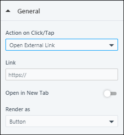
- Action on Click/Tap – This determines the button’s/link’s behaviour when it is clicked or tapped on. You can choose from any of the following actions –
- Open External Link – Add the external link you want the lead to be redirected to –
- Link – Add the URL of the website you want your lead to be redirected to when the button/link is clicked.
- Open in New Tab – To open the link on a new tab, enable the slider.
- Render as – To render the action as a button, select Button. To render the action as a link, select Link.
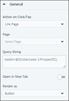
- Open External Link – Add the external link you want the lead to be redirected to –
-
- Link Page – Select the portal page you want the lead to be redirected to when they click the button/link.
- Page – From the dropdown, select the page or section you want your lead to be redirected to within the portal.
- Query String – You can send the value of a particular field (First Name, Mobile field, etc.), by adding a mail merge parameter here. This will ensure that the field value is carried forward to the subsequent pages that have been configured.
- Open in New Tab – To open the link on a new tab, enable the slider.
- Render as – To render the action as a button, select Button. To render the action as a link, select Link.
- Link Page – Select the portal page you want the lead to be redirected to when they click the button/link.
-
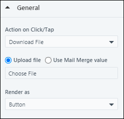
- Download File – Enable your leads to download a file (like prospectus, etc.) when they click the button/link.
- Upload File – Click Choose File, and upload the file, or select the file from your media library, which is automatically downloaded when your lead performs the action.
- Use Mail Merge Values – Alternatively, you can mail merge a custom field set (CFS) that contains a file, by selecting the CFS from the dropdown.
- Render as – To render the action as a button, select Button. To render the action as a link, select Link.
- Download File – Enable your leads to download a file (like prospectus, etc.) when they click the button/link.
-
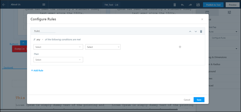
- Based on Rules – This option allows you to set-up rules based on the choices a lead makes. For example, if the lead chooses “City” as “New Delhi”, the you can set-up a condition that redirects the lead to the portal page for leads in New Delhi. Similarly, if the lead chooses “Course” as “B.Tech”, you can set-up a condition to download the prospectus form for B.Tech applicants. To set-up rules –
- From the Actions on Click/Tap dropdown, select Based on Rules.
- Click Configure Rules, and on the Configure Rules pop-up, rename the rule.
- From the any dropdown, choose if you want the condition to be any or all, and set-up the base rule.
- From the Then dropdown, select the action you want to be carried out when the condition is satisfied.
- Open External Link – Add the URL of the website you want your lead to be redirected to when the action is performed. To open this link on a new tab, enable the slider against Open in New Tab.
- Link Page – From the Select dropdown, select the portal page you want the lead to be redirected to once the action is performed. You can send the value of a particular field (First Name, Mobile field, etc.), by adding a query parameter here. This will ensure that the field value is carried forward to the subsequent pages that have been configured. To open this link on a new tab, enable the slider against Open in New Tab.
- Download File – Choose the file that should be downloaded when the lead submits the form.
- Open External Link – Add the URL of the website you want your lead to be redirected to when the action is performed. To open this link on a new tab, enable the
- To add more rule, click Add Rule.
- Once you’re done, click Save. You’ll then get a message saying, “Rules saved successfully”.
- Based on Rules – This option allows you to set-up rules based on the choices a lead makes. For example, if the lead chooses “City” as “New Delhi”, the you can set-up a condition that redirects the lead to the portal page for leads in New Delhi. Similarly, if the lead chooses “Course” as “B.Tech”, you can set-up a condition to download the prospectus form for B.Tech applicants. To set-up rules –
-
- None – If you want no actions to be performed, choose None.
- Render as – To render the action as a button, select Button. To render the action as a link, select Link.
- None – If you want no actions to be performed, choose None.
- Button Effects
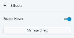
- Hover Effect– When you move your cursor over a button, it will animate. Under the Effects tab, you can enable Hover and click on Manage Effect. You can choose from the following three effects when you hover over a button –
- Shadow Effect – Display a shadow around the button.
- Color Effect – Animate using colour transition.
- Shrink & Grow Animation -The button will animate by shrinking in size and re-sizing to the original.
- Hover Effect– When you move your cursor over a button, it will animate. Under the Effects tab, you can enable Hover and click on Manage Effect. You can choose from the following three effects when you hover over a button –
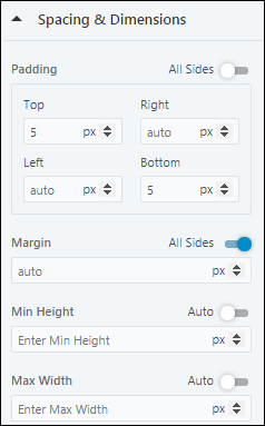
7.2 Spacing & Dimensions
- Padding – Set the padding for the selected layout. If you want the padding dimensions to be applicable on all sides of the layout, against All Sides, toggle the slider.
- Margin – Set the margin width for the selected layout. If you want the margin to be applicable on all sides of the layout, against All Sides, toggle the slider.
- Min Height – Set a minimum height for the selected layout. If you want the height to be set automatically, against Auto, toggle the slider.
- Max Width – Set the maximum width for the selected layout. If you want the height to be set automatically, against Auto, toggle the slider.
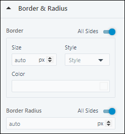
7.3 Border & Radius
- Border – Set the size, style and colour for the border around the selected layout. If you want the border to be applicable on all sides of the selected layout, against All Sides, toggle the slider.
- Border Radius – Set the radius for the border around the selected layout. If you want the border radius to be applicable on all sides of the layout, against All Sides, toggle the slider.
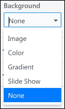
7.4 Background
You can either choose to leave the section’s background blank, or set an image, or a background colour.
- To add an image, from the dropdown, select Image. Then, click on Choose Image to choose an image from your Image Library.
- To set the background colour, from the dropdown, select Color. Then, choose a colour from the gradient screen, or enter the hex code for a specific colour.
- Select Gradient to add a consistent visual theming.
- Select Slide Show to extend the idea of a hero image, allowing you to present multiple images in a sequence. Click Manage Slides to add more slides.
- To leave the background blank, from the dropdown, select None.
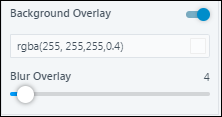
You also have the option to add a Background Overlay. It enhances the readability of the text and reduces visual stress for viewers. You can enable Background Overlay by toggling the slider. It has 2 options –
- Color Overlay – A color filter that puts a tint on the selected element to make the text more readable.
- Blur Overlay – Customize the intensity of the blur to be added to the background.
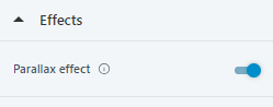
Background Effects
You can make your background images dynamic and reactive to scroll movements.
- Parallax Effect – Select a background image, on the right-hand panel, navigate to Effects, and enable Parallax Effect
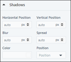
7.5 Shadows
Set a shadow for the specified layout.
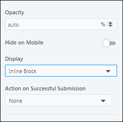
7.6 Advanced
- Opacity – Set the opacity for the layout.
- Display – It determines the CSS display behaviour of a specific layout.
- Block – Displays a layout as a block element.
- Flex – Displays a layout as a block-level flex container.
- Inline – Displays a layout as an inline element.
- Inline Block – Displays a layout as an inline-level block container.
- Inline Flex – Displays a layout as an inline-level flex container.
- Action on Successful Submission – This is applicable only for Forms. You can configure the following actions on a successful submission –
- Open External Link – Add an external link, and configure if it opens in the same tab or a new tab.
- Link – If you choose Open External Link as the Action on Successful submission, then add the URL of the website you want your lead to be redirected to, when the form is submitted.
- Link Page – Select the portal page you want the user to be redirected to on successful submission.
- Page – If you choose Link Page as the Action on Successful submission, then from the dropdown, select the page or section you want your lead to be redirected to, when the form is submitted.
- Download File – Enable users to download a file (like prospectus, etc.) on submission by uploading it here.
- File – If you choose Download File as the Action on Successful submission, then under File, click Choose File, to choose a file from your Document Library.
- None – No action will be taken on successful submission.
- Open External Link – Add an external link, and configure if it opens in the same tab or a new tab.
8. Actions
You can perform the following additional actions on a page –
- To completely clear the portal designer canvas, click the
 icon.
icon. - To undo the changes you recently made, click the
 icon.
icon. - To redo the changes you recently made, click the
 icon.
icon. - To save your progress with the changes you made, click the
 icon.
icon. - To preview the page, click Preview.
- Once the page is ready, click Publish to Test. This will publish the page to the test environment.
9. Add Multiple Web Pages
Add multiple web pages (home page, contact us page, application dashboard, etc.) to your LeadSquared Portals, using the Portal Designer. You can also make logins compulsory to view certain pages. This can be used for application and user profile pages. To know more, please refer to Create Portals with Multiple Web Pages.
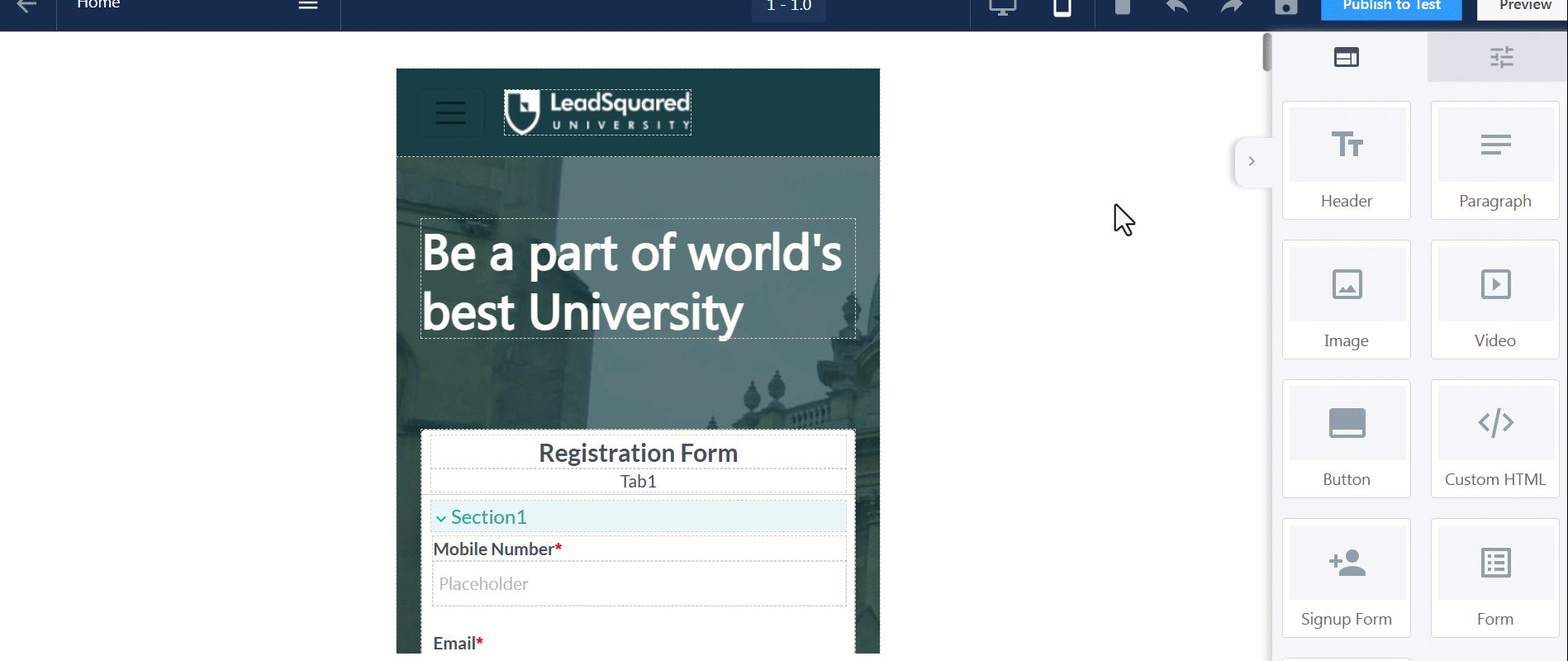
10. Mobile Editor
To help you create fully responsive and mobile-first designs, Portals includes a Mobile Editor. This feature lets you switch to mobile view and customize the layout specifically for mobile devices, ensuring a smooth experience for the majority of your audience.
Beyond cosmetic changes, the Mobile Editor allows you to tailor functional behavior—for instance, you can design distinct user journeys on mobile and desktop. You might choose to present a simplified, app-like experience on mobile while offering a more feature-rich layout on desktop.
Note:
- The older Hide on Mobile and Hide on Desktop options are no longer recommended. Instead, use the Mobile Editor for a cleaner and more intuitive layout experience.
- A default mobile version is automatically generated based on your desktop design, so using the Mobile Editor is optional. You only need to use it when you want to fine-tune the mobile layout or create a different experience tailored specifically for mobile users.
- Mobile layouts are only visible to users accessing the page on mobile devices. This view is not supported on Tablets.
Key Capabilities
Here are some capabilities of the mobile editor –
Full Editing Support
The mobile editor offers the same drag-and-drop functionality as the desktop editor, allowing you to add, rearrange, or delete components in mobile view. Once a section is edited in mobile, it becomes independent of its desktop counterpart, future changes made on desktop won’t affect it unless reverted.
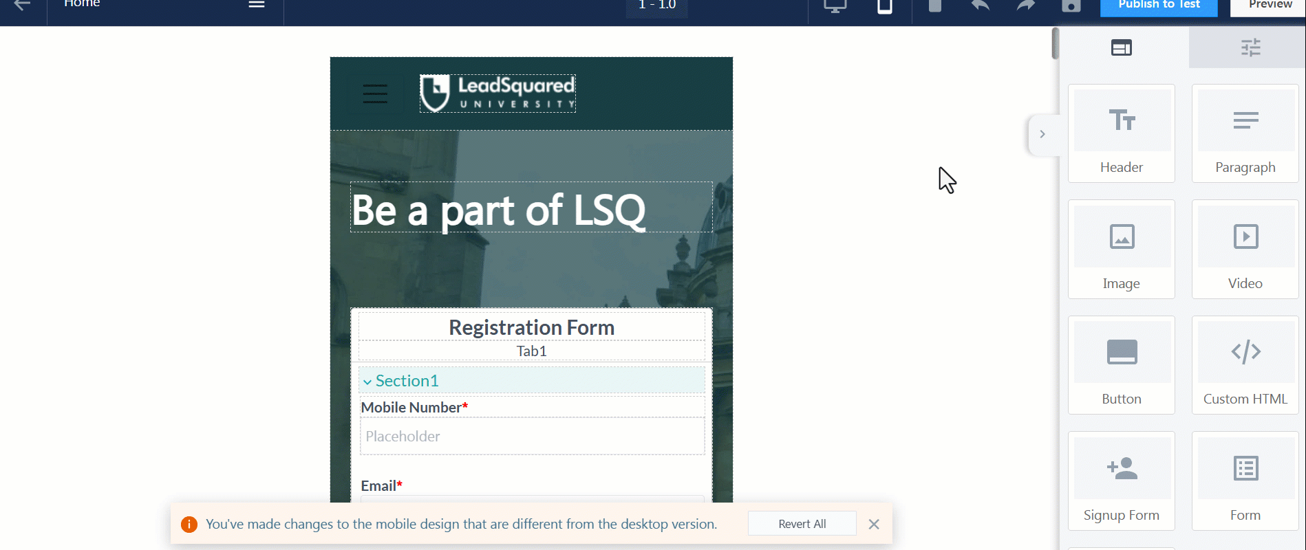
Section Sync and Revert Behavior
When a section is edited in mobile view, it becomes independent of the desktop version and is marked with an orange border to indicate it is out of sync.
You can click on an individual section to revert it, or you can revert the entire mobile layout at any time to restore alignment with the latest desktop design.

Preview Your Design
Click on Preview to preview and test your mobile design.
11. Test the Portal
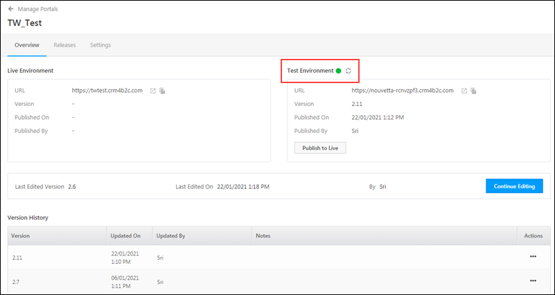
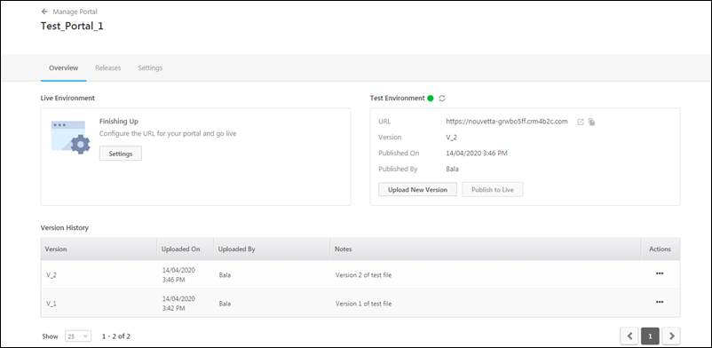
Once the portal is designed, you can test it by deploying it on the Test Environment. Once it is successfully tested, you can make it live.
- After you’ve created the portal and click Publish to Test, the portal is automatically uploaded to the Test Environment.
- For a couple of minutes, the Test Environment status will stay
 red.
red. - The status will automatically turn
 green. If it doesn’t, click on the
  refresh icon.
 - If your portal is enabled in the live environment, you can click Publish to Live.
12. Configure the Portal
On the Portal page, navigate to Overview>Finishing Up>Settings, or click the Settings tab to Configure the portal. Here, you can configure the name, domain, email and SMS settings for the portal.
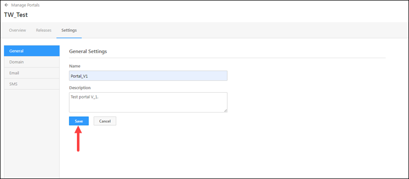
12.1 General Settings
Provide the name and description of the portal. This will help your users identify the portal. Once you’re done, click Save.
12.2 Domain Settings
Default Domain – You can host your portals on LeadSquared’s default domain.
- In the Domain Settings column, enter a subdomain name for the portal you’ve created.
- The URL for the default LeadSquared domain is “lsqportal.com”
- Once you have added the details, click Confirm.
To delete the portal, click Delete Portal.
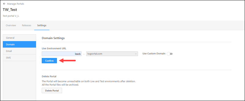
Custom Domain – Alongside Use Custom Domain, enable the slider to host the portal on your own custom business/brand sub-domain (e.g., applications.mybusiness.com).
For details, see Use Custom Domains for Your Portals.
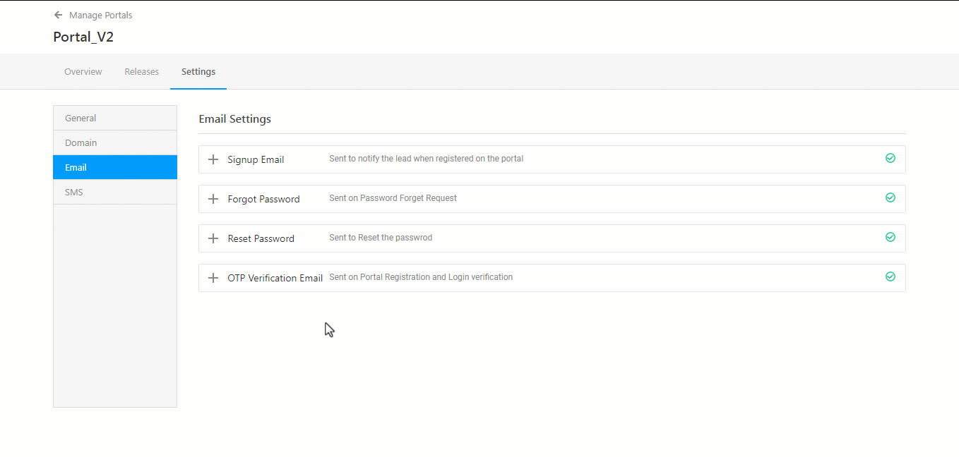
12.3 Email Settings
You can edit or disable email notifications a lead or opportunity would receive for “Signup”, “Forgot Password”, “Password Reset”, and “OTP Verification Email”. To configure these emails –
- Navigate to Settings>Email Settings.
- Expand the email tab. You will find the Disable Email and Edit options.
- If you want to edit the email, click on the Edit button. This opens a window where you can edit the email.
- Once you’re done editing the mail, click Done.
- To send out a test mail, click Save and Test, and on the Test your email content pop-up, enter the mail Id to which you want to send the test mail.
- To disable these emails, click Disable Email, and confirm that same.
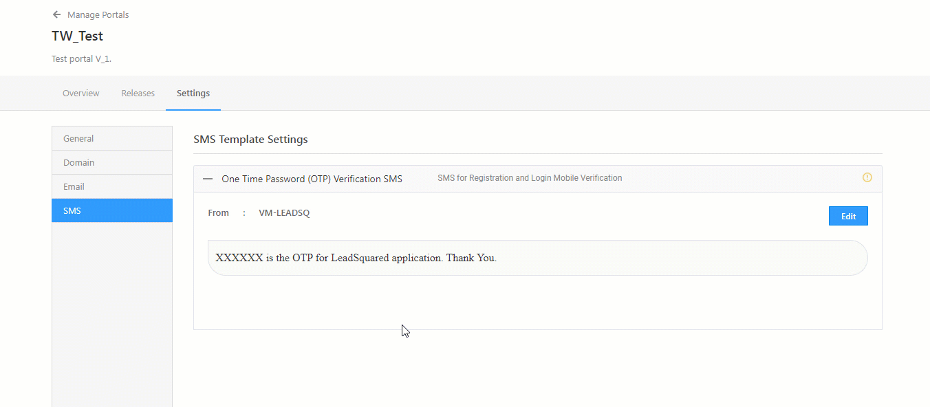
12.4 SMS Template Settings
To verify your lead’s mobile numbers (for Portal Registration and Portal Login), we send out OTPs via SMS. This is done by default, and it requires no additional configuration from your end. To include your company’s name in the default SMS, click Edit, and enter the name.
13. Version History
You can view the various versions of the code that was uploaded on this portal.
- Under Actions, click the
 icon against any version of the code.
 - To test a previous version of the code, click Publish to Test.
- To download a previous version of the code, click Download Zip.
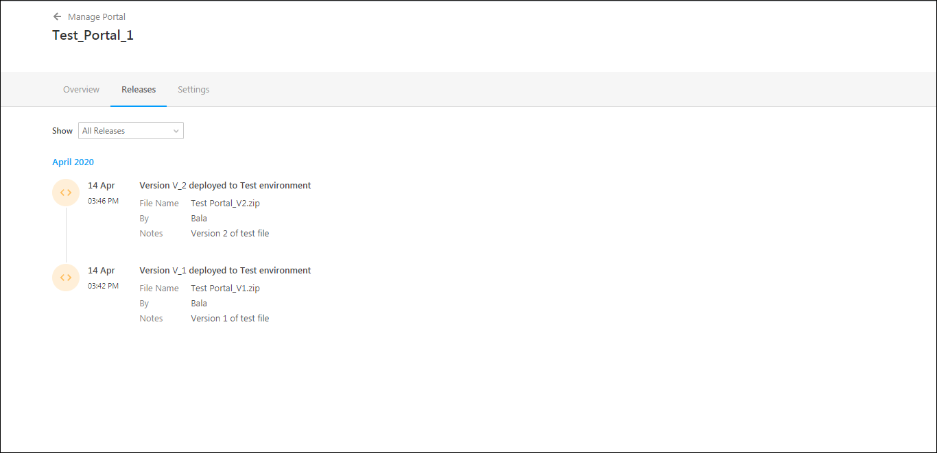
14. Releases
- You can check all the versions that have been uploaded to the portal under the Releases tab.
- The default selection is All Releases, but you can also filter by Test Releases and Live Releases.
15. Troubleshooting
1. Issue: Field Updates on the Form are Not Reflected in the Portal
- Description: The values updated in a drop-down field in a form are not appearing in the portal as expected.
- Cause: This is due to a caching issue. When form changes are made, the portal may not immediately reflect the updates.
- Solution: To resolve this, reconfigure the form within the portal and republish the portal. This will clear the cache and apply the updated values.
2. Issue: I’m unable to Publish my Portal to Live Environment
- Description: I’m receiving the following error when I try to publish my portal to the live environment – “There was an error processing the request. Please contact administrator.”
- Explanation: This issue typically occurs when the custom domains for the portal are not verified, or there is a mismatch in the CAA (Certification Authority Authorization) records. The CAA records must be correctly configured and verified to successfully publish the portal.
- Solution: Verify that the custom domains are properly configured (see How to Use Custom Domains for Portals). Check for any mismatches in the CAA records and correct them.
3. Issue: Duplicate Dynamic Form Submission Captured Against Lead
- Description: The form submission from the portal is being captured twice for the same lead, causing the lead stage to revert to a previous stage.
- Cause: This happens when a student opens the form in multiple browser tabs and submits the form from different tabs. Each submission gets recorded separately, leading to the duplication.
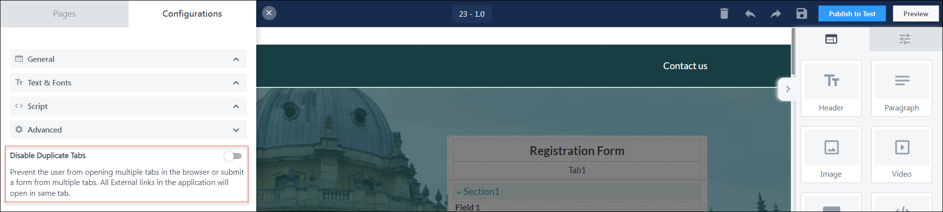
- Solution: To prevent this, enable the “Disable Duplicate Tabs” setting in the Advanced Configuration of the Portal. This will restrict form submissions from multiple open tabs and avoid duplicate submissions.
4. Issue: “Cannot Open Duplicate Tabs” Error in LeadSquared Portal
- Description: When attempting to open the LeadSquared Portal in a new tab while already logged in on another tab, you may receive the error message: “Cannot open duplicate tabs.”
- Explanation: This message appears because the portal is already open in another tab with the user logged in.
- Solution: Sign Out or Close Tabs: To resolve this issue, please sign out from the already open tab or close all tabs in your browser. Then, reopen the Portal in a new tab.
Any Questions?
Did you find this article helpful? Please let us know any feedback you may have in the comments section below. We’d love to hear from you and help you out!
Where to write custom css?
Hi, Agni. To add your custom CSS, add the Custom HTML Block that’s present under Elements. On this block, you can add your custom CSS. Hope this helps!