1. Feature Overview
LeadSquared’s Landing Pages Pro (LPP) Designer enables you to build customized landing pages to capture leads and opportunities. You can create a landing page without writing a single line of code.
2. Prerequisites
- This feature is specifically for Landing Pages Pro. Landing Pages Pro is a paid feature. To enable it, contact your account manager, or send an email to support@leadsquared.com.
- To capture Leads or Opportunities, you must first create the relevant forms using Dynamic Forms.
3. Getting Started
3.1 Select an Existing Template
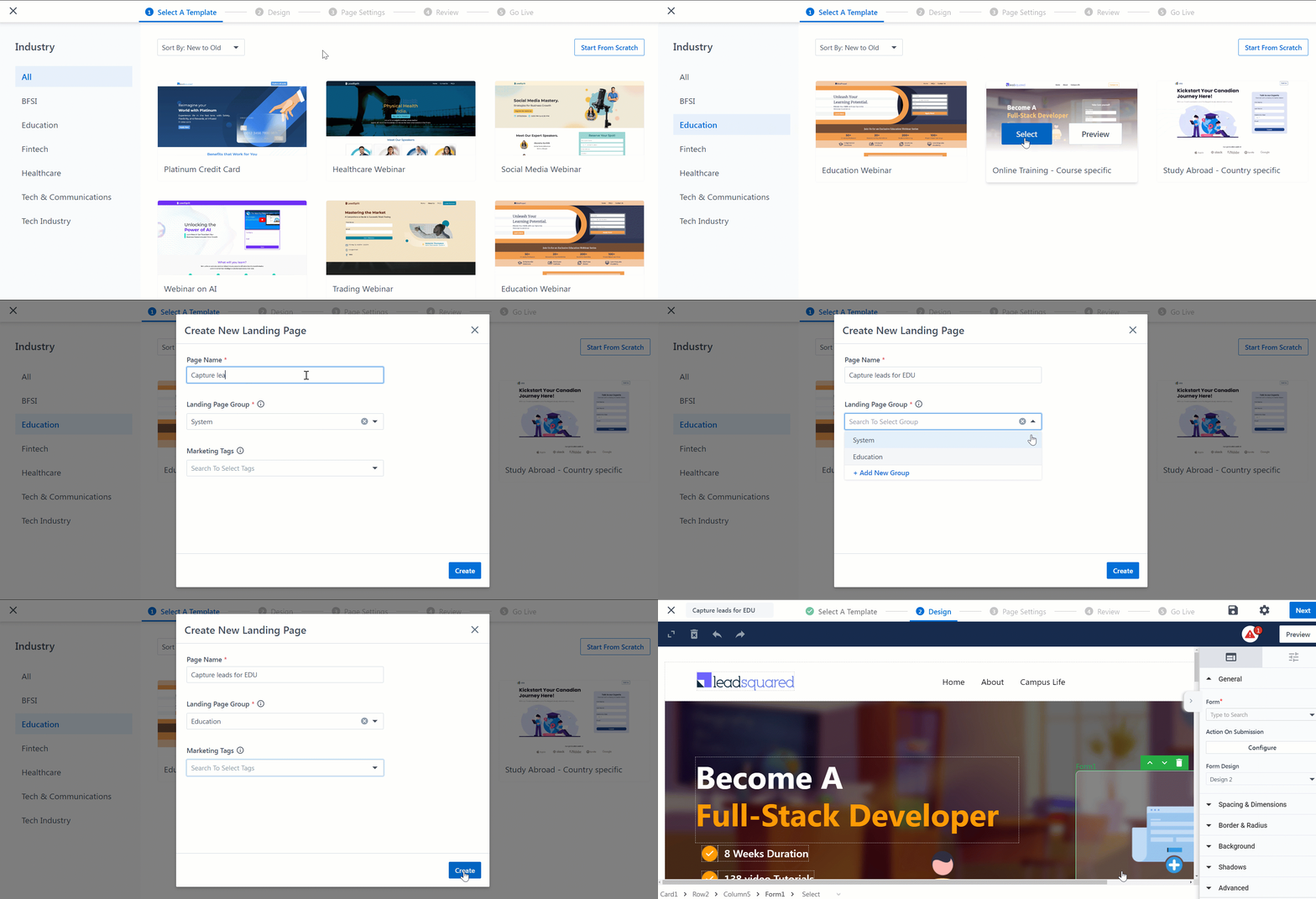
To select from the list of templates –
- Create a Landing Page on Landing Pages Pro –
- From the LeadSquared dashboard, navigate to Marketing>Landing Pages Pro.
- Click the + Create New Landing Page button.
- Select a relevant Industry from the options on the left panel.
- Preview a template by clicking the Preview button, and select a template by clicking the Select button.
- Enter a Page Name.
- Assign the landing page to a group.
- To add a new Landing Page Group, select +Add New Group from the dropdown. This option lets you categorize and group your landing pages.
- Optionally, you can add relevant Marketing Tags to the landing page.
- Click Create.
3.2 Build from Scratch
Alternatively, you can choose to build your own landing page from scratch in minutes.
Click on Start From Scratch. On the designer, you can –
- Click on Add Design Block or the
 icon to add a section.
 - Choose from a wide range of industry-specific templates and pre-designed sections (hero banners, testimonials, forms, sliders, etc.).
- Customize if required.

3.3 Save and Reuse Sections
You can save any section or element you create (e.g., a testimonial block, a call-to-action banner, or a lead capture form) and reuse it across any Portal and Landing Pages Pro.
For example, If you’ve created a custom header with your brand’s logo and navigation, select that element and click on the ![]() icon to Save Section. Now, you can apply it to all future pages from the Saved Sections panel in the designer.
icon to Save Section. Now, you can apply it to all future pages from the Saved Sections panel in the designer.

4. Layouts
The page layout is divided into the following –
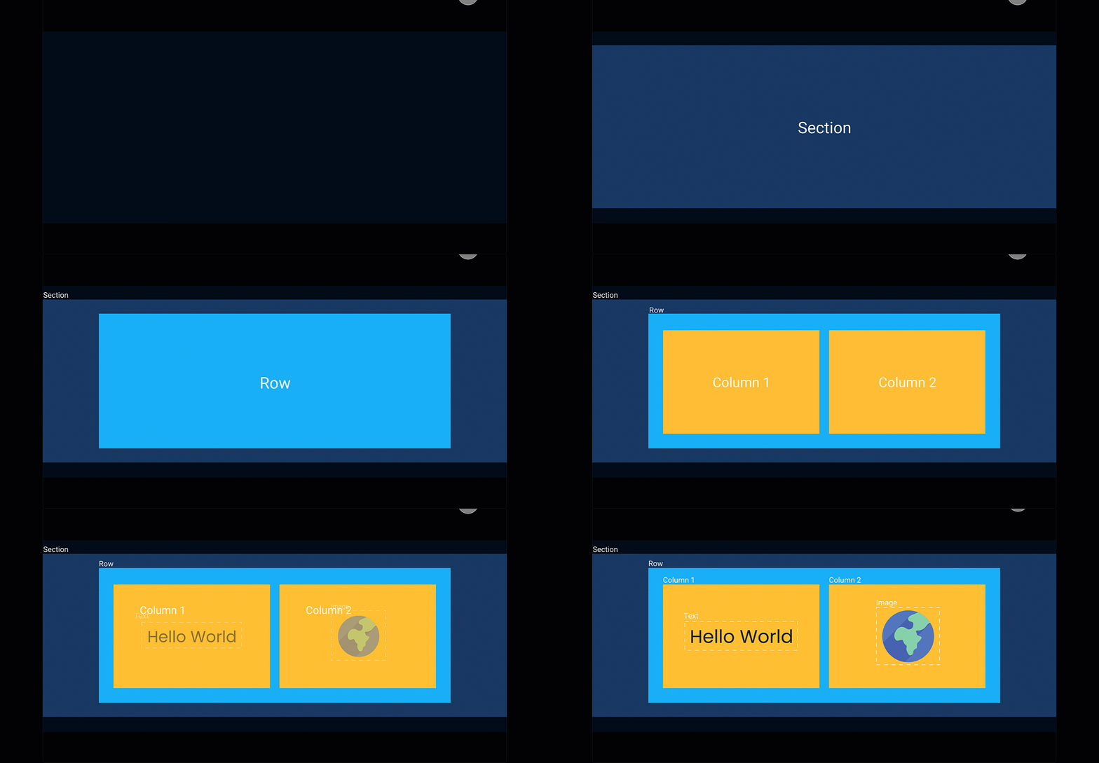
- Section – This is the base layout of a particular section on the page. This will hold the rows and columns, which will help you manage the structure of your content.
- Rows and Columns – Rows contain columns, which in turn contain various elements. Rows are stacked vertically, while columns are stacked horizontally. Using rows and columns together, you will be able to arrange your content on the designer.
5. Elements
The elements that go inside each layout are –
- Header – The header for the selected layout. This can either be the overall page header or an individual section’s header.
- Paragraph – The text content that is present within a layout, for a specific section.
- Image – To add an image within the selected layout, click Choose Image, and upload an image. To make the image interactive, configure an action by clicking Action on Click/Tap.
- Video – To add a video within the selected layout, enter the video’s URL under Video URL. To autoplay the video when a cursor is hovered over it, toggle the
 slider.
 - Button – You can add a button within a layout, and under Action on Click/Tap, you can configure what happens when the button is clicked/tapped.
- Custom HTML – This feature gives you a code editor to add any custom HTML code to your landing page. To do this, drag and drop a Custom HTML block. On the outer box, click
 , and add your HTML code.
 - Form – You can choose to add a LeadSquared Dynamic form within a section on the webpage.

6. Action Tool Bar
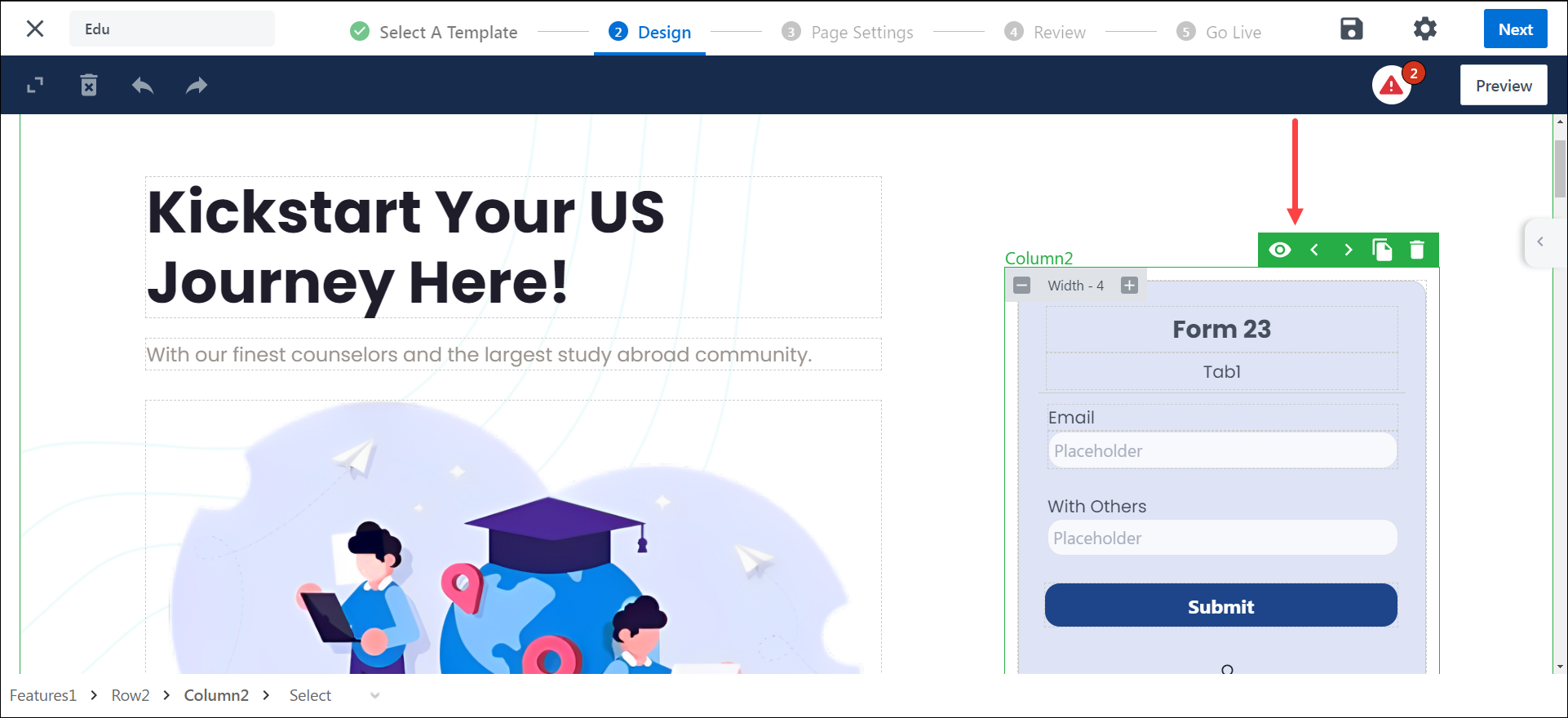
You can use the following action on Sections, Rows, and Columns –
- Hide on device – This feature lets you control how layouts display on desktop or mobile. You can hide or show specific sections based on the device to create a cleaner, more tailored user experience. Select an element, choose the device to hide it from, and preview your layout to ensure it looks right on both desktop and mobile.
- Move Up – Shift the selected Section, Row, or Column upward.
- Move Down – Shift the selected Section, Row, or Column downward.
- Move Left– Shift the selected Section, Row, or Column to the left.
- Move Right– Shift the selected Section, Row, or Column to the right.
- Clone – Create a duplicate of the element.
- Delete – Remove the selected Section, Row, or Column.
Note:
- The Hide on Device feature is available for backward compatibility but is no longer recommended. Instead, use the Mobile Editor for a cleaner and more intuitive layout experience
- You can only have one form on a landing page. However, if you hide a form on one device, you can add another form to the page and hide it on the alternate device.
7. Properties
Each layout listed above can be customized by using the following properties –
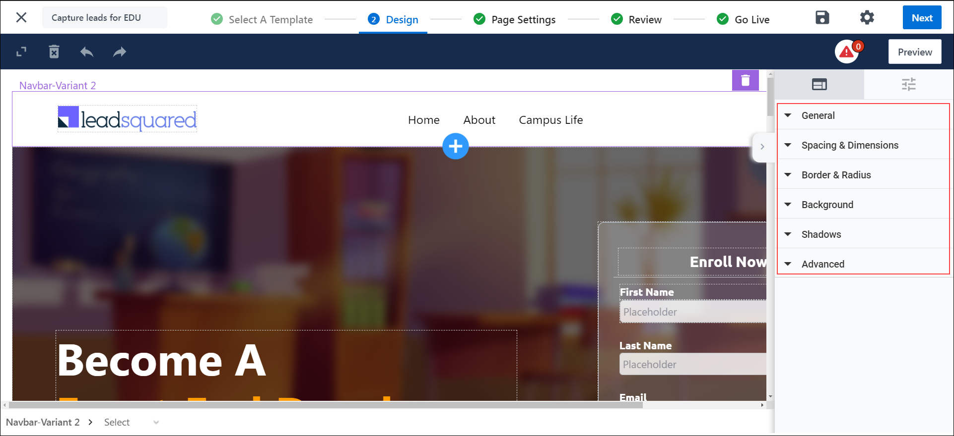
7.1 General
The General property varies on some elements –
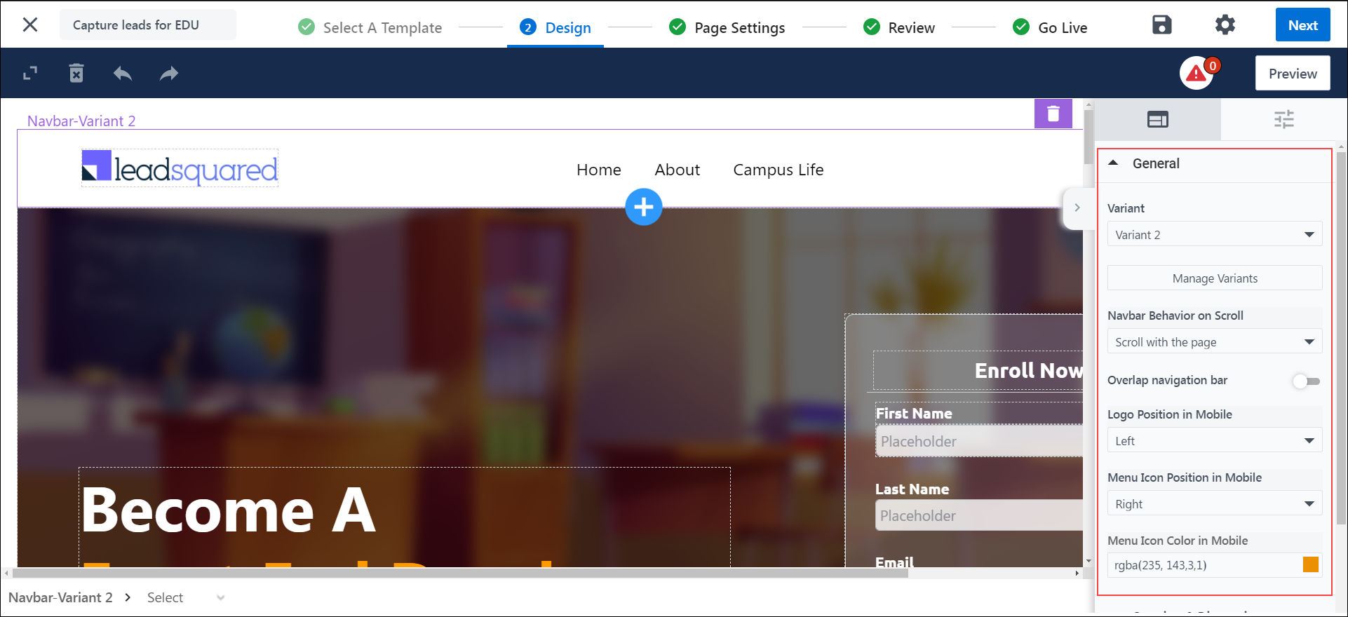
7.1.1 General Property on Navbar
- Variant – Create various variants of the navbar by clicking Manage Variants and clone an existing variant.
- Navbar Behavior on Scroll – Set the navbar behavior while scrolling through the page, to either remain sticky on the top, scroll with the rest of the page, or fade out while scrolling through the page.
- Overlap navigation bar – By enabling this option, the nav bar will blend with the next block.
- Logo Position in Mobile – Choose how you want the logo to be positioned on the mobile device version of the page. It can either be to the left of the screen or the center of the screen.
- Menu Icon Position in Mobile – Choose how you want the main menu to be positioned on the mobile device version of the page. It can either be to the left or right of the mobile device screen.
- Menu Icon Color – Pick a color for the menu icon from the gradient screen, or enter the hex code for a specific color.
7.1.2 General Property on Forms
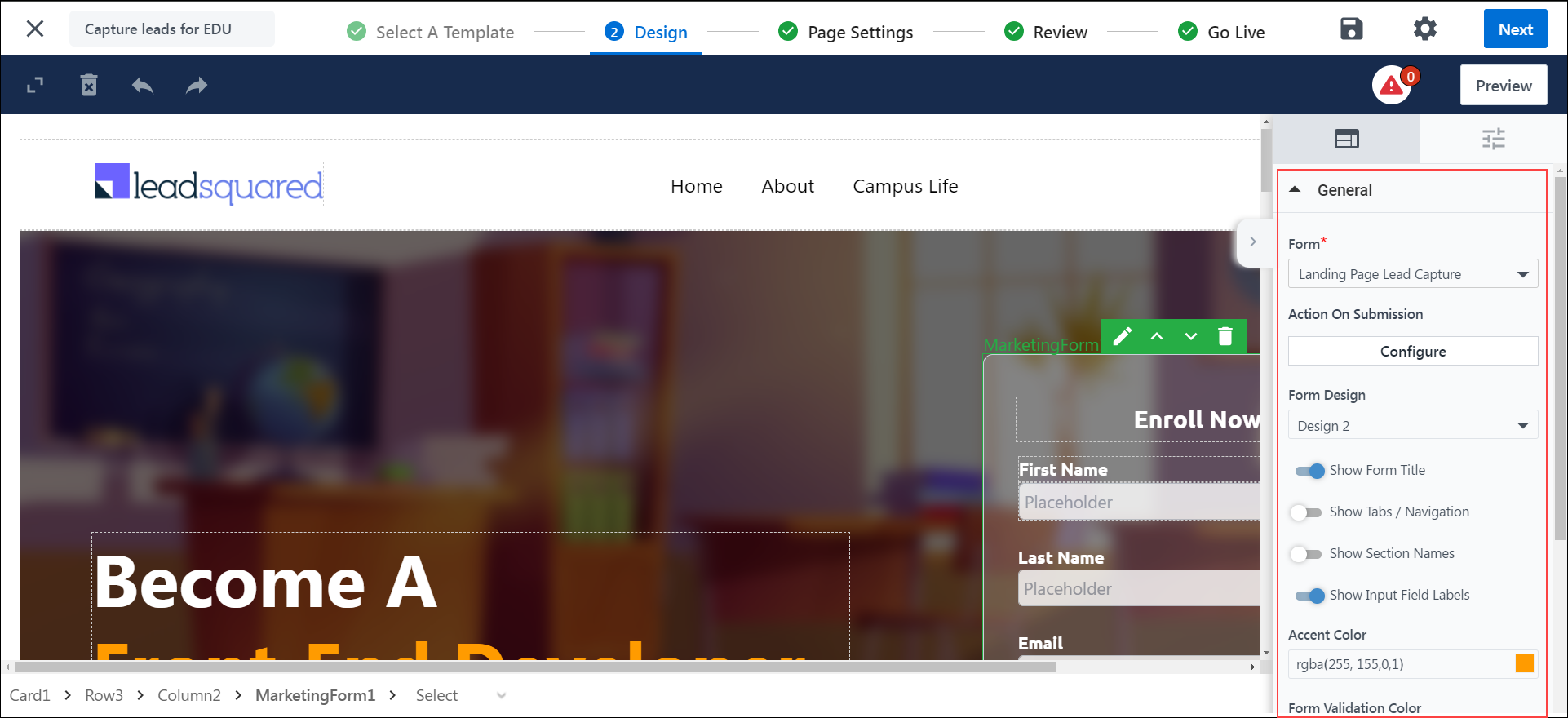
The properties of a Form are –
- LSQ Form – Select the form from the dropdown.
- Action On Submission – You can configure actions on a successful form submission. Each action can be a Common Action, or you can configure actions Based on Rules –
- Common Action – If you select this option, the action will apply to all leads on Form submission.
- Based On Rules – This option allows you to set-up rules based on the choices a lead makes. For example, if the lead chooses “City” as “New Delhi”, you can set up a condition that redirects the lead to the landing page for leads in New Delhi. Similarly, if the lead chooses “Course” as “B.Tech”, you can set up a condition to download the prospectus form for B.Tech applicants
- You can configure the following actions –
- Thank You Message – Configure a message displayed to the lead on successful Form submission.
- Download File – Enable users to download a file (like prospectus, etc.) on submission by uploading it here.
- Open WebPage – Leads can be redirected to an external URL or a published Landing Page on submission.
- Form Design – Choose the form design From the dropdown.
- Show Form Title – To show the title of the Form on your landing page, toggle the
 slider.
 - Show Tabs/Navigation – To show the sections within the Form, toggle the
 slider.
 - Show Section Names – To show the names of the sections within the Form, toggle the
 slider.
 - Show Input Field Labels – To show the input field labels on the placeholder, toggle the
 slider.
 - Accent Color – Select the color of the Save button and tabs From the gradient screen, or enter the hex code for a specific color.
- Form Validation Color – Select the color that will indicate a field as mandatory.
- Font – Select the font you want to display on the Form.
7.1.2 General Property on Buttons and Links
The properties of buttons and links are –
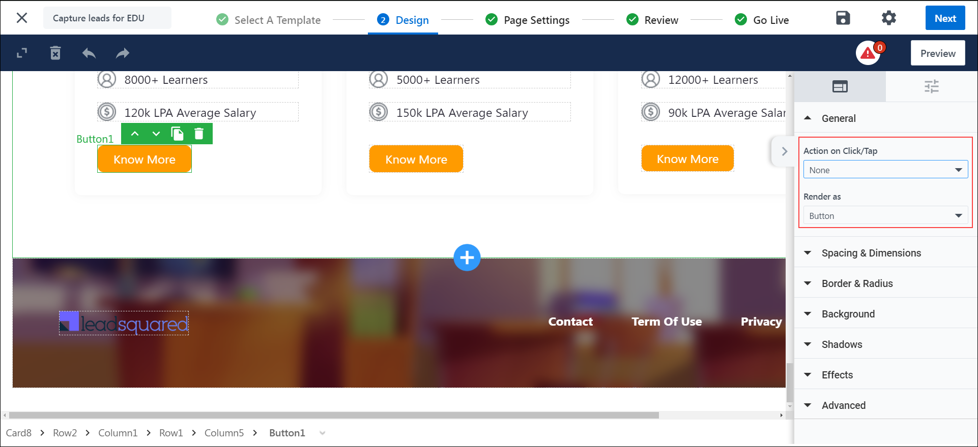
- Action on Click/Tap – This determines the button’s/link’s behavior when it is clicked or tapped on. You can choose from any of the following actions –
- Open External Link – Add the external link you want the lead to be redirected to –
- Link – Add the URL of the website you want your lead to be redirected to when the button/link is clicked.
- Open in New Tab – To open the link on a new tab, enable the
 slider.
 - Render as – To render the action as a button, select Button. To render the action as a link, select Link.
- Open External Link – Add the external link you want the lead to be redirected to –

-
- Download File – Enable your leads to download a file (like prospectus, etc.) when they click the button/link.
- Upload File – Click Choose File, upload the file, or select the file from your media library, which is automatically downloaded when your lead performs the action.
- Use Mail Merge Values – Alternatively, you can mail merge a custom field set (CFS) that contains a file, by selecting the CFS from the dropdown.
- Render as – To render the action as a button, select Button. To render the action as a link, select Link.
- Download File – Enable your leads to download a file (like prospectus, etc.) when they click the button/link.

-
- Scroll – Scroll to a particular section on the Landing Page
- Select Scroll Destination – Select a section from the drop-down menu.
- Render as – To render the action as a button, select Button. To render the action as a link, select Link.
- Scroll – Scroll to a particular section on the Landing Page

-
- None – If you want no actions to be performed, choose None.
- Render as – To render the action as a button, select Button. To render the action as a link, select Link.
- None – If you want no actions to be performed, choose None.
7.2 Spacing & Dimensions
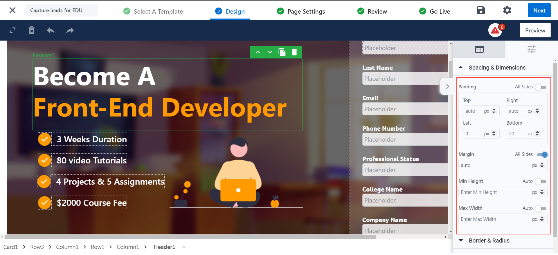
- Padding – Set the padding for the selected layout. If you want the padding dimensions to be applicable on all sides of the layout, against All Sides, toggle the
 slider.
 - Margin – Set the margin width for the selected layout. If you want the margin to be applicable on all sides of the layout, against All Sides, toggle the
 slider.
 - Min Height – Set a minimum height for the selected layout. If you want the height to be set automatically, against Auto, toggle the
 slider.
 - Max Width – Set the maximum width for the selected layout. If you want the height to be set automatically, against Auto, toggle the
 slider.
7.3 Alignment
The content inside a column layout can be aligned left, center, or right.

7.4 Border & Radius
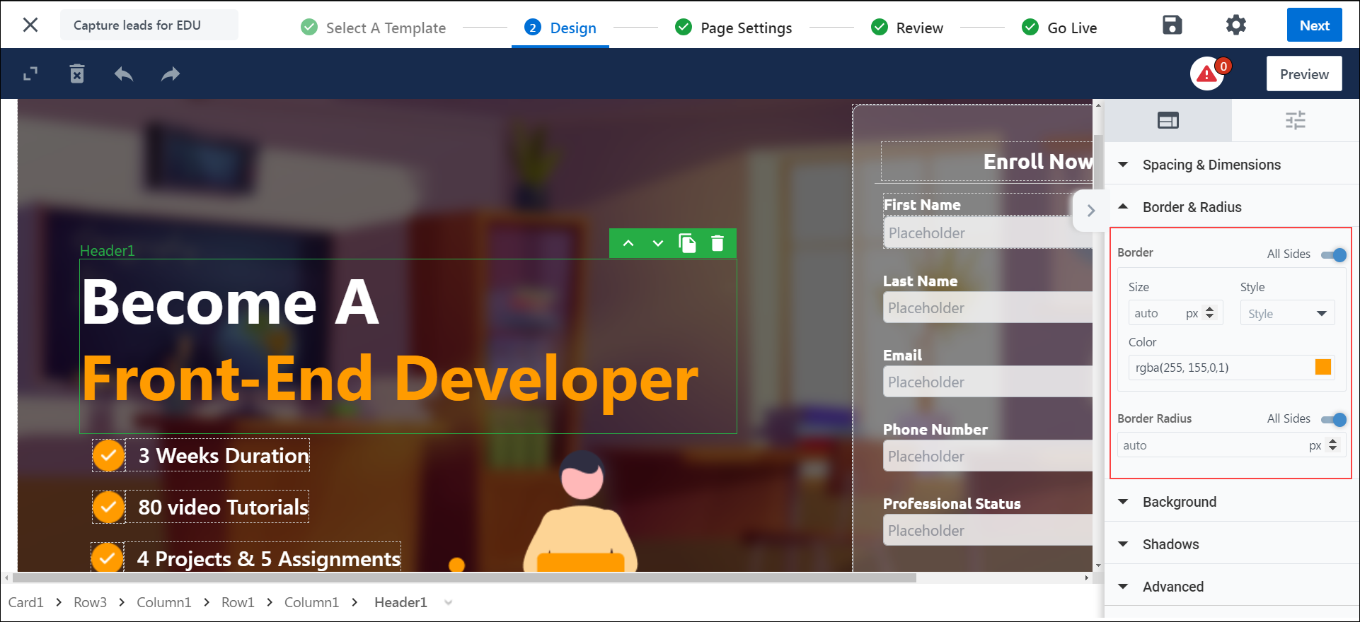
- Border – Set the size, style, and color for the border around the selected layout. If you want the border to be applicable on all sides of the selected layout, against All Sides, toggle the
 slider.
 - Border Radius – Set the radius for the border around the selected layout. If you want the border radius to be applicable on all sides of the layout, against All Sides, toggle the
 slider.
7.5 Background
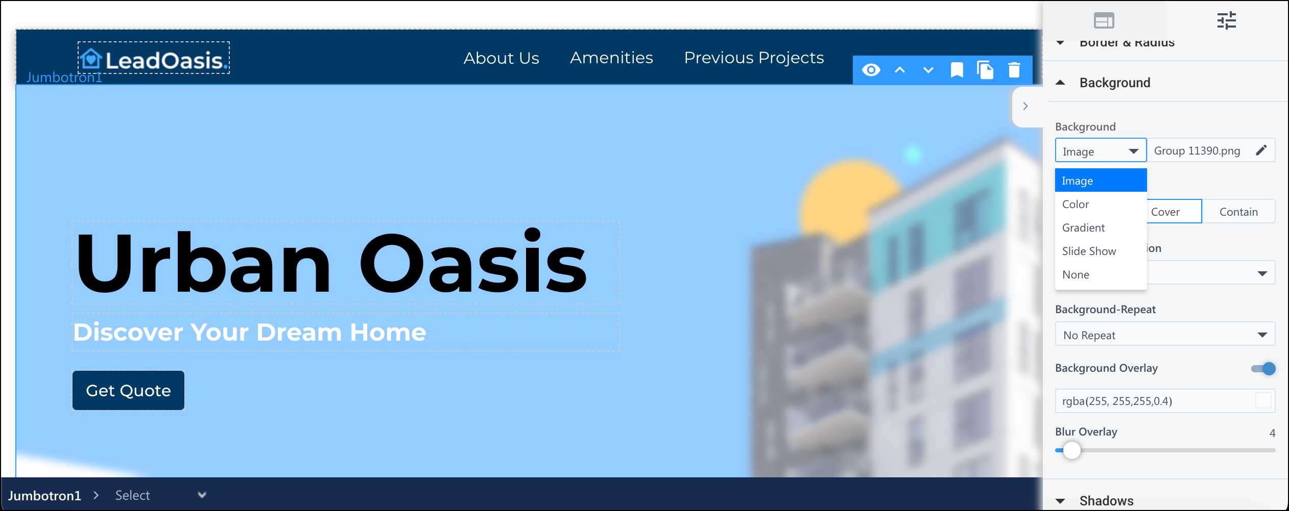
You can either choose to leave the section’s background blank, set an image, or add a background color.
- Image – To add an image, from the dropdown, select Image. Then, click on Choose Image to choose an image from your Image Library.
- Color – To set the background color, from the dropdown, select Color. Then, choose a color from the gradient screen, or enter the hex code for a specific color.
- Gradient – Select Gradient to add a consistent visual theming.
- Slide Show – Select Slide Show to extend the idea of a hero image, allowing you to present multiple images in a sequence. Click Manage Slides to add more slides. Slide Show can only be applied on a section layout.
- None – To leave the background blank, from the dropdown, select None.
You also have the option to add a Background Overlay. It enhances the readability of the text and reduces visual stress for viewers. You can enable Background Overlay by toggling ![]() the slider. It has 2 options –
the slider. It has 2 options –
- Color Overlay – A color filter that puts a tint on the selected element to make the text more readable. Choose a color from the gradient screen, or enter the hex code for a specific color.
- Blur Overlay – Customize the intensity of the blur to be added to the background.
7.6 Shadows
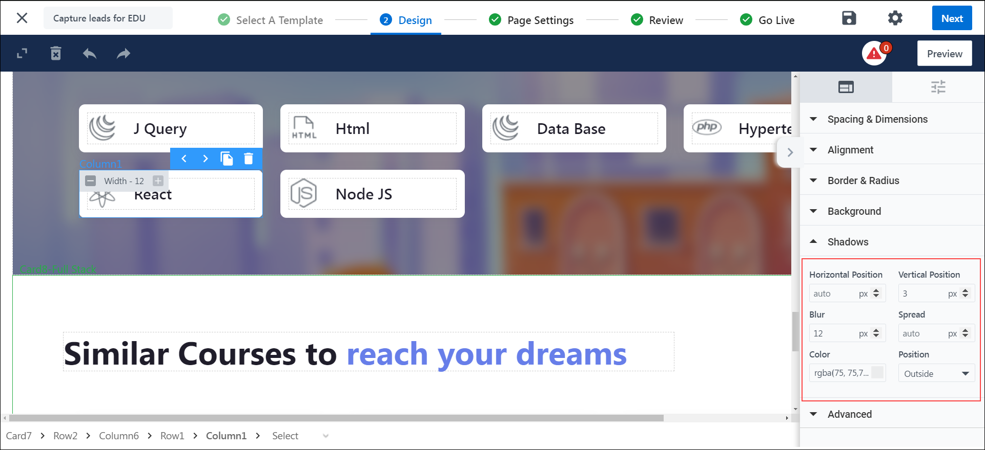
Set a shadow for the specified layout.
7.7 Effects
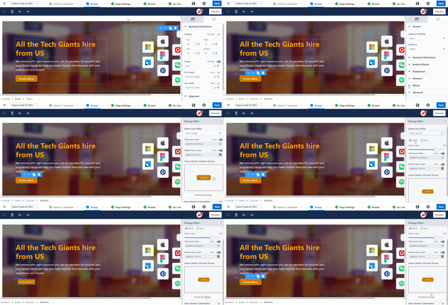
Under the Effects tab, you can enable the Hover and Parallax effect.
7.7.1 Hover Effect
With this effect, when you move your cursor over a button, it will animate.
Click on Manage Effect. You can choose from the following three effects when you hover over a button –
- Shadow Effect – Display a shadow around the button.
- Color Effect – Animate using color transition.
- Shrink & Grow Animation – The button will animate by shrinking in size and re-sizing to the original.
7.7.2 Parallax Effect
With the Parallax effect, make your background images dynamic and reactive to scroll movements. It works by creating an illusion of depth and movement as users scroll down the page.
- Select a background image.
- Select the Effects tab in the right-hand panel.
- Enable the Parallax effect.
7.8 Advanced
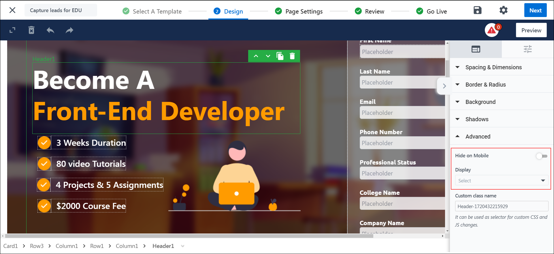
- Display – It determines the CSS display behavior of a specific layout.
- Block – Displays a layout as a block element.
- Flex – Displays a layout as a block-level flex container.
- Inline – Displays a layout as an inline element.
- Inline Block – Displays a layout as an inline-level block container.
- Inline Flex – Displays a layout as an inline-level flex container.
8. Actions
You can perform the following additional actions on the landing page designer –
- To completely clear the landing page designer canvas, click the
 icon.
icon. - To undo the changes you recently made, click the
 icon.
icon. - To redo the changes you recently made, click the
 icon.
icon. - To save your progress with the changes you made, click the
 icon.
icon. - To preview the page, click Preview.
9. Themes
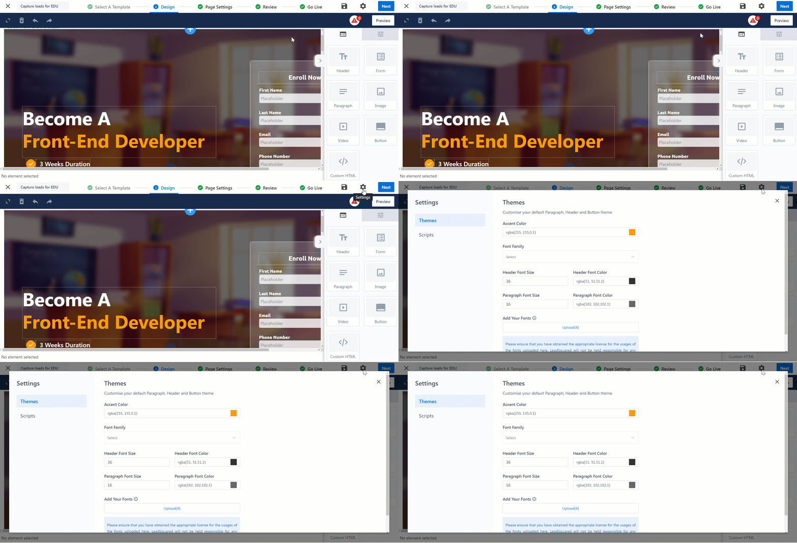
Customize your default Paragraph, Header, and Button theme through Settings by clicking the ![]() icon.
icon.
10. Mobile Editor
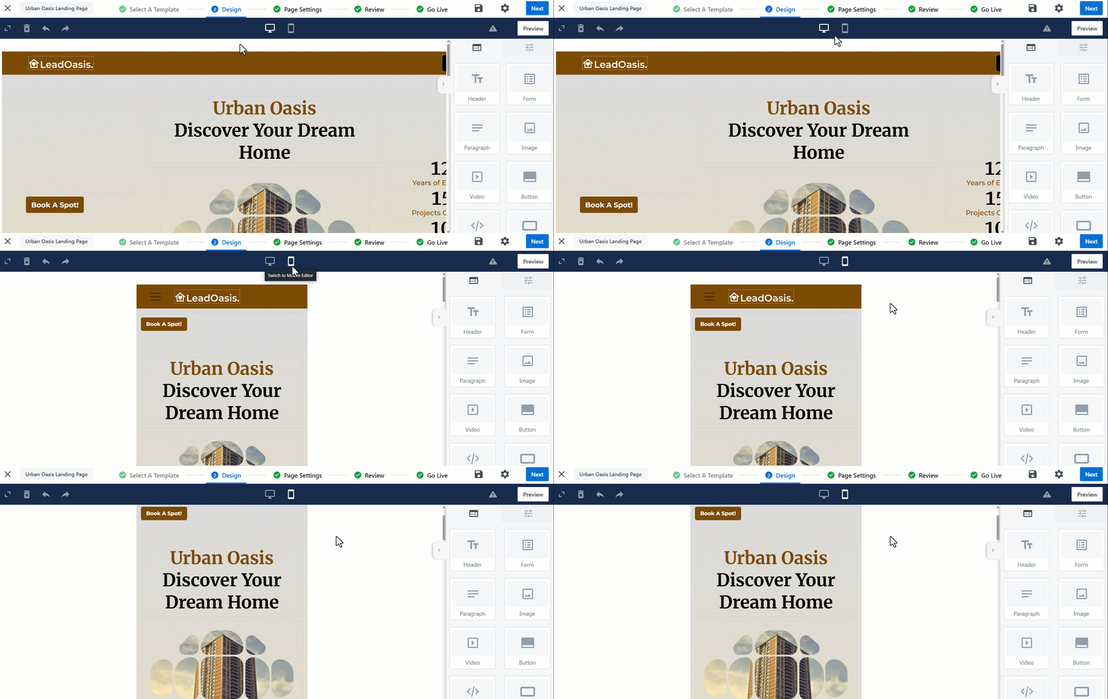
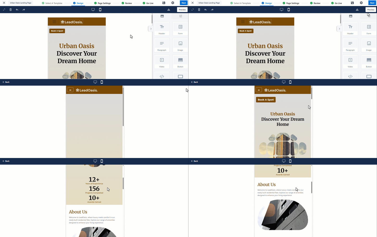
To help you create fully responsive and mobile-first designs, the Landing Pages Pro Designer includes a Mobile Editor. This feature lets you switch to mobile view and customize the layout specifically for mobile devices, ensuring a smooth experience for the majority of your audience.
Beyond cosmetic changes, the Mobile Editor allows you to tailor functional behavior—for instance, you can design distinct user journeys on mobile and desktop. You might choose to present a simplified, app-like experience on mobile while offering a more feature-rich layout on desktop.
Note:
- The older Hide on Mobile and Hide on Desktop options are no longer recommended. Instead, use the Mobile Editor for a cleaner and more intuitive layout experience.
- A default mobile version is automatically generated based on your desktop design, so using the Mobile Editor is optional. You only need to use it when you want to fine-tune the mobile layout or create a different experience tailored specifically for mobile users.
- Mobile layouts are only visible to users accessing the page on mobile devices. This view is not supported on Tablets.
Key Capabilities
Here are some capabilities of the mobile editor –
Full Editing Support
The mobile editor offers the same drag-and-drop functionality as the desktop editor, allowing you to add, rearrange, or delete components in mobile view. Once a section is edited in mobile, it becomes independent of its desktop counterpart, future changes made on desktop won’t affect it unless reverted.

Section Sync and Revert Behavior
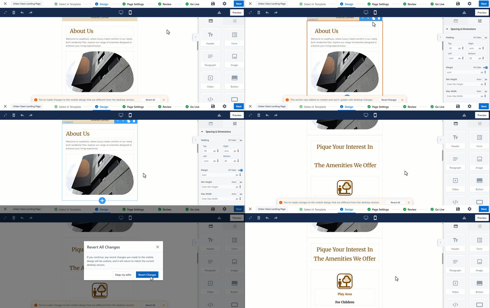
When a section is edited in mobile view, it becomes independent of the desktop version and is marked with an orange border to indicate it is out of sync.
You can click on an individual section to revert it, or you can revert the entire mobile layout at any time to restore alignment with the latest desktop design.

Preview Your Design
Click on Preview to preview and test your mobile design.
Any Questions?
Did you find this article helpful? Please let us know any feedback you may have in the comments section below. We’d love to hear from you and help you out!


Hi
I’m getting “powered by leadsquared”, in the footer, how to disable this in the footer?
Hi, Sameer. You can contact support@leadsquared.com to get this disabled.