


Get Started

Sales Suite
Field Ops
Marketing
Service CRM
Integrations & Apps
FloStack
Flostack Microsite Builder

1. Feature Overview
In the FloStack Microsite Builder, you can create customized Microsites to showcase your services and engage leads through callbacks, appointment bookings, or live chat. You can build multiple Microsites tailored to different audiences, ensuring a personalized experience. By configuring Rule Boards and assigning Microsites to different priority buckets, you can dynamically adjust content based on lead attributes. You build a Microsite in three stages, available as tabs on the Library page –
- Contents – Upload the images, videos, and documents you want to show to your leads.
- Components – Create reusable blocks, such as carousels, CTA buttons, and highlights, using your uploaded content.
- Templates – Arrange components into a Microsite layout, and configure how leads connect with their advisor.
Here are some benefits of using FloStack’s Microsite –
- Improved Speed-to-Lead and Conversions – One of the key benefits of FloStack’s personalized microsites is the ability to dramatically improve speed-to-lead and conversion rates. By providing the lead with immediate access to curated information, direct communication with a representative, and the ability to schedule appointments, businesses can significantly reduce the time it takes to engage and convert a prospect.
- Personalized Content and Engagement – The personalized microsite offers a seamless, user-friendly experience for the lead, with access to welcome videos, product information, appointment scheduling, and more. This level of personalization helps the lead feel valued and encourages them to continue their evaluation, ultimately leading to higher engagement and conversion rates.

2. Prerequisites
- You must be an admin user on FloStack. To learn more about FloStack (flostack.io), and enable it on your account, contact flostack@leadsquared.com.
- To let leads book appointments through the Microsite, configure your calendar.
- To let leads message you through the Microsite, configure a chatbot. To do this, contact flostack@leadsquared.com.
- Once a Microsite is created, use the Rule Board to control which Microsites are displayed to specific leads based on their attributes.
3. Contents
On the Contents tab, you can upload and manage the images, videos, and PDFs you want to use in your Microsite. Each content card displays the file name, file size, upload date, file type, and the number of views.
3.1 Upload Content
To view the content, navigate to Microsite Builder>Library>Contents. Click the Grid or List icon to change how the content is displayed.
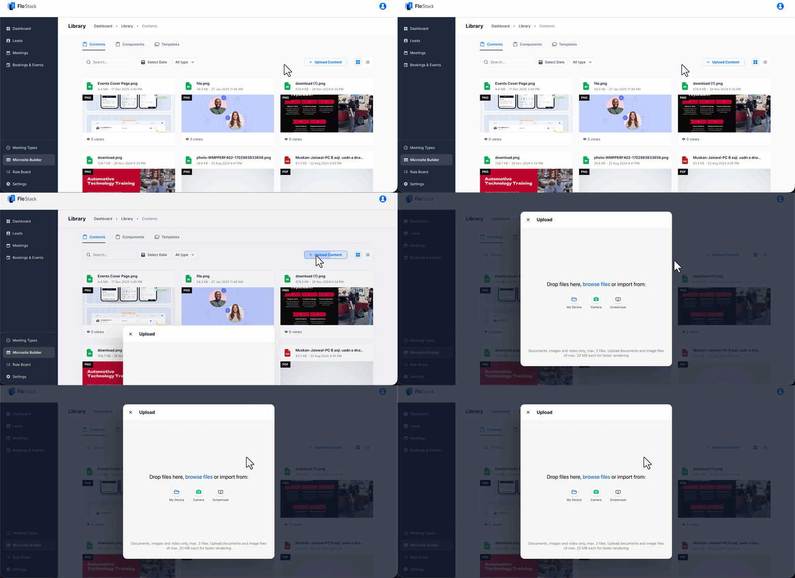
To upload a file –
- Navigate to Microsite Builder>Library>Contents.
- Click Upload Content.
- On the Upload pop-up window, drag and drop your files, or click browse files. You can also import content from My Device, Camera, or Screencast.
Note:
- You can upload a maximum of 3 files at a time.
- Upload limit for documents and images is 20 MB.
- The following file types are supported –
- Document – PDF, DOCX, TXT
- Image – JPEG, PNG, GIF, SVG, WEBP
- Video – MP4, MOV, AVI, MKV, WEBM
3.2 Search and Filter Content
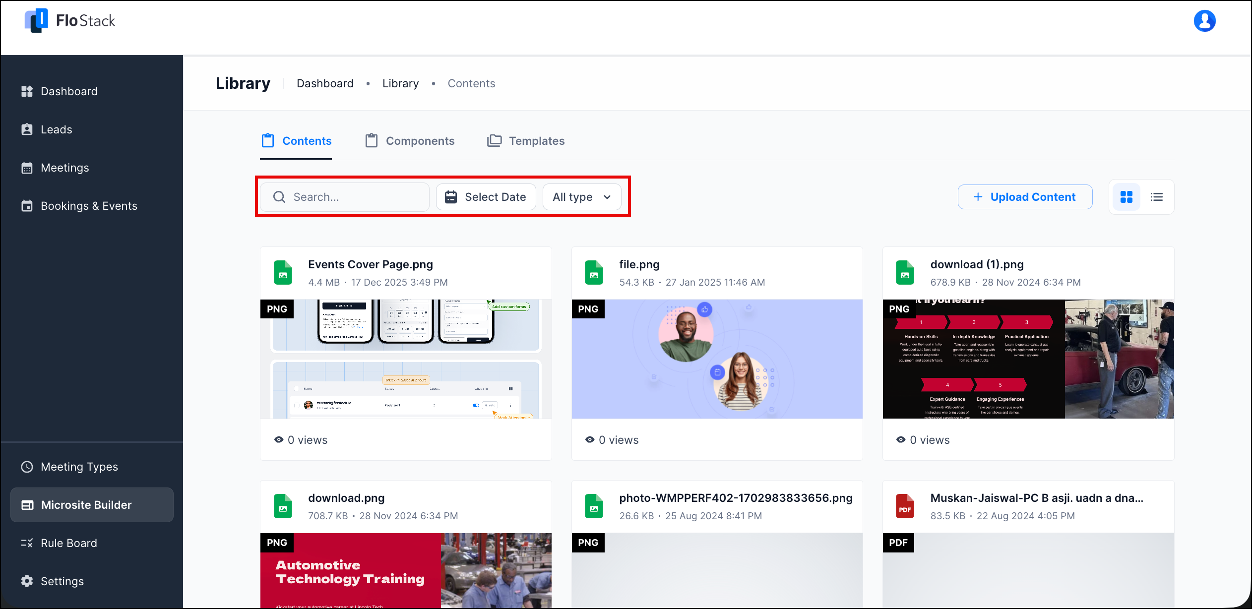
To find a specific file, use the following options on the Contents tab –
- Search – Enter the file name.
- Select Date – Choose the date on which the file was uploaded.
- All type – Select image, video, or pdf, and then click Apply. To remove the filter, click Clear.
4. Components
Components are the reusable blocks that make up a Microsite. Create a component once on the Components tab, and then add it to any Template. You can create the following components –
- Carousel – Add images and data in carousel slides.
- CTA Button – Add a block with a button to re-direct the lead to an action.
- Testimonial Carousel – Add testimonies, profiles, and similar content in a carousel.
- Highlights – Showcase important numbers or information.
- Image Carousel – Add images in carousel slides.
- Embed URL – Enter the URL to embed resources from the web in your Microsite.
- HTML Editor – Create blocks by adding text, images, videos, and links visually, or code directly.
- Image Gallery – Add images alone, or with text content as cards.
4.1 Create a Component
To create a component –
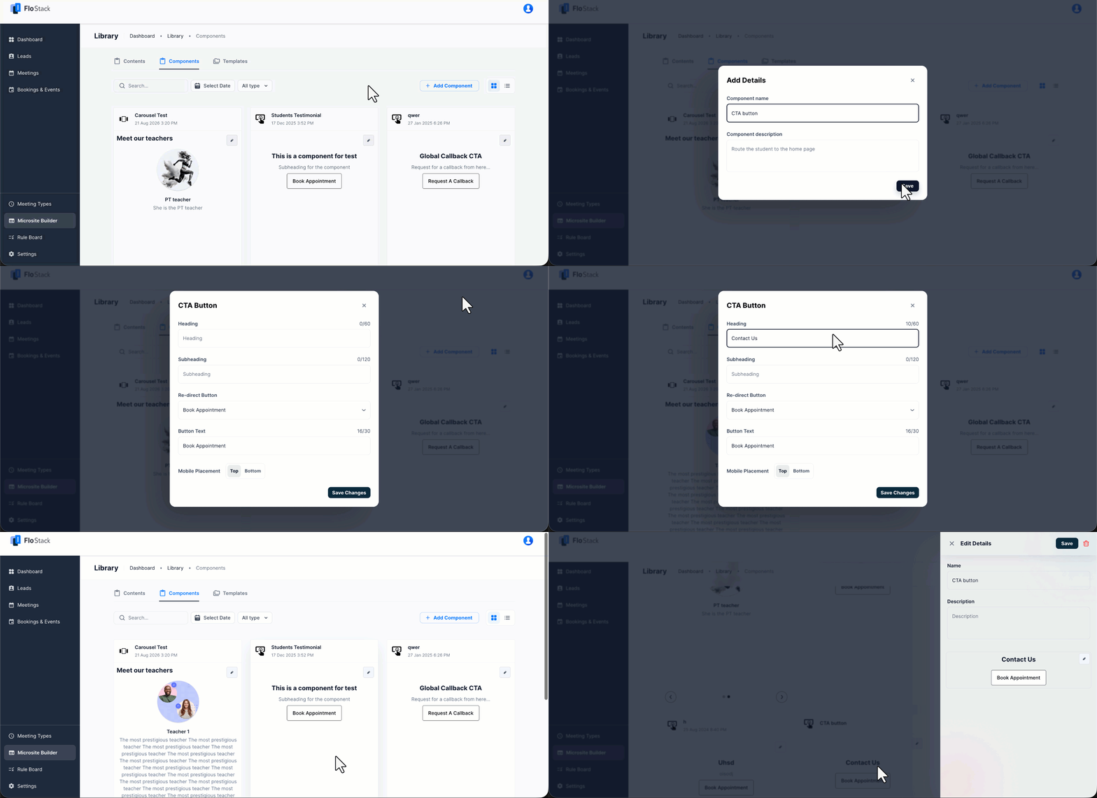
- Navigate to Microsite Builder>Library>Components, and then click Add Component.
- On the Add New Component pop-up window, under the Basic Components section, select a component, and then click Continue.
- On the Add Details pop-up window, enter the Component name and Component description, and then click Save.
- Configure the component settings, and then click Save Changes.
Note: Wherever you upload an image to a component, the following limits apply –
- Supported file types are JPEG, JPG, PNG, and GIF.
- The maximum file size is 3.1 MB.
The settings available depend on the component you select. Sections 4.2 to 4.9 describe the settings for each component.
4.2 Carousel
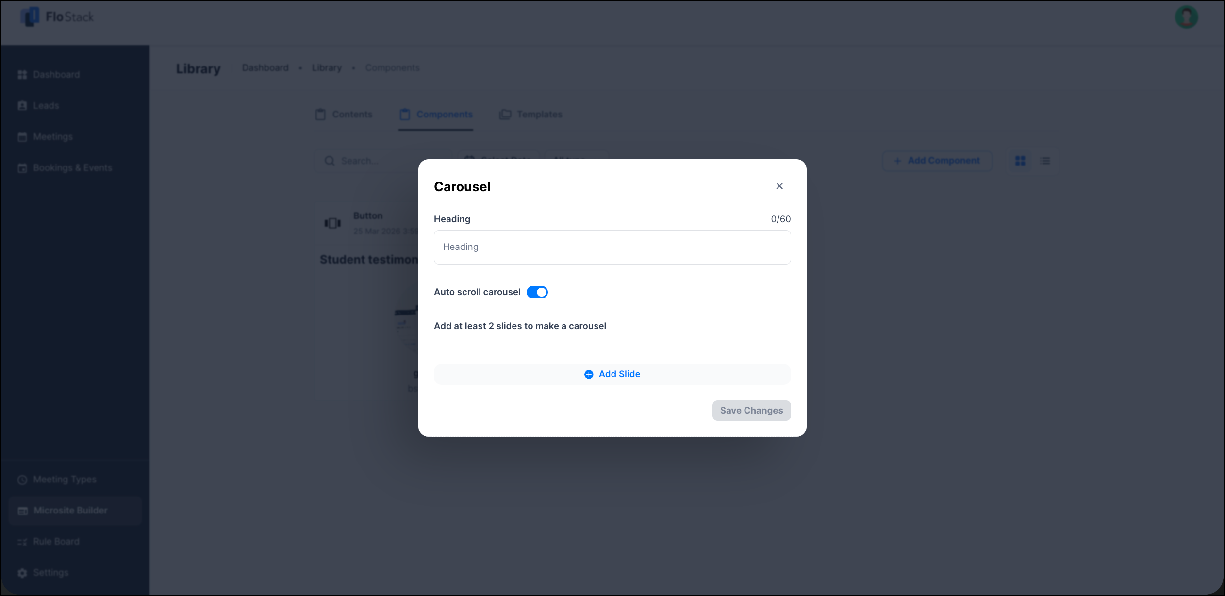
Use the Carousel component to display images along with a heading and description in carousel slides.
| Field | Description |
| Heading | The heading displayed above the carousel. You can enter up to 60 characters. |
| Auto scroll carousel | Moves the carousel to the next slide automatically. Disable the toggle to let the lead move between slides manually. |
| Add Slide | Adds a slide to the carousel. Add at least two slides to create a carousel. |
To add a slide, click Add Slide, and then configure the following on the Edit Carousel Slide pop-up window.
| Field | Description |
| Upload image | The image displayed on the slide. |
| Heading | The heading displayed on the slide. You can enter up to 60 characters. |
| Description | The text displayed below the heading. You can enter up to 500 characters. |
Click Add Slide to save the slide, and then click Save Changes.
4.3 CTA Button
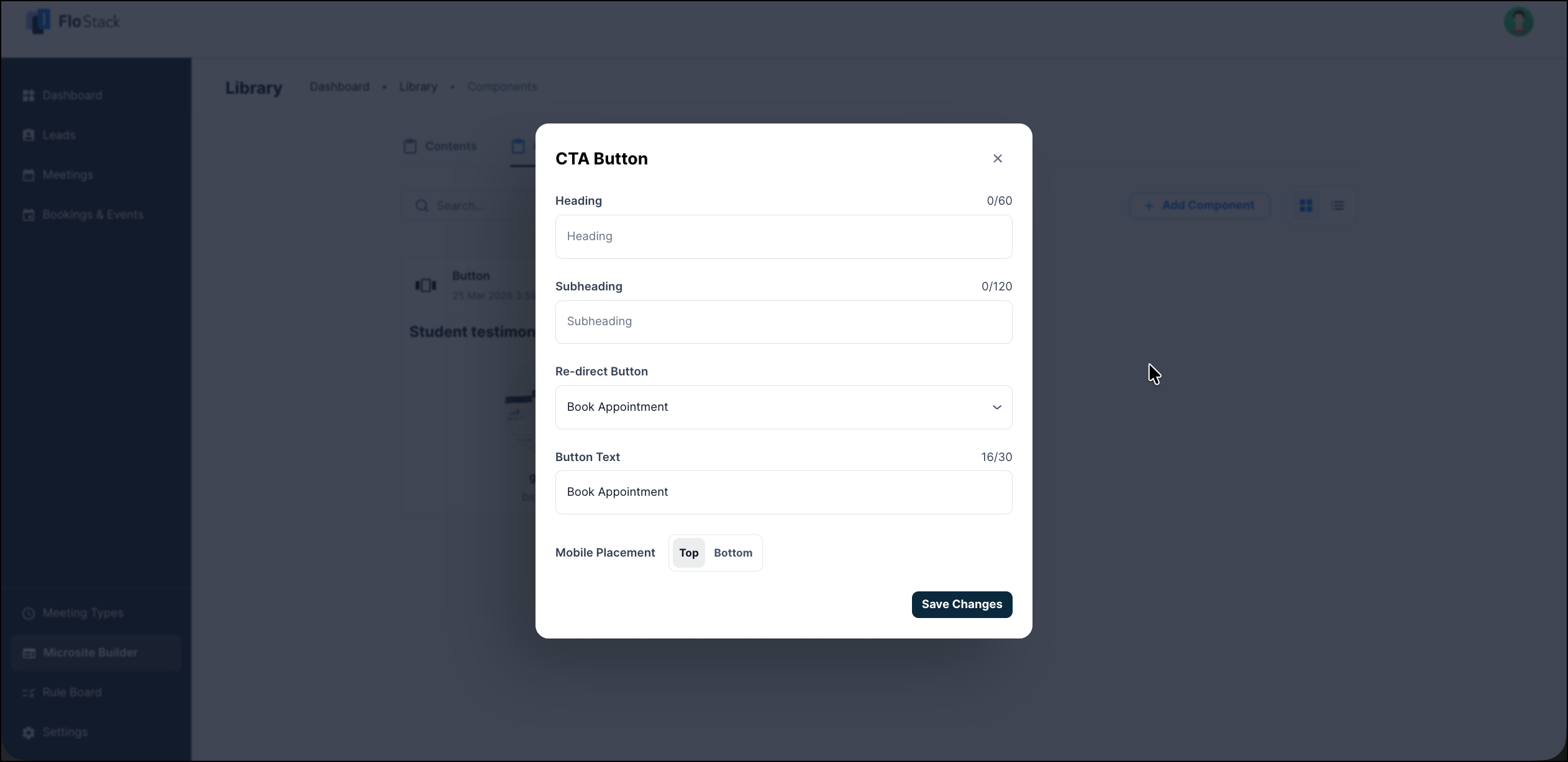
Use the CTA Button component to display a block with a button that re-directs the lead to an action.
| Field | Description |
| Heading | The heading displayed on the block. You can enter up to 60 characters. |
| Subheading | The supporting text displayed below the heading. You can enter up to 120 characters. |
| Re-direct Button | The action the lead is re-directed to when they click the button. For example, Book Appointment. |
| Button Text | The text displayed on the button. You can enter up to 30 characters. |
| Mobile Placement | The position of the block when the lead views the Microsite on a mobile device. Select Top or Bottom. |
4.4 Testimonial Carousel
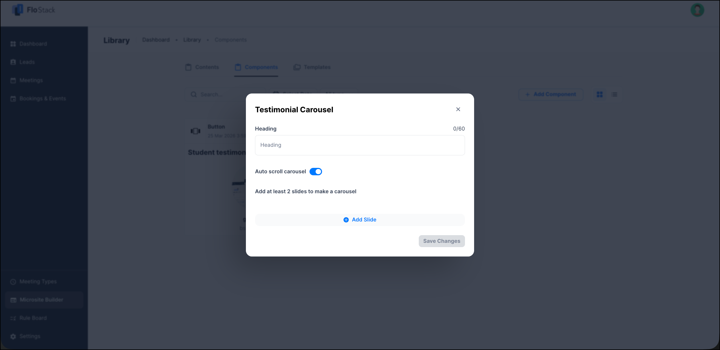
Use the Testimonial Carousel component to display testimonials and profiles in carousel slides.
| Field | Description |
| Heading | The heading displayed above the carousel. You can enter up to 60 characters. |
| Auto scroll carousel | Moves the carousel to the next slide automatically. Disable the toggle to let the lead move between slides manually. |
| Add Slide | Adds a slide to the carousel. Add at least two slides to create a carousel. |
To add a slide, click Add Slide, and then configure the following on the Edit Testimonial Carousel Slide pop-up window.
| Field | Description |
| Upload photo | The photo of the person giving the testimonial. |
| Name | The name of the person. You can enter up to 60 characters. |
| Job Title | The job title of the person. You can enter up to 60 characters. |
| Testimonial | The body text of the testimonial. You can enter up to 500 characters. |
Click Add Slide to save the slide, and then click Save Changes.
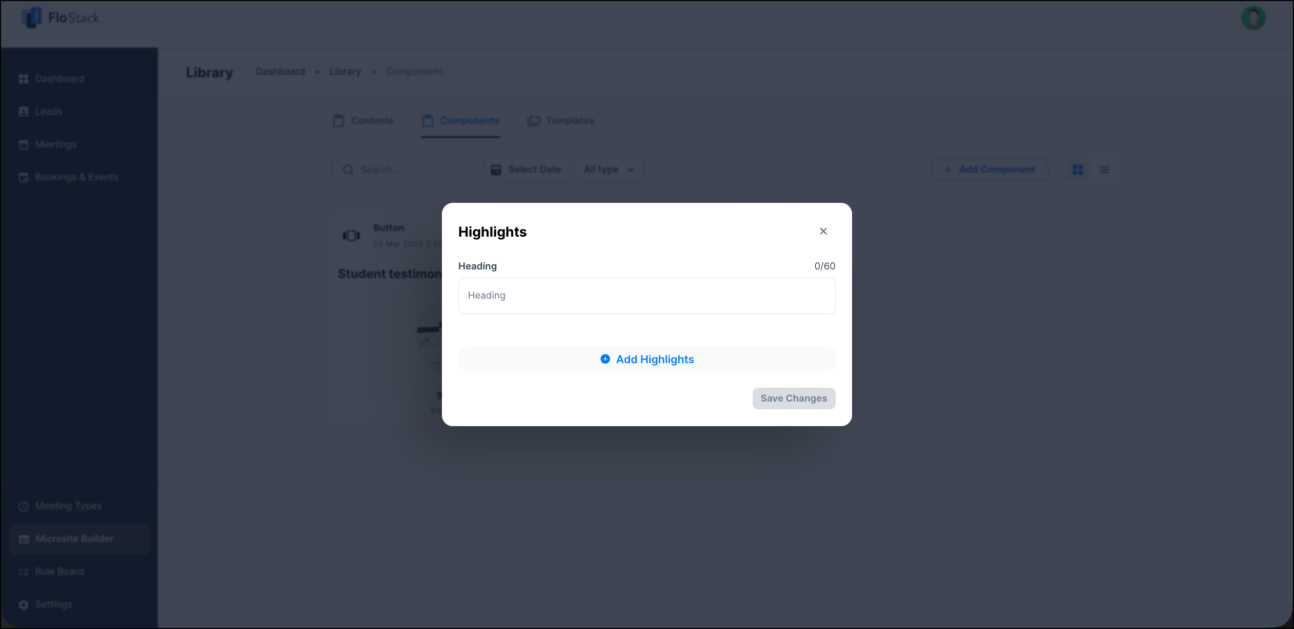
4.5 Highlights
Use the Highlights component to put a spotlight on key details, such as important numbers or program information. Each highlight is a key and value pair with an icon.
| Field | Description |
| Heading | The heading displayed above the highlights. You can enter up to 60 characters. |
| Add Highlights | Adds a highlight to the component. |
To add a highlight, click Add Highlights, and then configure the following on the Edit highlight pop-up window.
| Field | Description |
| Icon | The icon displayed with the highlight. To change it, click the Edit icon. |
| Key | The label of the highlight. For example, Program Name. You can enter up to 60 characters. |
| Value | The value against the label. For example, Nursing. You can enter up to 60 characters. |
Click Add to save the highlight, and then click Save Changes.
4.6 Image Carousel
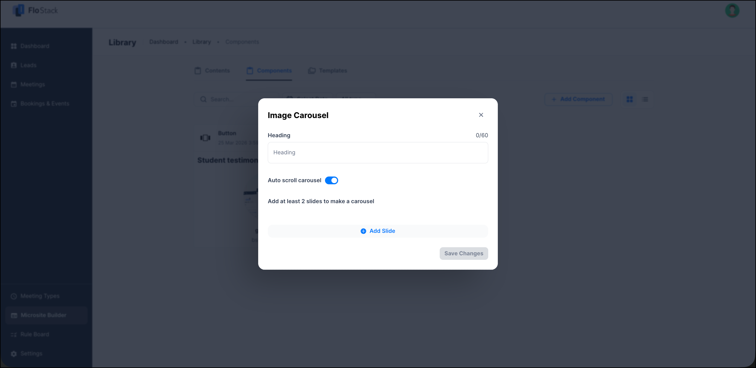
Use the Image Carousel component to display images in carousel slides, without any accompanying text.
| Field | Description |
| Heading | The heading displayed above the carousel. You can enter up to 60 characters. |
| Auto scroll carousel | Moves the carousel to the next slide automatically. Disable the toggle to let the lead move between slides manually. |
| Add Slide | Adds a slide to the carousel. Add at least two slides to create a carousel. |
To add a slide, click Add Slide, and then upload an image on the Edit Carousel Slide pop-up window. Click Add Slide to save the slide, and then click Save Changes.
4.7 Embed URL
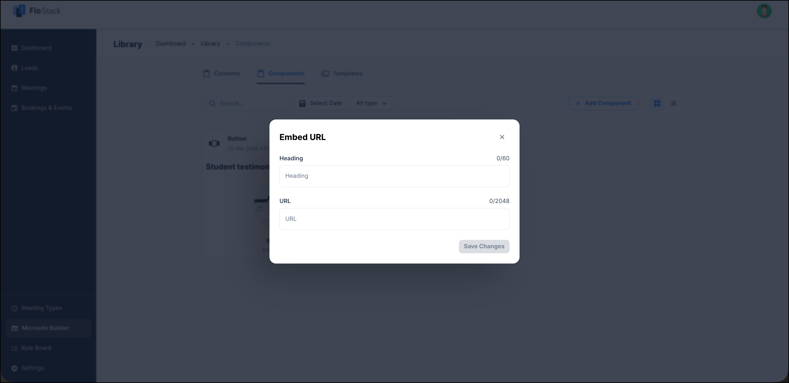
Use the Embed URL component to embed a resource from the web in your Microsite.
| Field | Description |
| Heading | The heading displayed above the embedded resource. You can enter up to 60 characters. |
| URL | The URL of the resource you want to embed. You can enter up to 2048 characters. |
4.8 HTML Editor
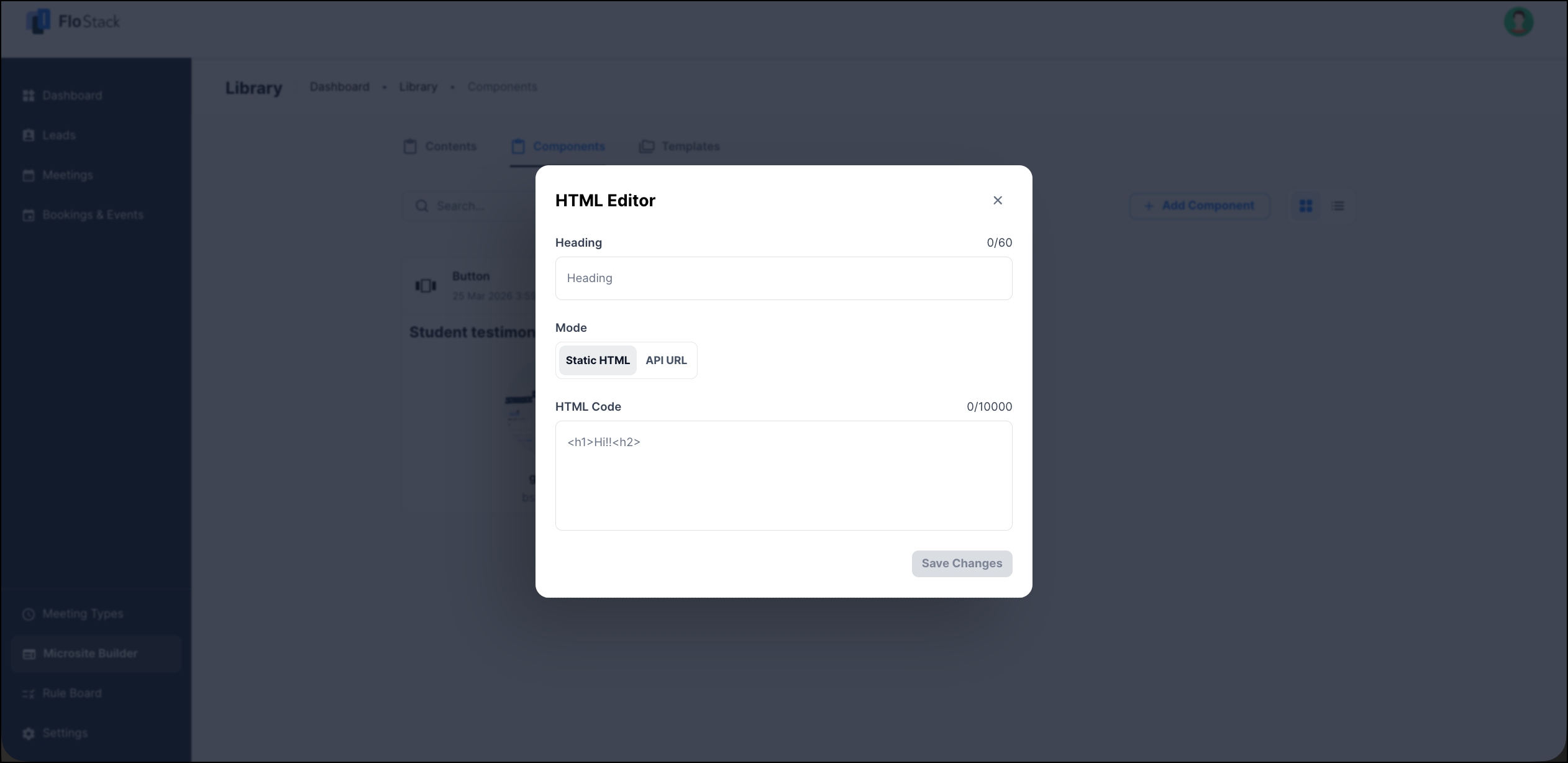
Use the HTML Editor component to add your own HTML to the Microsite. You can either paste the HTML directly, or point the component at a URL that returns HTML.
| Field | Description |
| Heading | The heading displayed above the block. You can enter up to 60 characters. |
| Mode | Select Static HTML to enter the HTML yourself, or API URL to fetch the HTML from a URL. |
| HTML Code | Available when the mode is Static HTML. The HTML rendered in the block. You can enter up to 10,000 characters. |
| API URL | Available when the mode is API URL. The URL that FloStack calls using a GET request to fetch the HTML. |
4.9 Image Gallery
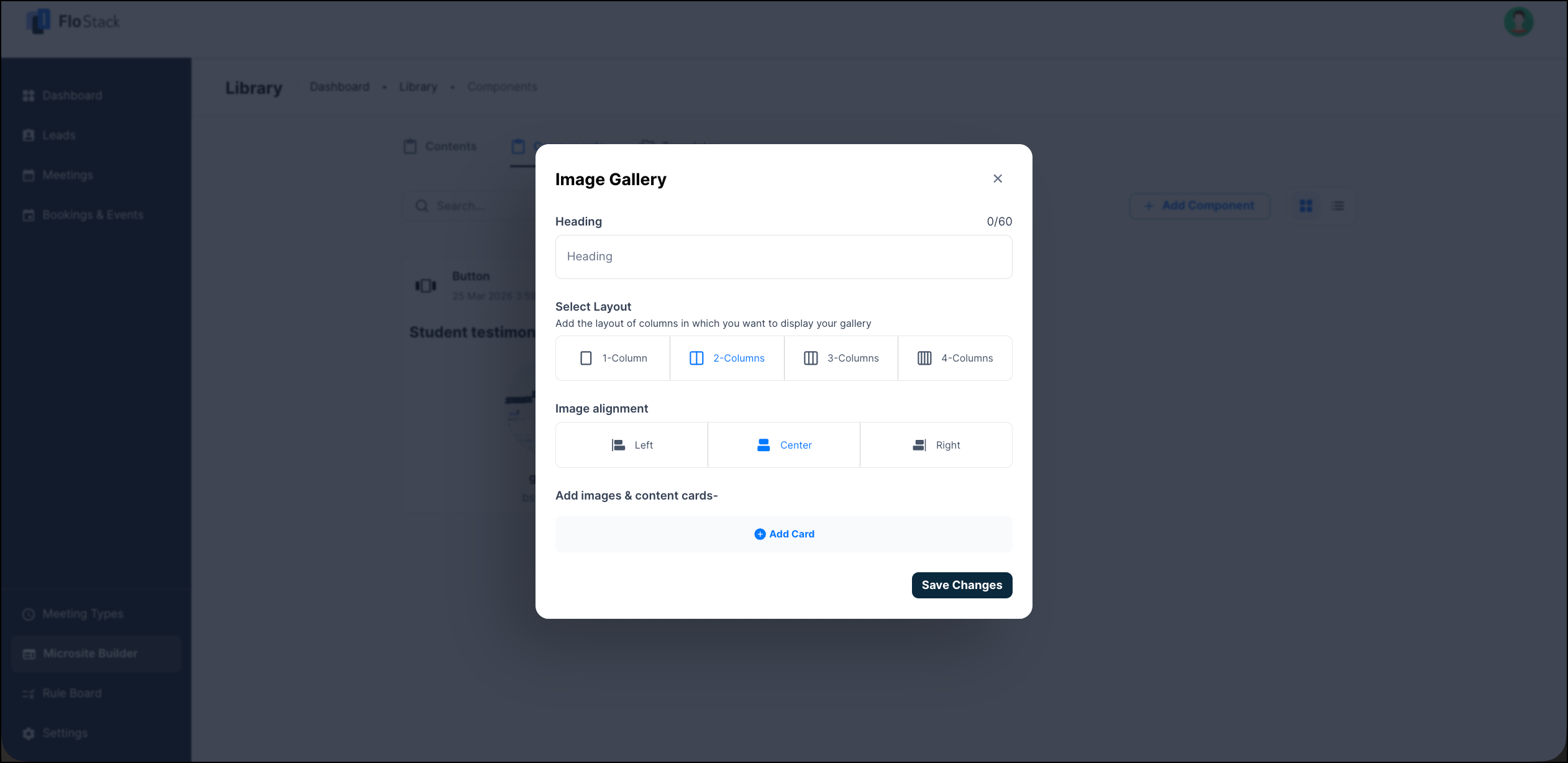
Use the Image Gallery component to display images on their own, or as cards with a title and description.
| Field | Description |
| Heading | The heading displayed above the gallery. You can enter up to 60 characters. |
| Select Layout | The number of columns in which the gallery is displayed. Select 1-Column, 2-Columns, 3-Columns, or 4-Columns. |
| Image alignment | The alignment of the images within the gallery. Select Left, Center, or Right. |
| Add Card | Adds an image and content card to the gallery. |
To add a card, click Add Card, and then configure the following on the Add Image & Content Card pop-up window.
| Field | Description |
| Upload image | The image displayed on the card. |
| Title | The title displayed on the card. You can enter up to 60 characters. |
| Description | The text displayed below the title. Use the toolbar to format the text. You can enter up to 1000 characters. |
Click Add Card to save the card, and then click Save Changes.
4.10 Search, Filter, and Edit Components
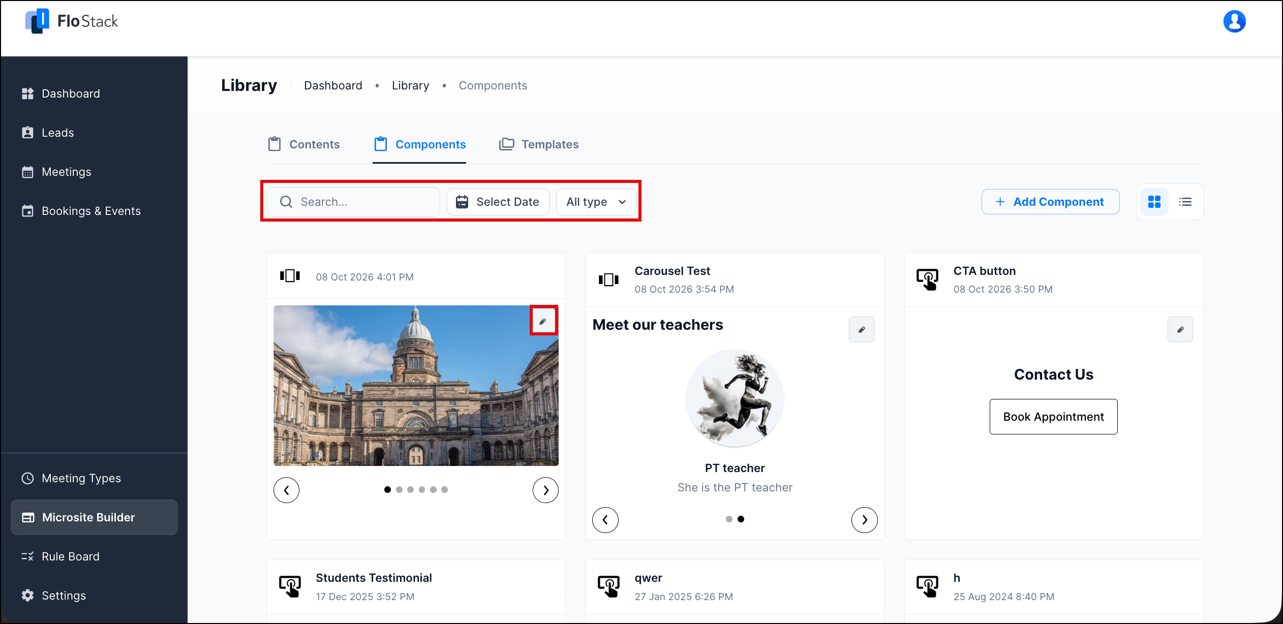
On the Components tab, use the following options –
- Search – Enter the component name.
- Select Date – Choose the date on which the component was created.
- All type – Select CTA, CAROUSEL, ICON_TEXT_LIST, or IFRAME, and then click Apply. To remove the filter, click Clear.
To modify a component, hover your cursor over the component card, and then click the Edit icon.
5. Templates
A Template is the Microsite layout your leads see.
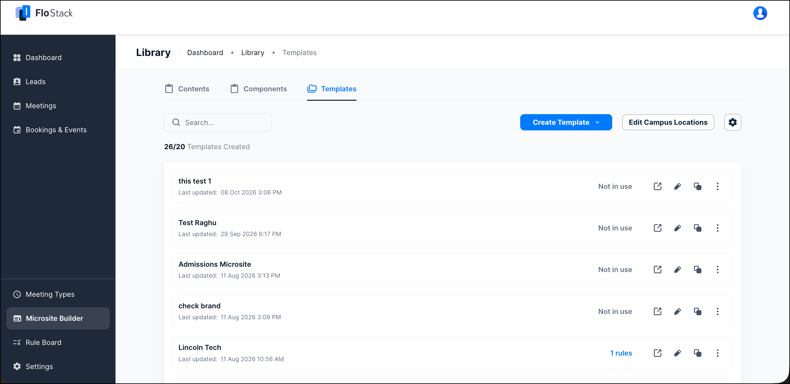
Navigate to Microsite Builder>Library>Templates. On the Templates tab, you can create, preview, duplicate, and manage your Microsites. The tab also displays the number of Templates you have created against the Templates available on your account. Against each Template, you can view the date it was last updated, and whether it is mapped to a Rule Board. Templates that are not mapped display Not in use.
Hover your cursor over a Template to use the following icons –
| Icon | Description |
| Preview | Opens the Microsite in a new tab, as your lead sees it. |
| Edit | Opens the Template in the template editor. |
| Duplicate | Creates a copy of the Template. |
| More | Displays additional actions for the Template. |
5.1 Create a Template
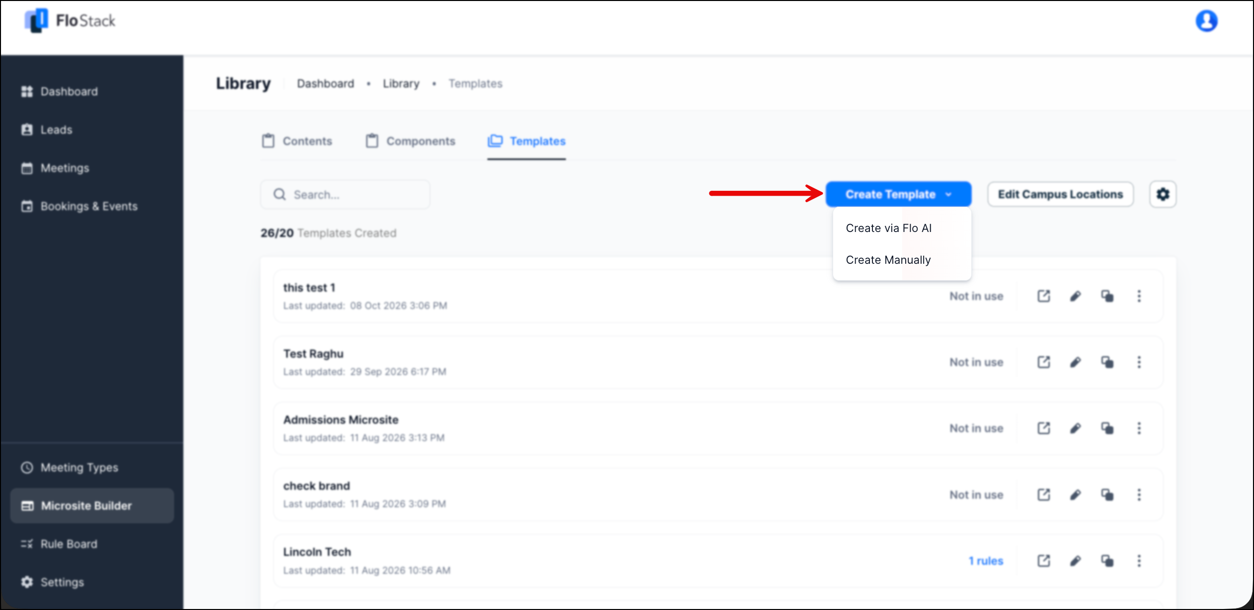
To create a Template, navigate to Microsite Builder>Library>Templates, click Create Template, and then select one of the following –
- Create via Flo AI – Answer a short set of questions, and let Flo generate the Microsite for you.
- Create Manually – Build the Microsite yourself in the template editor.
5.2 Create a Template Using Flo AI
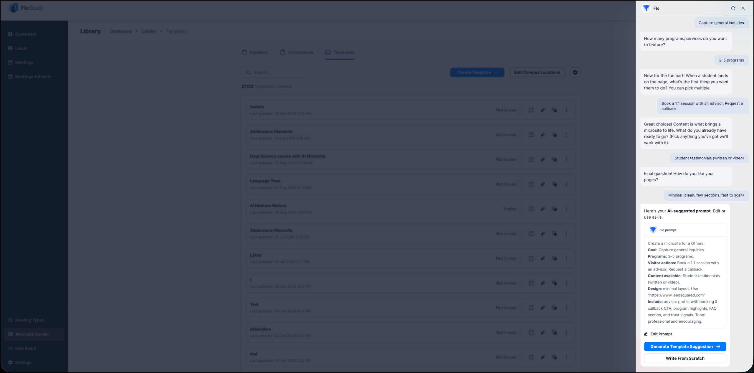
Flo is the AI assistant that builds a Microsite for you, based on your answers to seven questions. To create a Template using Flo –
- Click Create Template>Create via Flo AI.
- On the Flo pane, answer the questions. For questions where you can select more than one option, click Confirm after making your selections.
- Review the Flo prompt that Flo generates from your answers. To modify it, click Edit Prompt.
- Click Generate Template Suggestion. To write your own prompt instead, click Write From Scratch.
Flo asks the following questions –
| Question | Description |
| Website URL | Your current website. Flo uses it to match the look and feel of your brand. |
| Institution category | The type of institution you represent. |
| Main goal | What you want the Microsite to achieve. For example, Capture general inquiries. |
| Programs or services | The number of programs or services you want to feature. |
| Visitor actions | What you want the lead to do first. You can select more than one option, such as Book a 1:1 session with an advisor, Request a callback, Chat with an advisor, or Register for an event. |
| Content available | The content you already have, such as student testimonials. |
| Page layout | How you want the Microsite laid out. For example, Minimal (clean, few sections, fast to scan). |
5.3 Create Template Manually
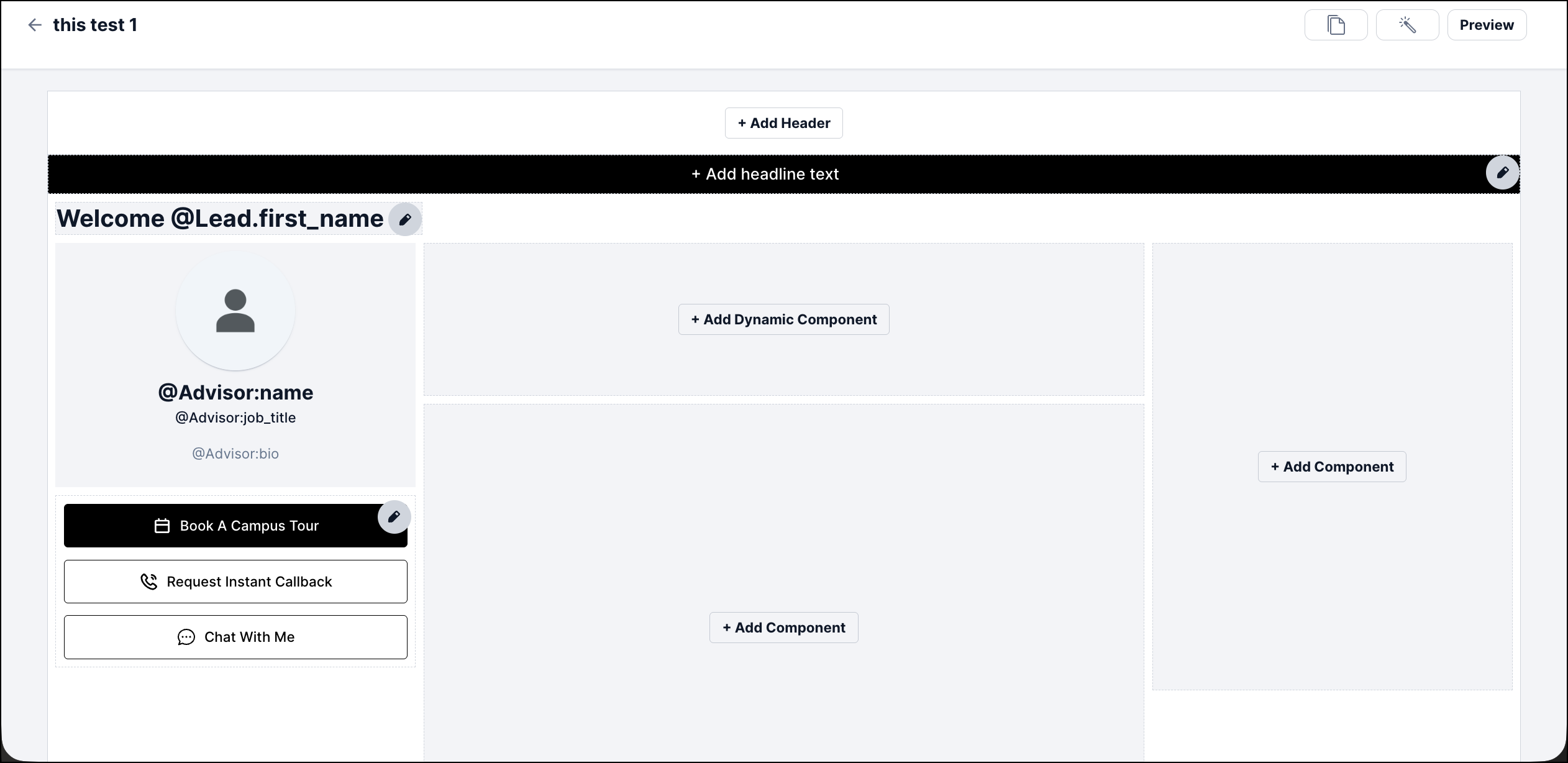
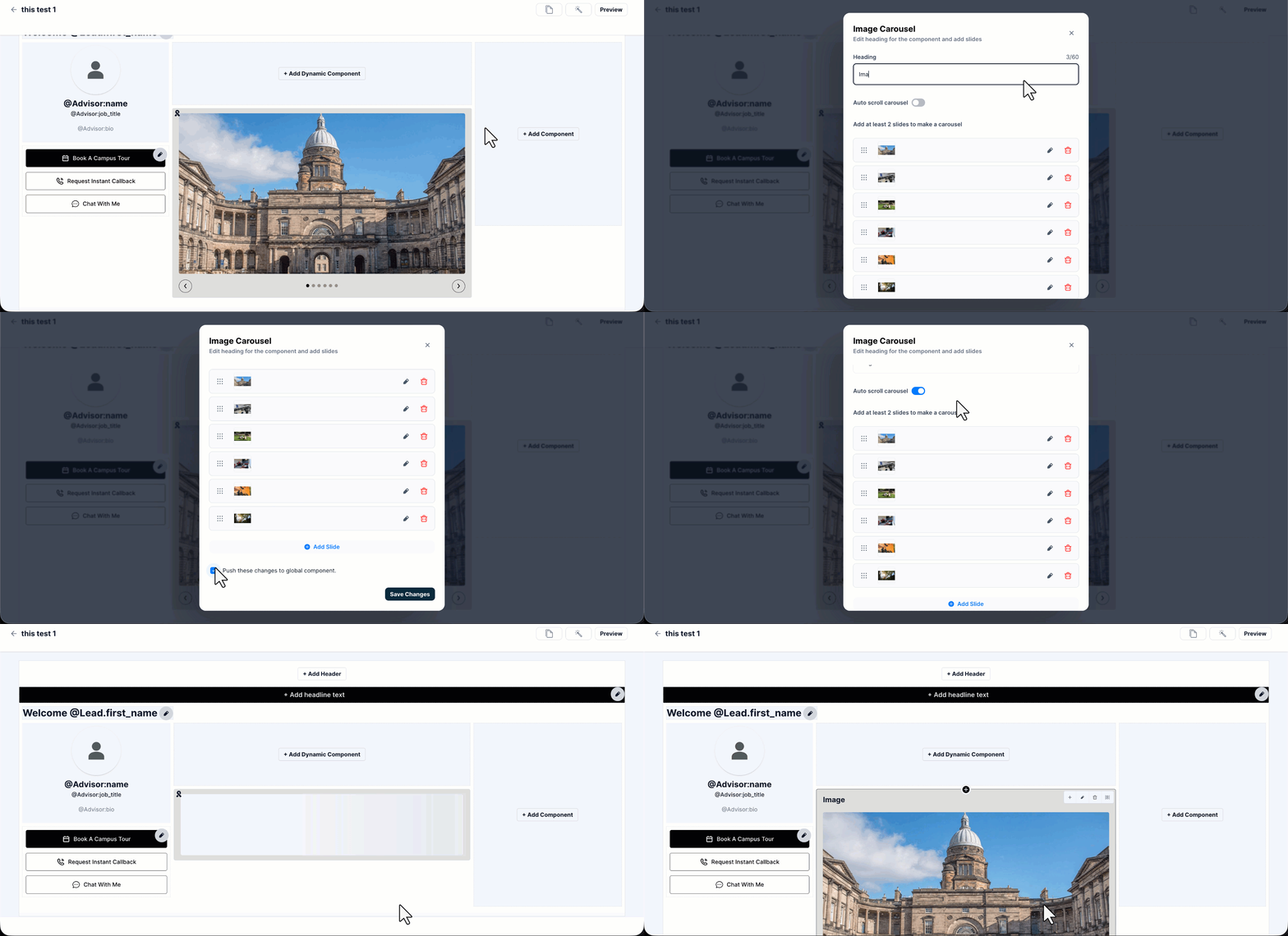
In the template editor, you can add the following to your Microsite –
- Add Header – Add a banner or logo at the top of the Microsite.
- Add headline text – Add a headline below the header.
- Welcome message – Personalize the greeting using placeholders, such as @Lead.first_name.
- Advisor card – Displays the advisor details using the @Advisor:name, @Advisor:job_title, and @Advisor:bio
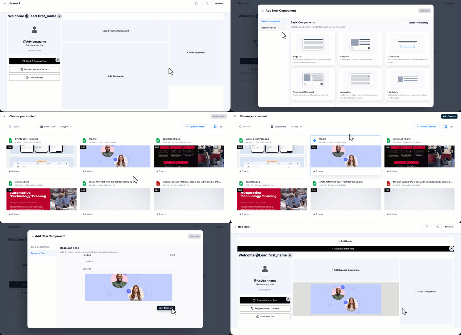
- Add Component – Add a component from your library, or create one from scratch.
- Add Dynamic Component – Add a component whose content changes based on the lead. For example, Nearest Campus Location, which uses the locations you configured through Edit Campus Locations (refer to section 8).
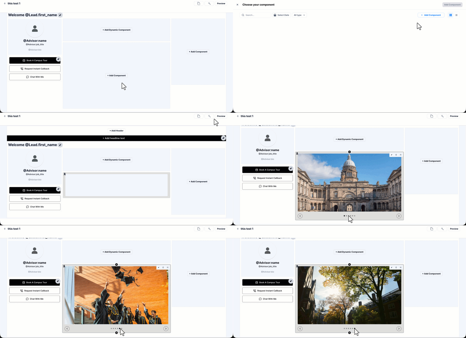
To add a component, click + Add Component, or click the icon above or below an existing component. Once you add a component, you can enrich it with content (images, videos, PDFs) from your library.
Hover your cursor over a component to edit, delete, or rearrange it.
5.4 Add a Dynamic Block
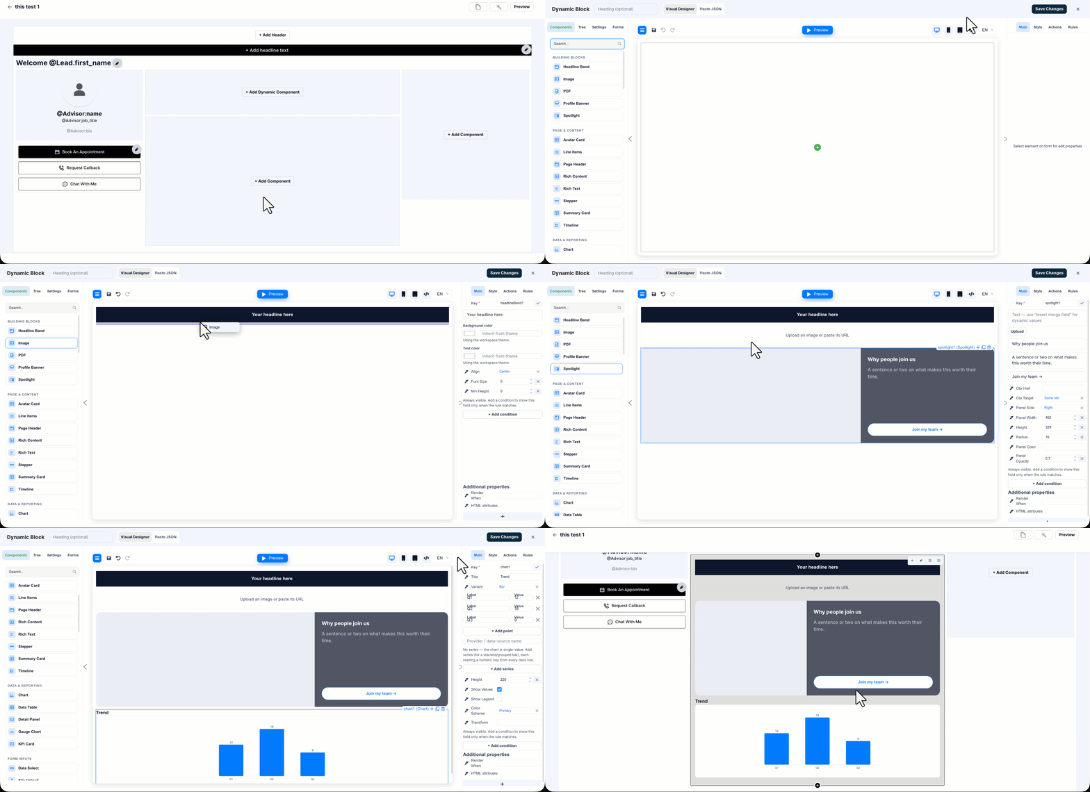
Use a Dynamic Block to design a component that the built-in components do not cover. You design the block in a separate designer, and FloStack adds the result to your Microsite as a component. To add a Dynamic Block, in the template editor, click + Add Component, select Dynamic Block, and then click Continue. The designer opens in two modes –
- Visual Designer – Drag building blocks, such as Image, Rich Text, Avatar Card, and Timeline, onto the canvas, and then set their properties on the right pane.
- Paste JSON – View and edit the JSON the block is built from. Changes you paste here appear on the canvas.
Click Preview to see the block, and then click Save Changes.
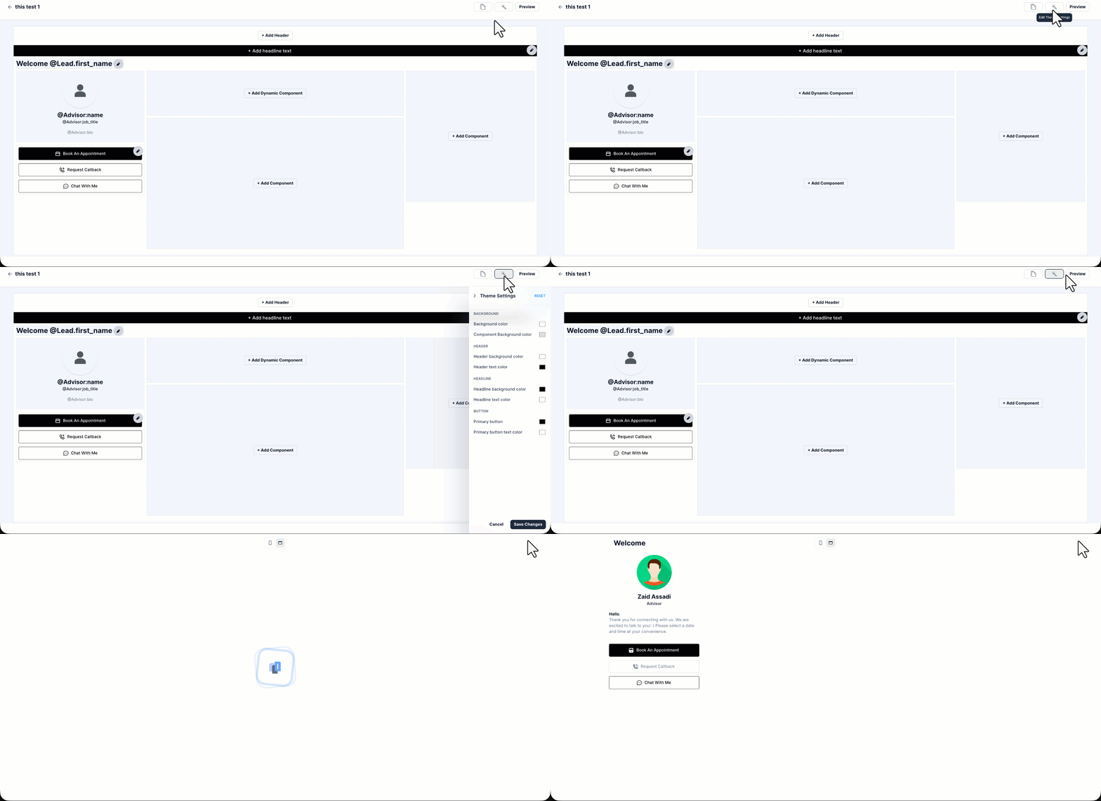
5.4 Change the Theme and Preview the Microsite
Click the icon to edit the theme of your Template. Click Preview to preview the Microsite.
6. Advisor Buttons
Leads communicate with you through the advisor buttons on the Microsite. Using these buttons, a lead can book an appointment, request a callback, or chat with their advisor directly.
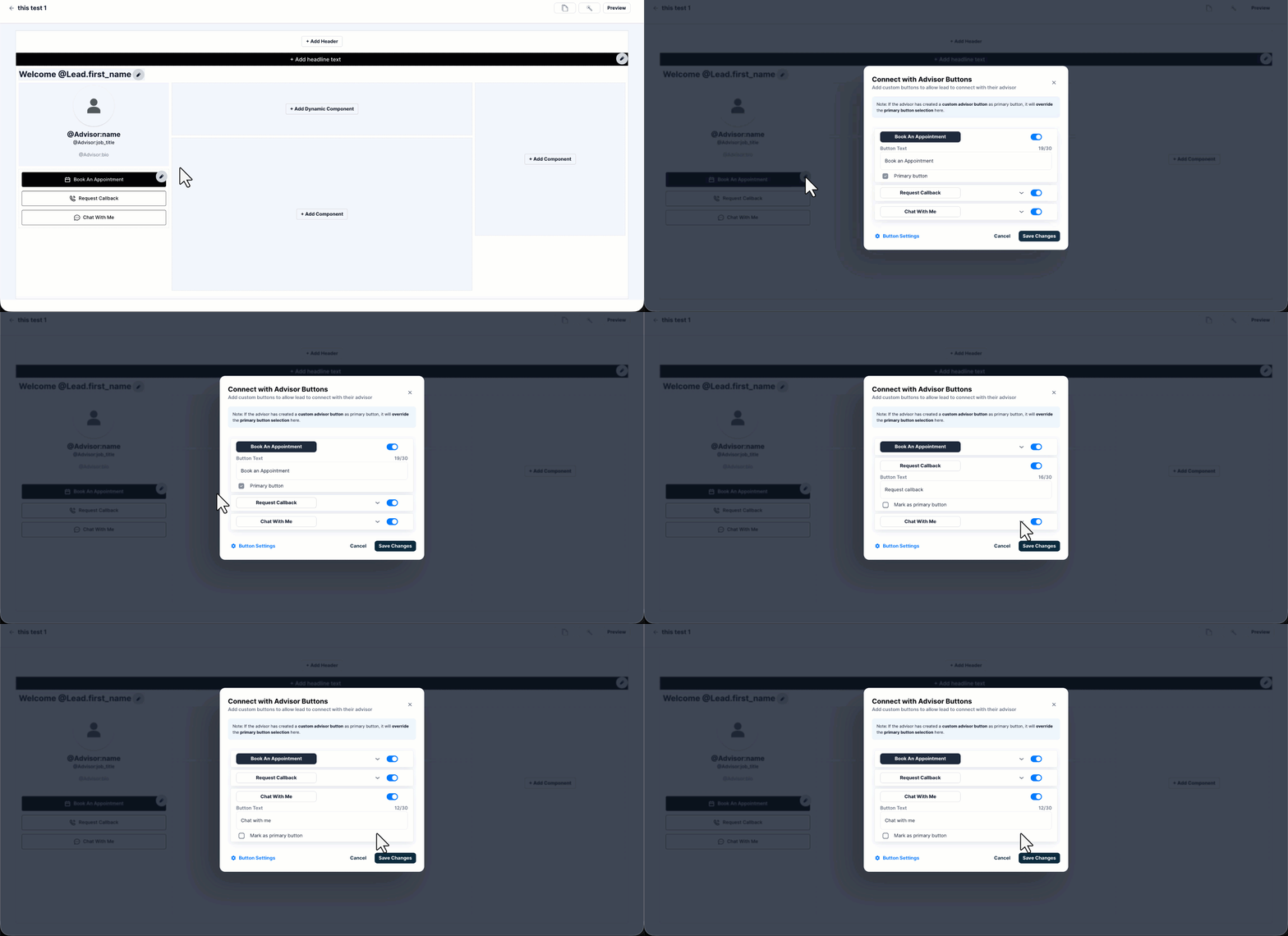
6.1 Configure the Buttons
To choose which buttons appear on a Microsite –
- In the template editor, hover your cursor over the buttons block, and then click the Edit
- On the Connect with Advisor Buttons pop-up window, enable or disable a button using the toggle.
- To rename a button, expand it, and then enter the Button Text. You can enter up to 30 characters.
- To display a button prominently on the Microsite, select the Primary button
- Click Save Changes.
6.2 Configure the Button Settings
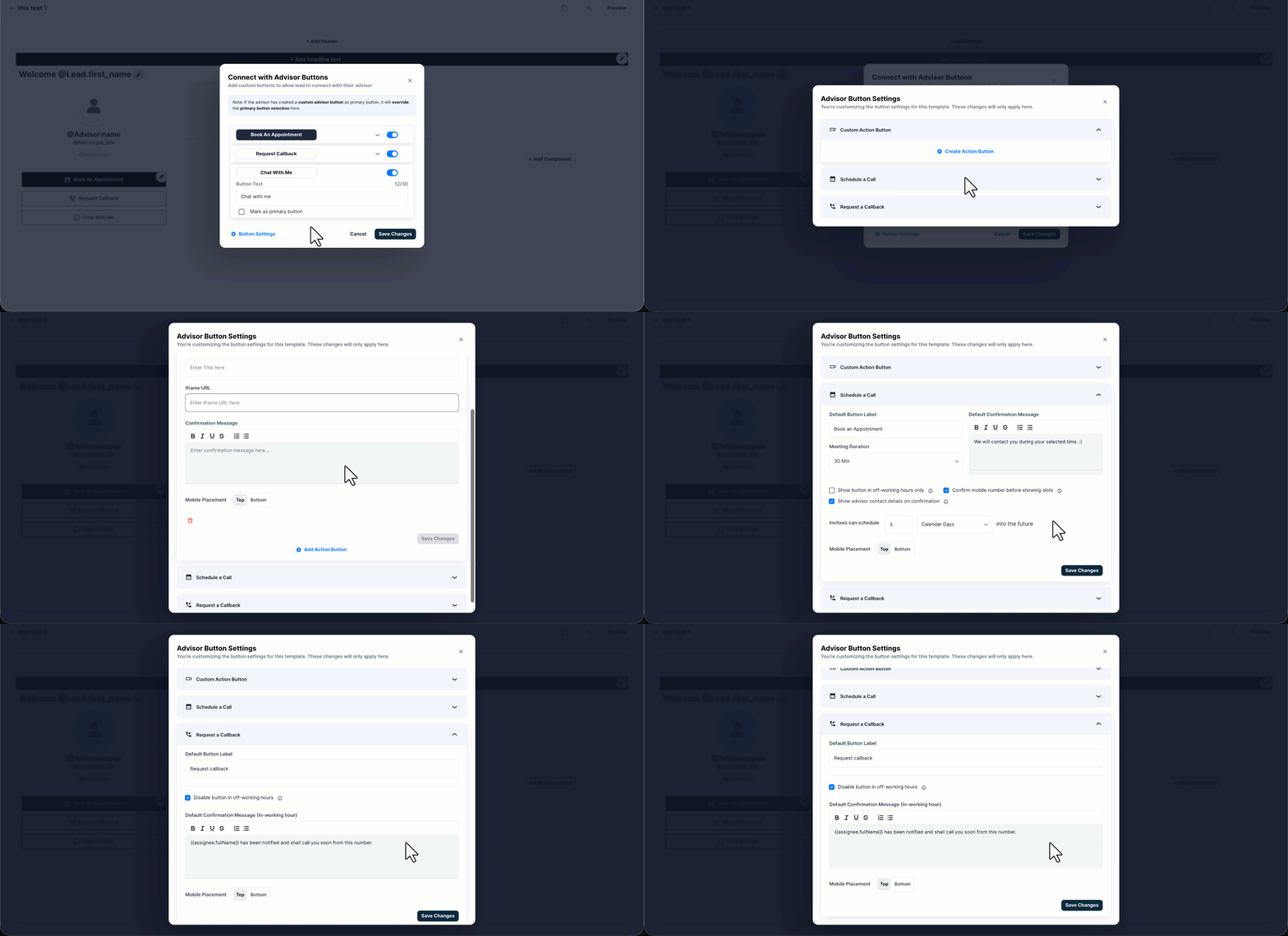
To configure how each button behaves for this Template, on the Connect with Advisor Buttons pop-up window, click Button Settings. You can configure the Custom Action Button, Schedule a Call, and Request a Callback sections.
Use the Custom Action Button section to add a button of your own, in addition to the standard buttons. When the lead clicks the button, the page you point it at is displayed in a pop-up window –
| Field | Desacription |
| Icon | The icon displayed on the button. |
| Button Label | The text displayed on the button. |
| Confirmation Title | The title displayed on the pop-up window that opens when the lead clicks the button. |
| Iframe URL | The URL of the page displayed in the pop-up window. |
| Confirmation Message | The message displayed to the lead on the pop-up window. Use the toolbar to format the message. |
| Mobile Placement | The position of the button when the lead views the Microsite on a mobile device. Select Top or Bottom. |
To remove a custom action button, click the Delete icon.
Note:
- A custom action button is always an addition. It does not replace the existing buttons.
- The changes you make here apply only to this Template.
Under the Schedule a Call section, configure the following –
| Field | Description |
| Default Button Label | The text displayed on the button. |
| Meeting Duration | The length of the appointment slot offered to the lead. |
| Default Confirmation Message | The message the lead sees after booking a slot. Use the toolbar to format the message. |
| Show button in off-working hours only | Displays the button to the lead only outside your working hours. |
| Confirm mobile number before showing slots | Prompts the lead to confirm their mobile number before the available slots are displayed. |
| Show advisor contact details on confirmation | Displays the advisor’s contact details to the lead on the confirmation screen. |
| Invitees can schedule | The booking window available to the lead. Enter a number, and then select Calendar Days. |
| Mobile Placement | The position of the button when the lead views the Microsite on a mobile device. Select Top or Bottom. |
Under the Request a Callback section, configure the following –
| Field | Description |
| Default Button Label | The text displayed on the button. |
| Disable button in off-working hours | Prevents the lead from requesting a callback outside your working hours. |
| Default Confirmation Message (In-working hour) | The message the lead sees after requesting a callback during working hours. Use placeholders, such as {{assignee.fullName}}, to personalize the message. |
| Mobile Placement | The position of the button when the lead views the Microsite on a mobile device. Select Top or Bottom. |
Note:
- To let leads book an appointment, configure your calendar.
- To let leads message you, configure a chatbot. To do this, contact flostack@leadsquared.com.
7. Template Default Settings
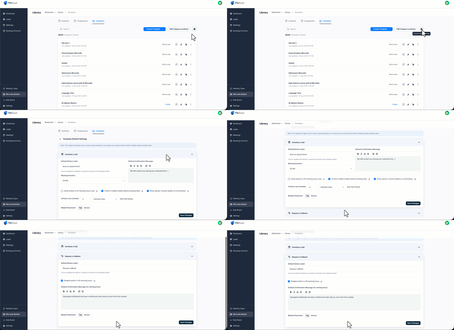
Use Template Default Settings to set the advisor button configuration applied to every new Template. This saves you from configuring the same settings each time you create a Microsite. To configure the default settings –
- Navigate to Microsite Builder>Library>Templates.
- Click the Settings
- On the Template Default Settings page, expand the Schedule a Call or Request a Callback
- Configure the settings, and then click Save Changes.
Note:
- These changes apply only to newly created Templates. To update an existing Template, edit the Button Settings in the template editor.
- The fields available here are the same as the fields described in section 6.2 Configure the Button Settings.
8. Campus Locations
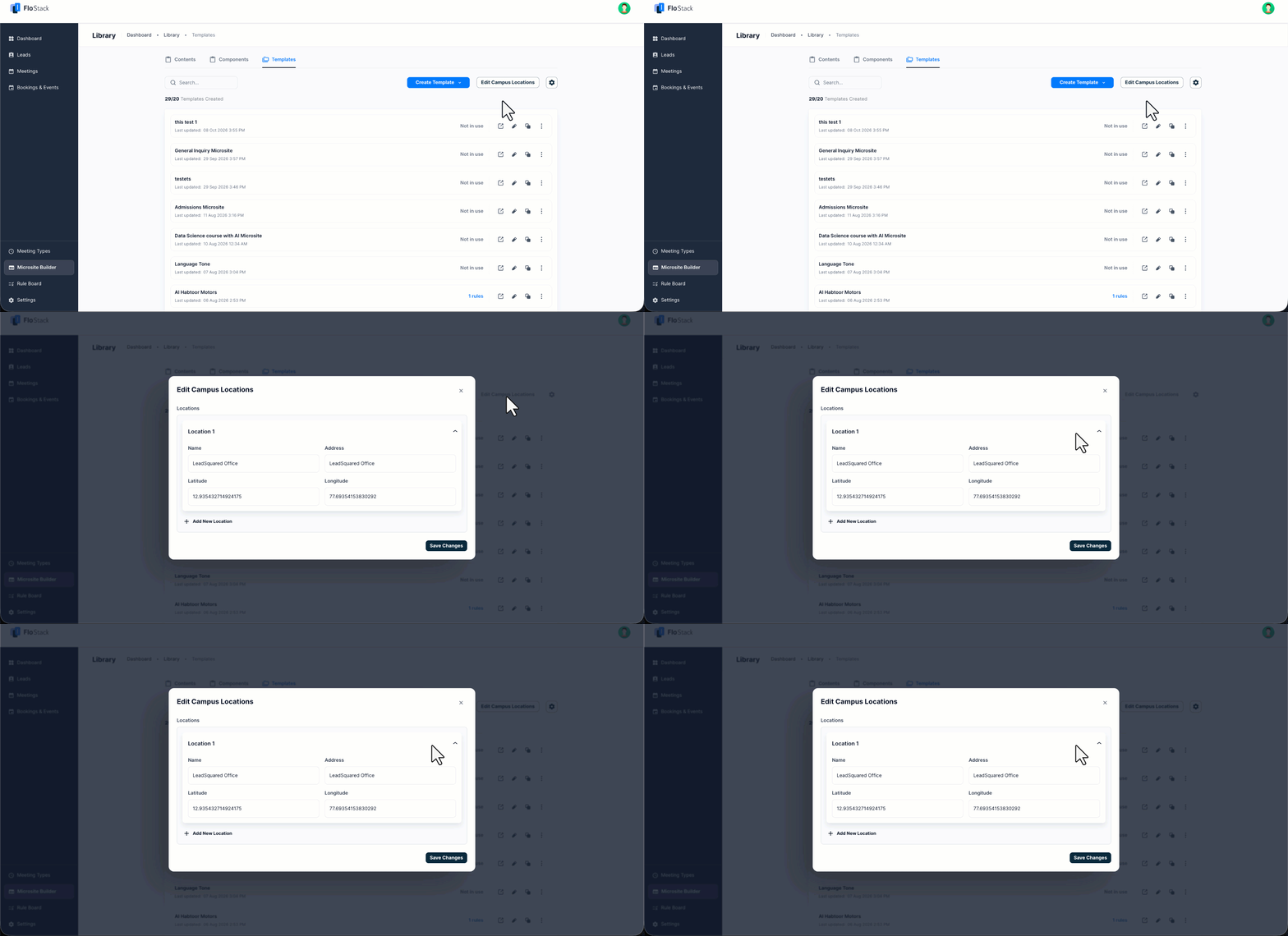
If your leads book in-person appointments, add your campus or office locations. The location is then available when a lead schedules a visit. To add a location –
- Navigate to Microsite Builder>Library>Templates.
- Click Edit Campus Locations.
- On the Edit Campus Locations pop-up window, enter the Name, Address, Latitude, and Longitude.
- To add another location, click Add New Location.
- Click Save Changes.
9. Next Steps
Once a Microsite is created, use the Rule Board to control which Microsites are displayed to specific leads based on their attributes.
Any Questions?
Did you find this article helpful? Please let us know any feedback you may have in the comments section below. We’d love to hear from you and help you out!