


Get Started

Sales Suite
Field Ops
Marketing
Service CRM
Integrations & Apps
FloStack
Activity Heatmaps on LeadSquared

1. Feature Overview
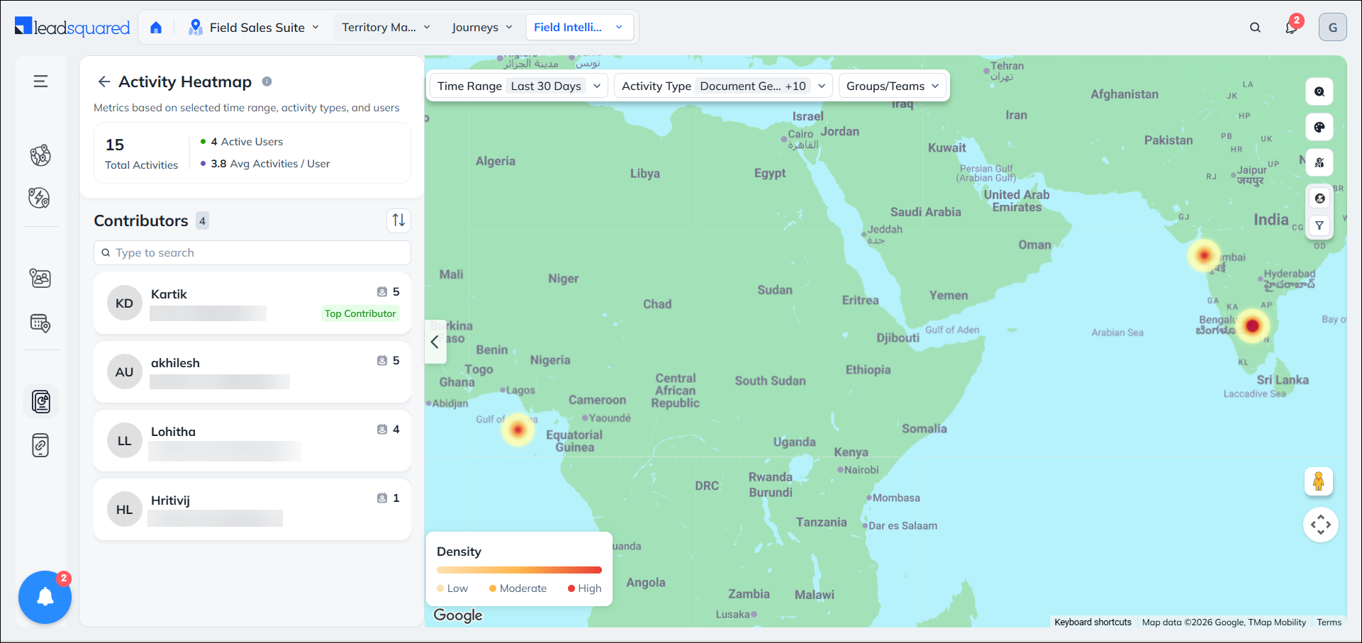
Activity Heatmaps in Field Force Insights provide a geographic view of where your field teams perform activities over a selected period. By transforming activity data into a color-coded density map, the feature helps managers quickly identify high-activity hotspots, coverage gaps, and under-served areas. With summary metrics, activity insights, top contributors, and timeline playback, managers can understand activity patterns and make more informed territory and field-force planning decisions.
2. Prerequisites
- You must have access to Field Force Insights based on your user role and permissions.
- Activity Heatmaps must be enabled for your account.
- Users must have the LeadSquared Mobile app installed on their devices, and location permission access must be enabled. To know more, please refer to Location Tracking on LeadSquared Mobile.
- Admins must enable location tracking permissions for their users:
- Navigate to Settings>Mobile App>Permissions.
- Under Location Tracking, enable all the permissions.
- All mobile users must Check-In/Check-Out daily for the system to effectively track their location.
- To get data with highest location accuracy, refer to
3. Use Cases
- Manufacturing: Identify whether sales reps are covering all dealer and distributor clusters or concentrating on easily accessible areas.
- BFSI: Assess branch territory coverage and determine whether field teams are reaching customers across the assigned radius or staying close to branch locations.
- Healthcare: Identify gaps in doctor and clinic visit coverage, especially in high-density areas that receive limited field activity.
- Real Estate: Track site visit coverage and identify areas where reps may be overlooking newly launched or less-accessible project sites.
4. How It Works
- Activity Heatmaps are available as a view within the existing Field Force Insights map. You can switch from the real-time user map to the Activity Heatmap view to analyze historical activity data.
- The heatmap displays activity concentration geographically, with different areas represented based on the density of activities performed there. This allows you to quickly identify areas where field activity is concentrated and areas with relatively low activity.
- The Activity Heatmap view also provides analytics to help you understand activity distribution across the selected period.
5. User Roles and Access
Activity Heatmaps access is determined by the user’s role in your LeadSquared account. The table below outlines the level of access each role has, including visibility into users, teams, and sales groups.
| User Role | Access |
| Admins | All users, teams and sales groups |
| Sales Managers | All users, teams and sales groups |
| Sales Group Managers / Reporting Managers | Sales Groups / Reportees they are managers of |
6. Access Activity Heatmaps
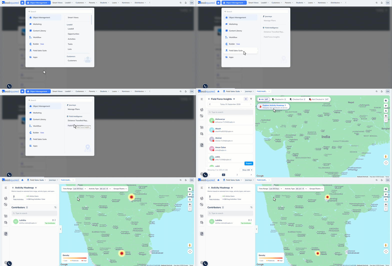
- Navigate to Field Force Insights.
- On the map, switch from the real-time user view to the Activity Heatmap view by clicking the Explore Activity Heatmap button.
- Select the required time period to analyze historical activity.
- Review the heatmap to identify areas with high and low activity concentration.
- Use the available analytics to understand the overall activity distribution and identify potential coverage gaps.
7. Activity Heatmap Page
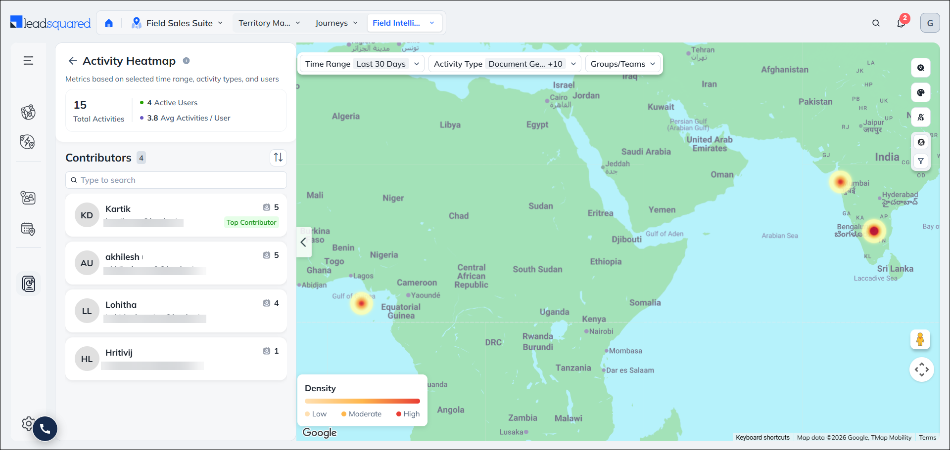
The Activity Heatmap page provides a geographic view of where your users are performing activities. Use the available filters and map controls to customize the view and focus on the activity data relevant to you. You can also collapse or expand the left panel to maximize the map view.
7.1 Density
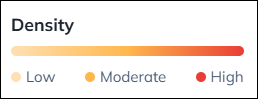
The Density tab uses three color levels to indicate activity concentration:
- Low (Yellow): Areas with fewer activities completed.
- Moderate (Orange): Areas with a moderate number of activities completed.
- High (Red): Areas with the highest number of activities completed.
Areas without any density indication represent locations that are not yet covered by your users.
7.2 Filters
Use the available filters to customize the Activity Heatmap and view only the data relevant to you.
- Time Range: Select a predefined duration from the dropdown or specify a custom date range of up to 30 days.
- Activity Type: Select the activity types you want to track. The heatmap displays only activities of the selected types.
- Groups / Teams: Select the groups or teams whose activities you want to track. By default, the heatmap displays activities performed by all active contributors.
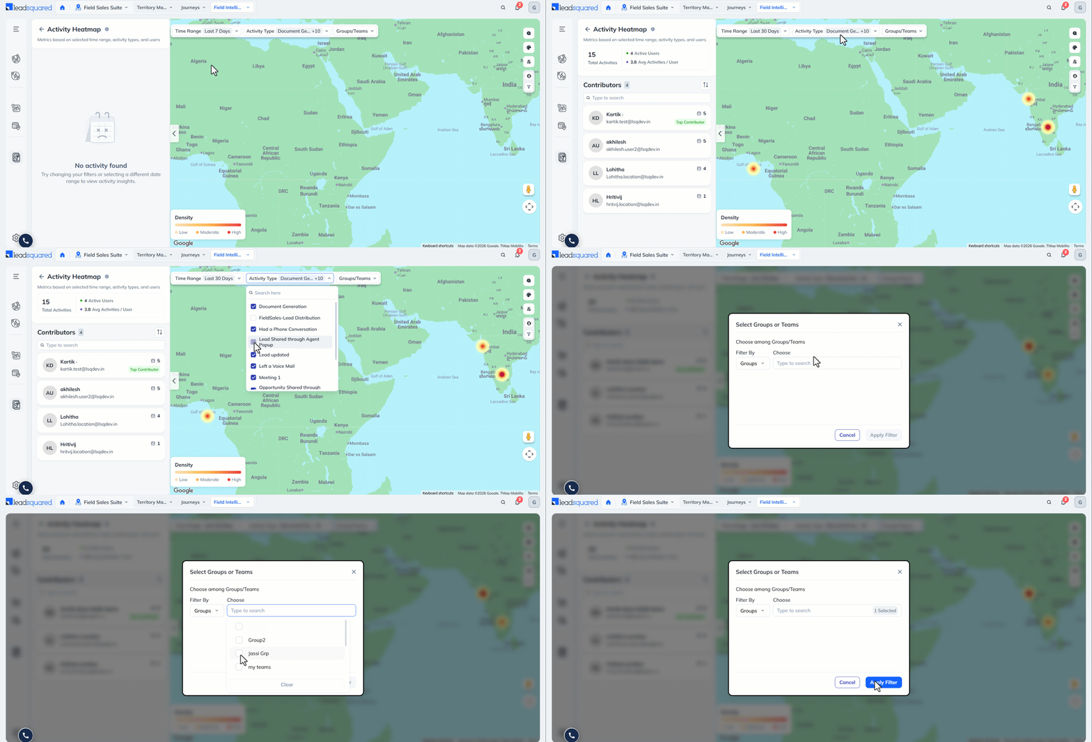
7.3 Total Activities
The Total Activities metric in the left panel displays the number of activities completed within the selected time range, based on the filters applied.
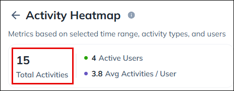
7.4 Active Users and Average Activities per User
- The Active Users metric displays the number of users who completed activities within the selected date range and based on the applied filters.
- The Average Activities per User is calculated by dividing the total number of completed activities by the number of active users within the selected time range.
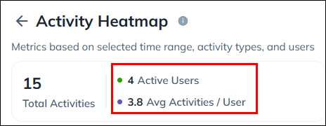
7.5 Contributors
The Contributors section lists the users who completed activities within the selected time range, based on the applied filters. By default, users are listed in descending order of the number of activities completed. Click the Ascending Order icon to reverse the order. The user with the highest number of completed activities is marked as the Top Contributor.
Each user card displays the user’s name, email address, and number of activities completed. Click a user card to view their activity details. The map automatically zooms in to the locations where the user performed activities. You can also click an activity icon on the map to view details such as:
- Lead associated with the activity
- Date and time the activity was completed
- User’s battery percentage when the activity was completed
- Location where the activity was performed
- User who performed the activity
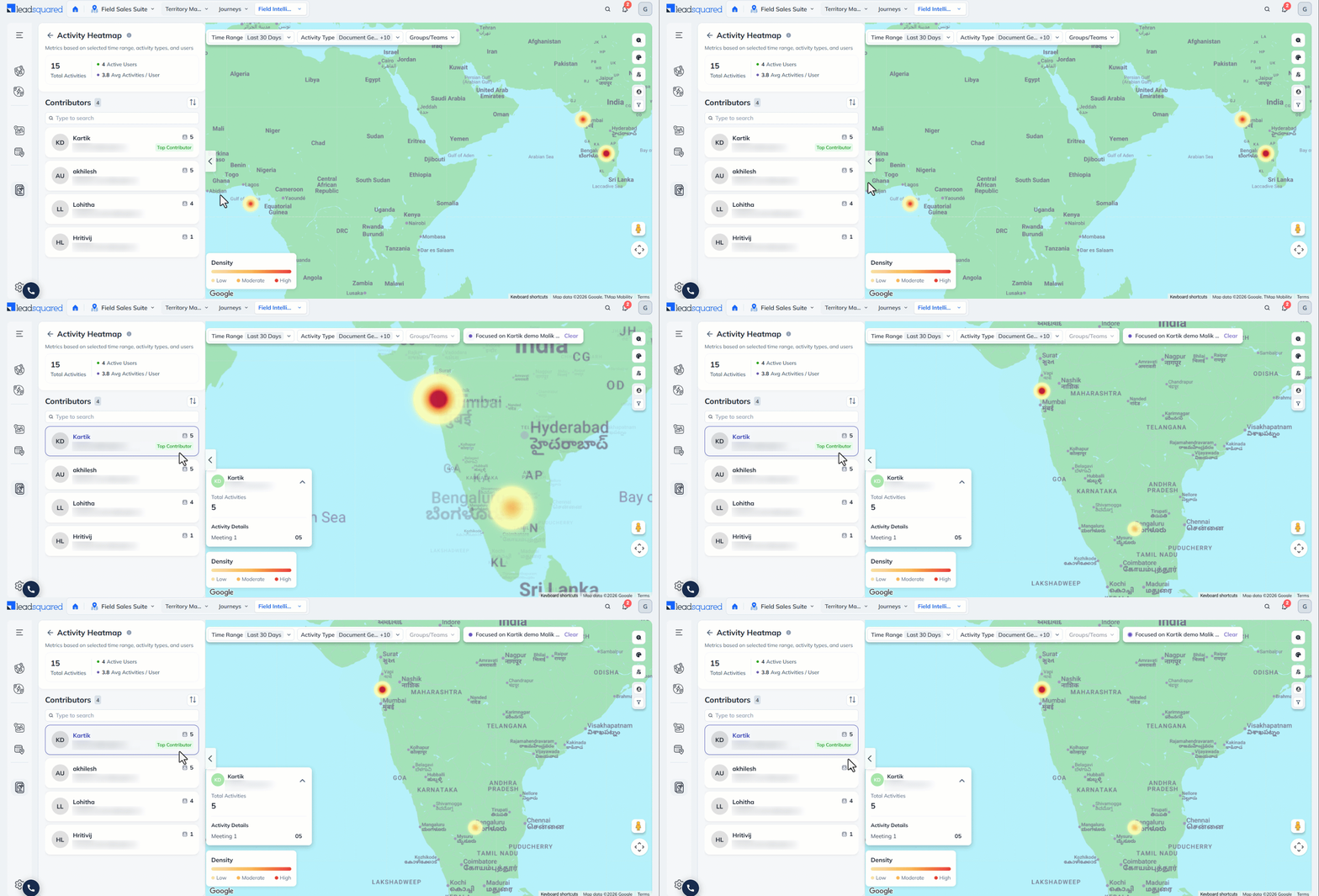
7.7 Map Actions
You can personalize the map view and perform the following actions using the icons displayed on the right side of the map –
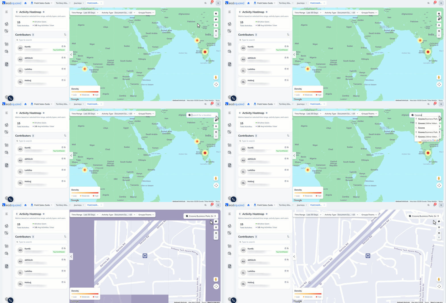
7.7.1 Search Location
Search for a specific address or location on the map by clicking the Search Location icon.
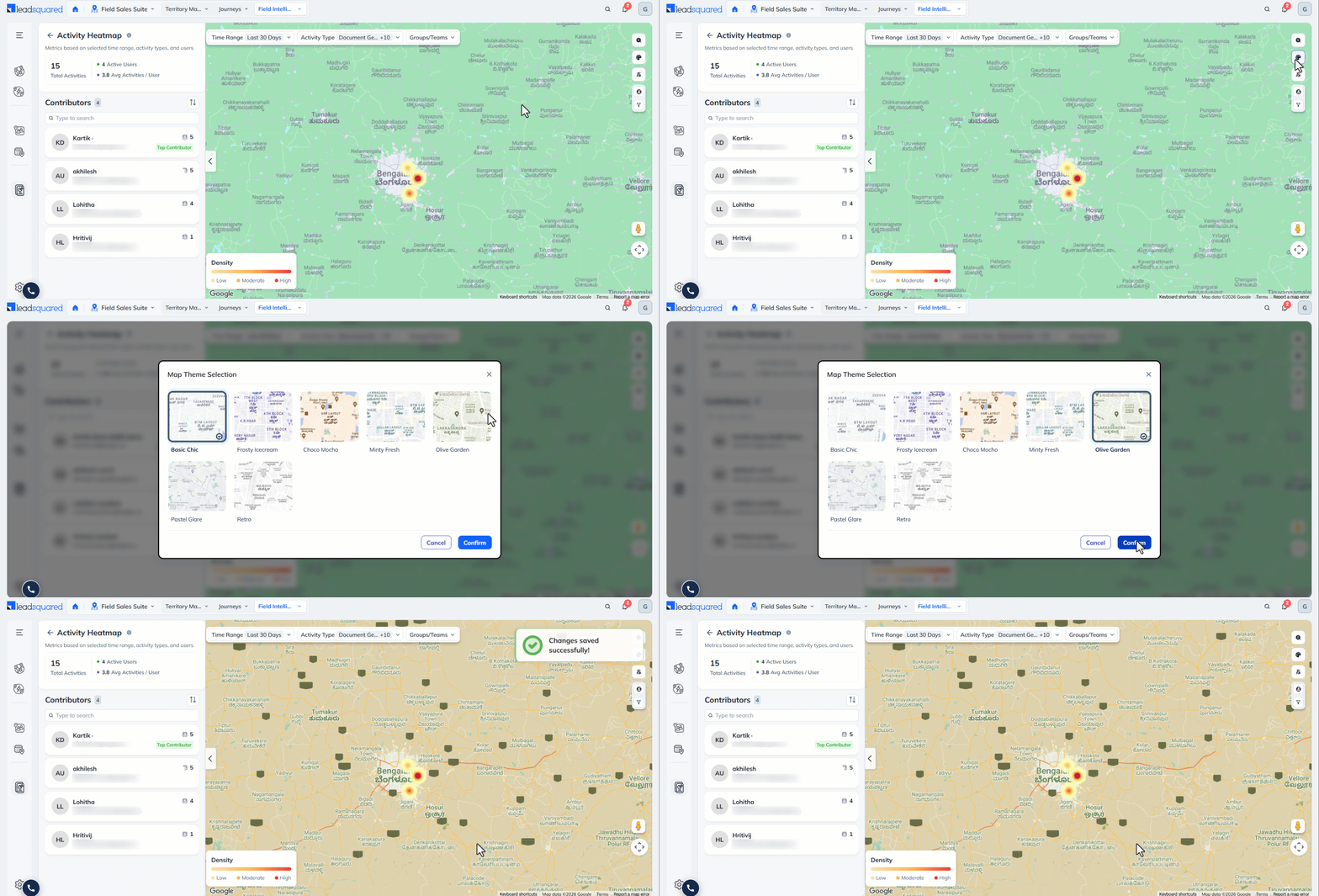
7.7.2 Map Theme Selection
Personalize your experience by selecting a preferred map theme. Click the Map Selection button and select the relevant theme. This will automatically apply across all Field Sales modules.
7.7.3 View Territories on Map
The Field Sales Territories feature allows Admins and Sales Managers to create territories and automatically distribute leads to sales users based on proximity. Within Field Force Insights, you can monitor user movement within or across their assigned territories. Click the View Territories icon for a comprehensive view of each user’s commute. This helps you assess whether all territories are being adequately covered by your team.
Note:
- The Field Sales Territories feature is not available by default. To get this enabled, reach out to support@leadsquared.com.
- You must be an Admin or Sales Manager to access Territories on the map. The admin can see all the territories whereas the Sales Managers can see only the territories owned by them.

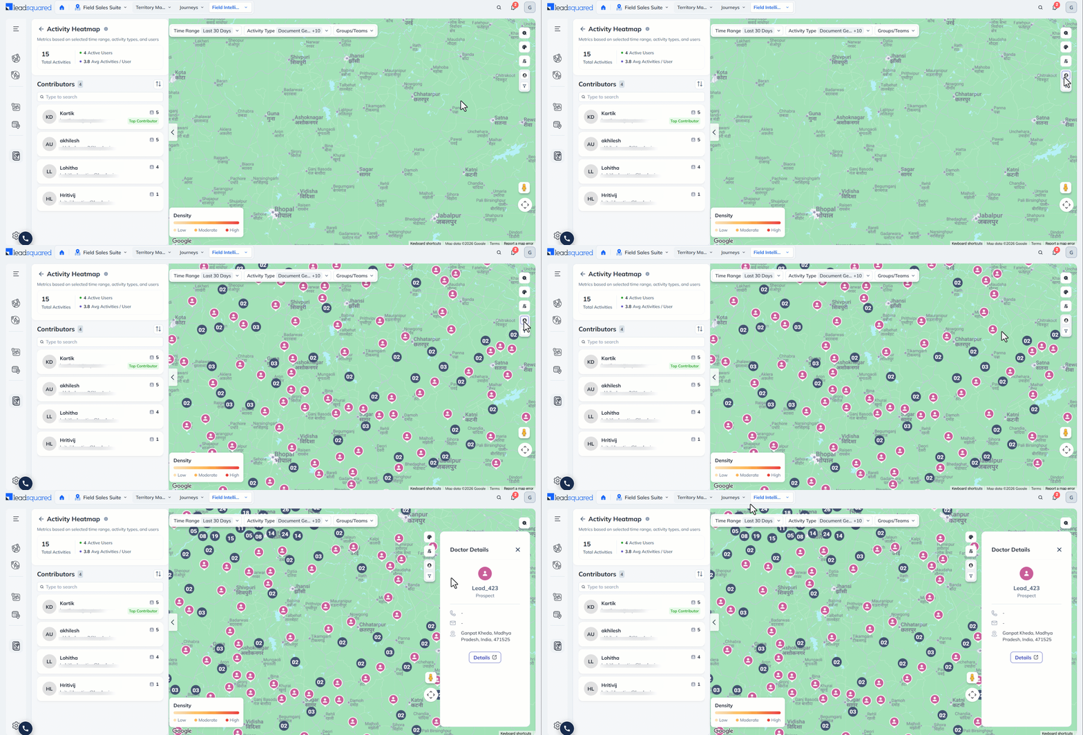
7.7.4 View Leads on Map
Alongside your users, view the leads on the map by clicking the Show/Hide Leads button. The leads are displayed in clusters on the map. Click the relevant cluster to view leads individually. From here, you can click on a lead and to go to the Lead Details page.
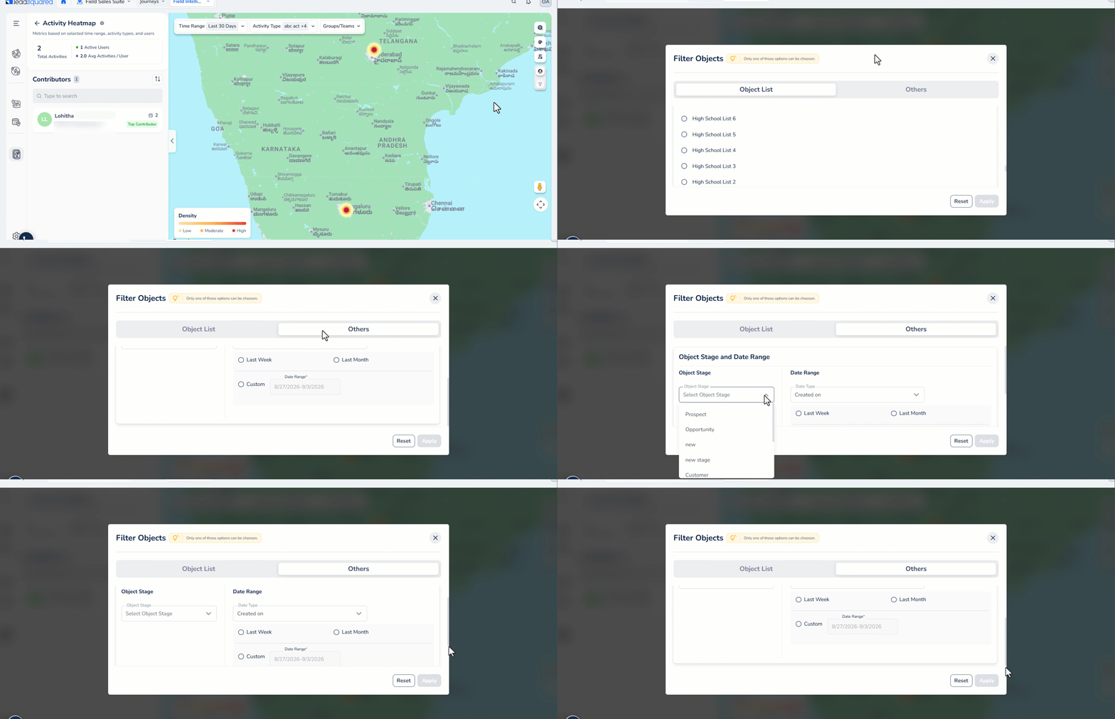
7.7.5 Apply Filters
To view specific leads quickly, filter and view leads on the map based on lead lists, lead stages or based on the dates they were created on.
Any Questions?
Did you find this article helpful? Please let us know any feedback you may have in the comments section below. We’d love to hear from you and help you out!