1. Feature Overview
SIERA’s Quick Edit feature lets users change the basic parameters of an existing report and Save it as a new copy or overwrite the existing report. This functionality is available to all user types.
2. Prerequisites
SIERA is a paid feature. To enable it, contact your account manager or send an email to support@leadsquared.com.
3. Using Quick Edit
On a SIERA report, you can use the Filters, Data, and Charts sections to make changes to the report. Once you’ve made some changes, you can save the modified report by clicking the Save As or Save button.
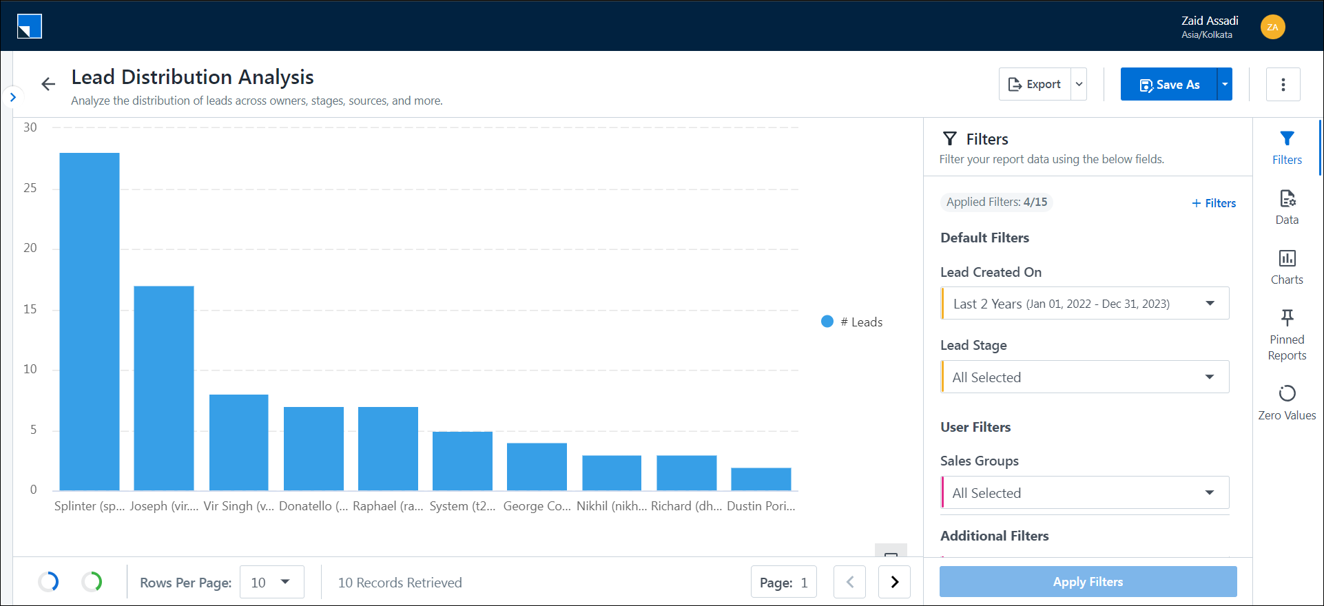
4. Filters
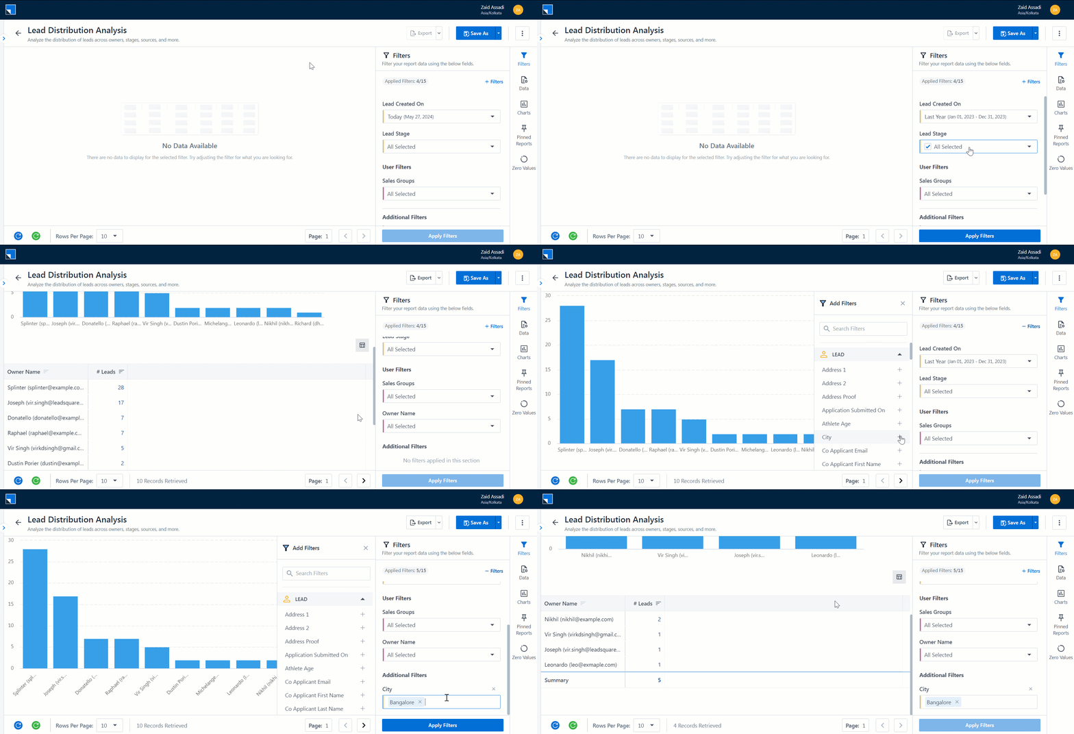
Each report comes with a default set of filters. The Filter section lets you change the filter values and add more filters to a report. A maximum of 15 filters can be applied to a report. The following data types are supported as filters –
- String – any field configured as String in LeadSquared will be of String type in reports. The filter will be an open text box where users can input matching texts. Upto 15 values can be added. To add a text filter, enter the text and press enter. The filter will be case-sensitive.
- Dropdown – Fields that are configured as dropdowns in LeadSquared will appear as a dropdown filter in reports. Such filters will come as a multi-select dropdown. The dropdown options will be taken from the options configured in LeadSquared. To apply a filter, select the values you want. There is also a search bar to search for specific dropdown values. Clicking on the “All Selected” will select or deselect all options.
- Date – Any field configured as a date in LeadSquared can also be used to apply filters. Date filters can be applied as Relative or Absolute.
- Relative date filters are changing date filter windows, for example, a relative date filter of the Last 7 days will always ensure to fetch the data for the last 7 days starting today.
- Absolute date filters are fixed date ranges, for example, an absolute date filter of 21st May 2024 to 28th May 2024, will always get the data for these date ranges.
5. Data
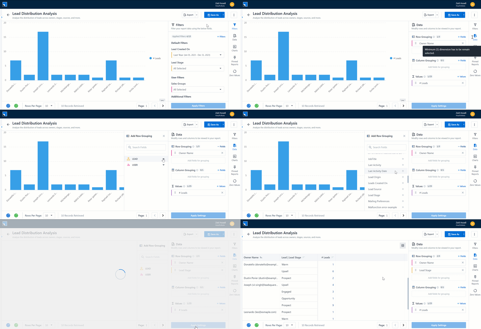
The data section lets users add groupings and values to a report. It defines what fields will occupy rows and columns and what will be counted in the report.
5.1 Rows
This option will let you select the row grouping of the report. Row grouping defines the fields that will occupy each row of the report. For instance, if we put Lead Stage as a Row Grouping, each value of Lead Stage will occupy a row.
The + Add button opens all fields corresponding to the Data Source (For example, Activity Data Source will contain all Lead Fields and Standard Activity Fields, along with System User Fields.) Click on any field to add it to the row grouping and click on Preview to see the changes.
Note:
- Only Date and String (Dropdown + Text) fields are allowed.
- The minimum permissible number of row groupings is 1.
- The maximum permissible number of row groupings is 3.
- To define sorting on a row grouping, click on the sort icon beside the field.
- To remove a field from the row grouping, click on the cross icon.
- To add a Row grouping, click on the + Fields option.
5.2 Columns
This option will let you select the column grouping of the report. You can make a pivot table with your data.
The + Add button opens all fields corresponding to the Data Source (For example, Activity Data Source will contain all Lead Fields and Standard Activity Fields, along with System User Fields.) Click on any field to add it to the Column grouping and click on Preview to see the changes.
Note:
- Only Date and String (Dropdown + Text) fields are allowed.
- In pivot mode, up to 52 columns will be visible, after which all the other columns will be clubbed under the Others column.
- The minimum permissible number of row groupings is 0.
- The maximum permissible number of row groupings is 1.
- To remove a field from column grouping, click on the cross icon.
- To add a column grouping, click the + Add option.

5.3 Values
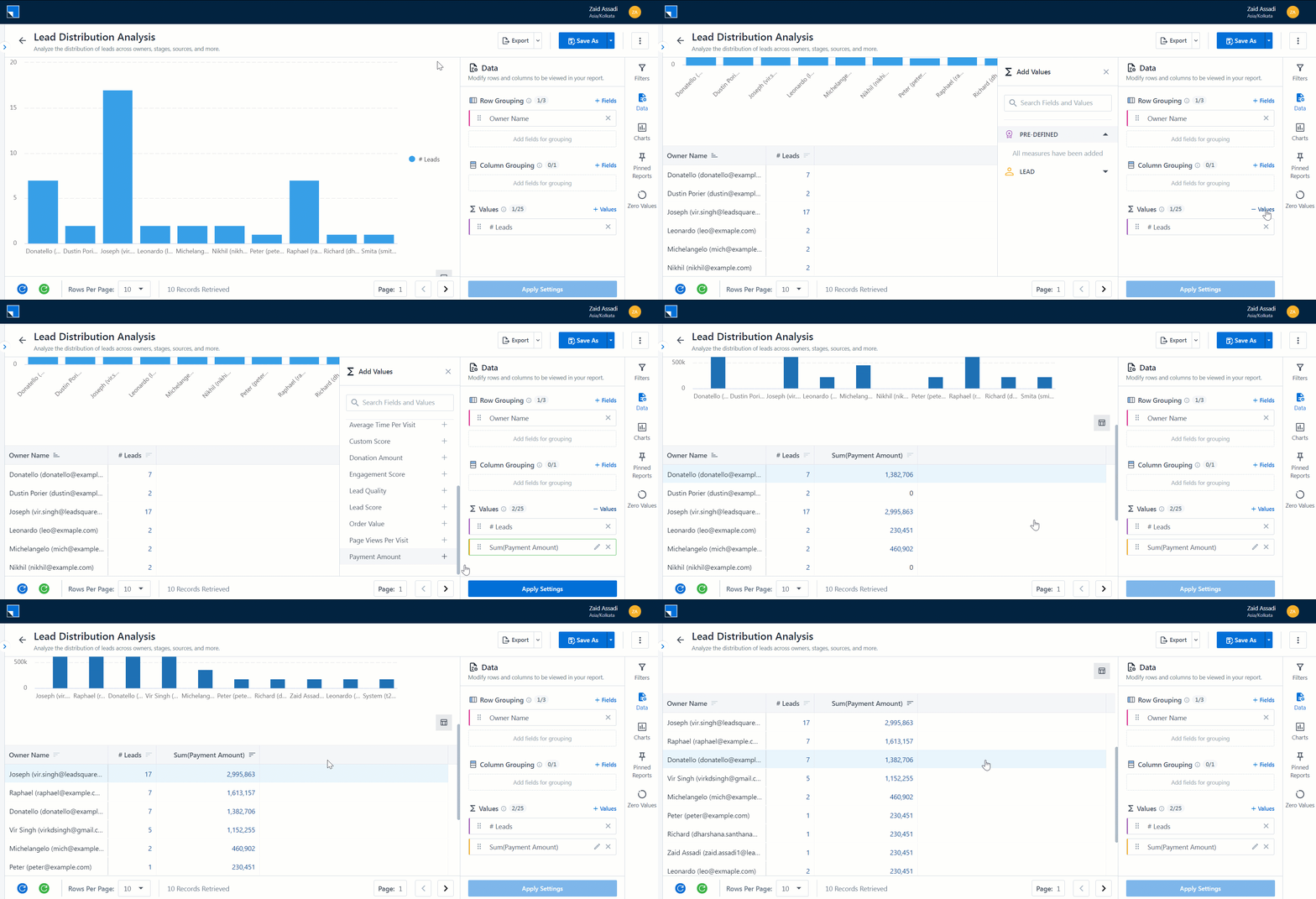
This option will let you select the measures in the report. The + Add button opens all fields corresponding to the Data Source (For example, Activity Data Source will contain all Lead Fields and Standard Activity Fields, along with System User Fields.) Click on any field to add it to the Values section and click on Preview to see the changes.
Note:
- Only Number fields are allowed to be added from the + Add options. Values Name and aggregator can also be changed by clicking the edit button.
- The Values section also has a pre-defined set of values to help create quick reports.
- The minimum permissible number of row groupings is 1.
- The maximum permissible number of row groupings is 25.
- To remove a field from column grouping, click on the cross icon.
6. Charts
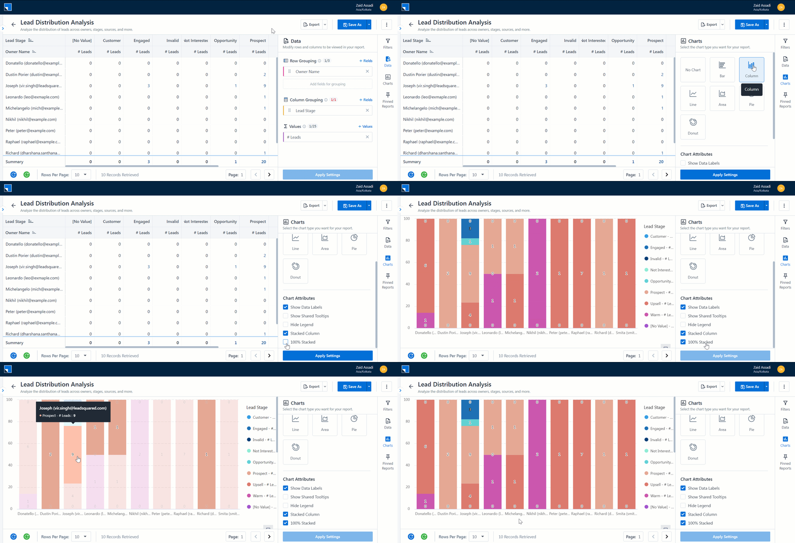
This section lets you add charts to your report. The axes of the charts depend on the Groupings and Values (refer to section 5).
The charts supported are –
- Bar Chart
- Column Chart
- Line Chart
- Area Chart
- Pie Chart
- Donut Chart
The following chart attributes are available to be applied. Certain attributes are exclusive to specific chart types as shown in the table below –
| Chart Attribute | Available On Chart Type | Description |
| Show Data Labels | All Charts | Add data labels to your chart. The data points highlight the value against the respective chart point. |
| Show Series Label | Line and Area | Adds the series label to your chart. |
| Show Category Name | Pie and Donut | Shows the category names. |
| Show Percentage Labels | Pie and Donut | Displays the percentage distribution of a value with the total in percentage. |
| Stacked | Bar, Column, Line, and Area | A stacked chart is a form of a chart that shows the composition and comparison of the variables selected. For example, if you have a Column chart of Owners vs Lead Stages stacked for Stages, you will see a chart with a Column for each Owner and each Column showing the distribution of leads per Owner. |
| 100% Stacked | Bar, and Column | A Percent Stacked Bar or Column Chart is designed to display the relationship of constituent parts to the whole. You can compare the contribution of each value to a total (sum) across categories. In the case of a Column Chart, the range of values along the Y-axis is from 0 to 100%. You will need to select the Stacked option along with this option.
|
| Hide Legend | All Charts | Hides the legend of the distribution on the chart. |
| Show Shared Tooltips | All Charts | Show all the shared data on the tooltip. |
7. Save or Save As
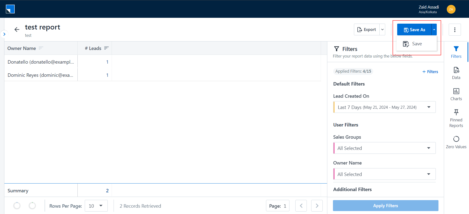
Any change made by modifying filters, data, and charts can be saved as a new report by clicking Save As or overwrite the existing report by clicking Save.
Note:
- You will be able to overwrite a report if you are the owner of the report. Otherwise, the Save button will be disabled for you.
- You cannot overwrite a system report.
8. Troubleshooting
Why am I receiving the error “Something went wrong” when saving an edited report?
- Problem Statement: Users encounter the error message “Something went wrong” when trying to save an edited report.
- Solution: This error occurs due to the presence of restricted symbols in the report’s name or description. To resolve the issue:
- Remove the “&” symbol from the report’s name and description.
- After making these changes, try saving the report again.
- Note: The following symbols are restricted in the report name and description
; ' " < . \ &
Any Questions?
Did you find this article helpful? Please let us know in the comments section below. We’d love to hear from you and help you out!


How do we add percentage% sign in tables
Hi, At present, this feature isn’t available but is in the pipeline. Also, could you please contact support@leadsquared.com with the specific use-case you’re trying solve? Our team will check if there is a workaround.
my report is not showing
Hi, Prateek. Please email support@leadsquared.com with a description of the issue. We’ll get back to you ASAP.